

我们在分析了差异表达数据之后,经常要生成一种直观图--热图(heatmap)。这一节就以基因芯片数据为例,示例生成高品质的热图。
比如

钢蓝渐白配色的热图
首先还是从最简单的heatmap开始。
> library(ggplot2)
> library(ALL) #可以使用biocLite("ALL")安装该数据包
> data("ALL")
> library(limma)
> eset<-ALL[,ALL$mol.biol %in% c("BCR/ABL","ALL1/AF4")]
> f<-factor(as.character(eset$mol.biol))
> design<-model.matrix(~f)
> fit<-eBayes(lmFit(eset,design)) #对基因芯片数据进行分析,得到差异表达的数据
> selected  <- p.adjust(fit$p.value[, 2]) <0.001
> esetSel <- eset[selected,] #选择其中一部分绘制热图
> dim(esetSel) #从这尺度上看,数目并不多,但也不少。如果基因数过多,可以分两次做图。
Features  Samples
      84       47
> library(hgu95av2.db)
> data<-exprs(esetSel)
> probes<-rownames(data)
> symbol<-mget(probes,hgu95av2SYMBOL,ifnotfound=NA)
> symbol<-do.call(rbind,symbol)
> symbol[is.na(symbol[,1]),1]<-rownames(symbol)[is.na(symbol[,1])]
> rownames(data)<-symbol[probes,1] #给每行以基因名替换探针名命名,在绘制热图时直接显示基因名。
> heatmap(data,cexRow=0.5) |
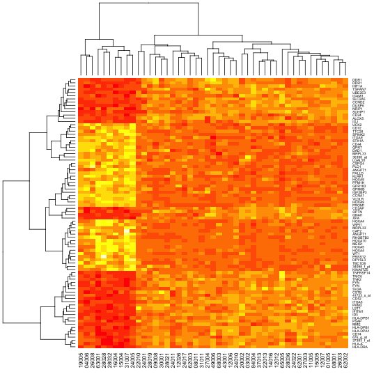
使用heatmap函数默认颜色生成的热图
这个图有三个部分,样品分枝树图和基因分枝树图,以及热图本身。之所以对样品进行聚类分析排序,是因为这次的样品本身并没有分组。如果有分组的话,那么可以关闭对样品的聚类分析。对基因进行聚类分析排序,主要是为了色块好看,其实可以选择不排序,或者使用GO聚类分析排序。上面的这种热图,方便简单,效果非常不错。
接下来我们假设样品是分好组的,那么我们想用不同的颜色来把样品组标记出来,那么我们可以使用ColSideColors参数来实现。同时,我们希望变更热图的渐变填充色,可以使用col参数来实现。
> color.map <- function(mol.biol) { if (mol.biol=="ALL1/AF4") "#FF0000" else "#0000FF" }
> patientcolors <- unlist(lapply(esetSel$mol.bio, color.map))
> heatmap(data, col=topo.colors(100), ColSideColors=patientcolors, cexRow=0.5) |
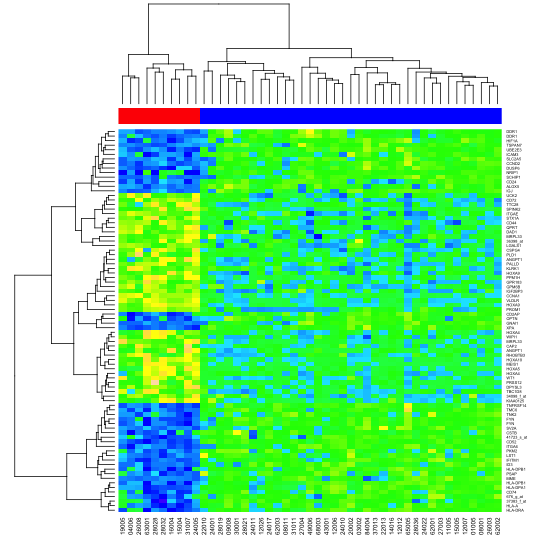
使用heatmap函数top.colors填充生成的热图
在heatmap函数中,样品分组只能有一种,如果样品分组有多次分组怎么办?heatmap.plus就是来解决这个问题的。它们的参数都一致,除了ColSideColors和RowSideColors。heatmap使用是一维数组,而heatmap.plus使用的是字符矩阵来设置这两个参数。
> library(heatmap.plus)
> hc<-hclust(dist(t(data)))
> dd.col<-as.dendrogram(hc)
> groups <- cutree(hc,k=5)
> color.map <- function(mol.biol) { if (mol.biol=="ALL1/AF4") 1 else 2 }
> patientcolors <- unlist(lapply(esetSel$mol.bio, color.map))
> col.patientcol<-rbind(groups,patientcolors)
> mode(col.patientcol)<-"character"
> heatmap.plus(data,ColSideColors=t(col.patientcol),cexRow=0.5) |
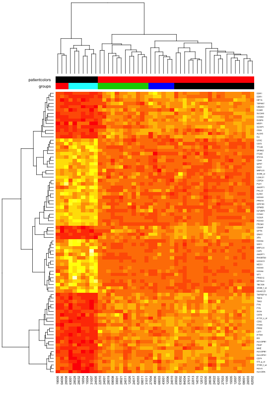
使用heatmap.plus绘制热图
这样绘图的不足是没有热图色key值。gplots中的heatmap.2为我们解决了这个问题。而且它带来了更多的预设填充色。下面就是几个例子。
> library("gplots")
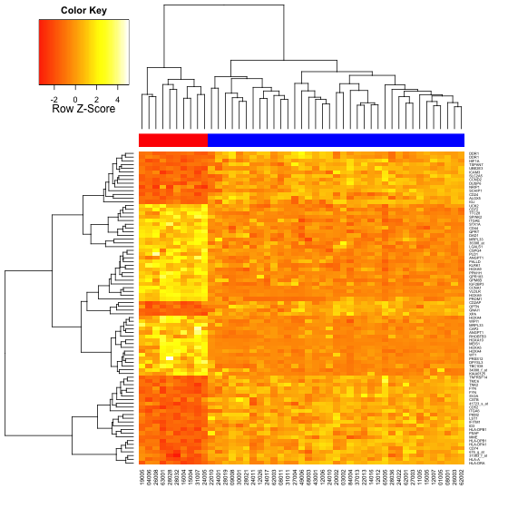
> heatmap.2(data, col=redgreen(75), scale="row", ColSideColors=patientcolors,
+ key=TRUE, symkey=FALSE, density.info="none", trace="none", cexRow=0.5) |
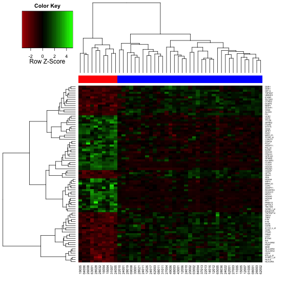
使用heatmap.2函数,readgreen渐变色填充生成的热图
> heatmap.2(data, col=heat.colors(100), scale="row", ColSideColors=patientcolors, + key=TRUE, symkey=FALSE, density.info="none", trace="none", cexRow=0.5) > heatmap.2(data, col=terrain.colors(100), scale="row", ColSideColors=patientcolors, + key=TRUE, symkey=FALSE, density.info="none", trace="none", cexRow=0.5) > heatmap.2(data, col=cm.colors(100), scale="row", ColSideColors=patientcolors, + key=TRUE, symkey=FALSE, density.info="none", trace="none", cexRow=0.5) > heatmap.2(data, col=redblue(100), scale="row", ColSideColors=patientcolors, + key=TRUE, symkey=FALSE, density.info="none", trace="none", cexRow=0.5) > heatmap.2(data, col=colorpanel(100,low="white",high="steelblue"), scale="row", ColSideColors=patientcolors, + key=TRUE, keysize=1, symkey=FALSE, density.info="none", trace="none", cexRow=0.5) |
使用heatmap.2函数,heat.colors渐变色填充生成的热图
使用heatmap.2函数,terrain.colors渐变色填充生成的热图
使用heatmap.2函数,cm.colors渐变色填充生成的热图
使用heatmap.2函数,redblue渐变色填充生成的热图
使用heatmap.2函数,colorpanel渐变色填充生成的热图
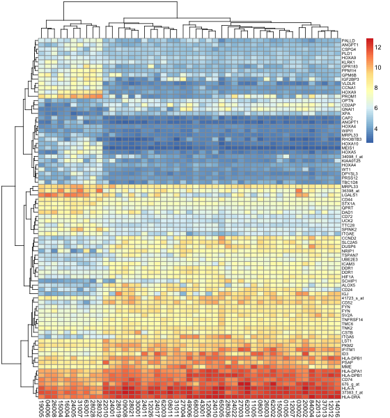
然而,以上的heatmap以及heatmap.2虽然方便简单,效果也很不错,可以使用colorpanel方便的设置渐变填充色,但是它的布局没有办法改变,生成的效果图显得有点呆板,不简洁。为此这里介绍如何使用ggplot2当中的geom_tile来为基因芯片绘制理想的热图。
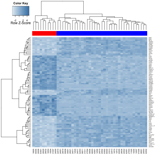
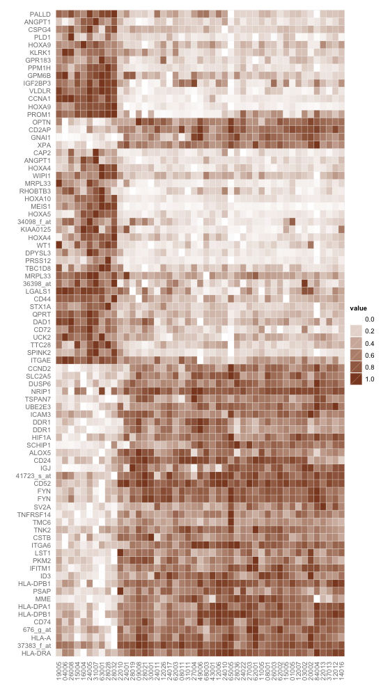
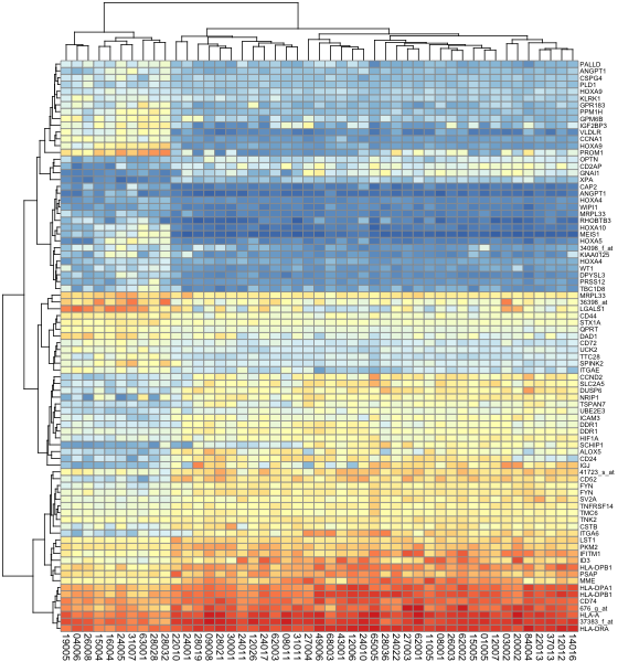
> library(ggplot2) > hc<-hclust(dist(data)) > rowInd<-hc$order > hc<-hclust(dist(t(data))) > colInd<-hc$order > data.m<-data[rowInd,colInd] #聚类分析的作用是为了色块集中,显示效果好。如果本身就对样品有分组,基因有排序,就可以跳过这一步。 > data.m<-apply(data.m,1,rescale) #以行为基准对数据进行变换,使每一行都变成[0,1]之间的数字。变换的方法可以是scale,rescale等等,按照自己的需要来变换。 > data.m<-t(data.m) #变换以后转置了。 > coln<-colnames(data.m) > rown<-rownames(data.m) #保存样品及基因名称。因为geom_tile会对它们按坐标重排,所以需要使用数字把它们的序列固定下来。 > colnames(data.m)<-1:ncol(data.m) > rownames(data.m)<-1:nrow(data.m) > data.m<-melt(data.m) #转换数据成适合geom_tile使用的形式 > head(data.m) X1 X2 value 1 1 1 0.1898007 2 2 1 0.6627467 3 3 1 0.5417057 4 4 1 0.4877054 5 5 1 0.5096474 6 6 1 0.2626248 > base_size<-12 #设置默认字体大小,依照样品或者基因的多少而微变。 > (p <- ggplot(data.m, aes(X2, X1)) + geom_tile(aes(fill = value), #设定横坐标为以前的列,纵坐标为以前的行,填充色为转换后的数据 + colour = "white") + scale_fill_gradient(low = "white", #设定渐变色的低值为白色,变值为钢蓝色。 + high = "steelblue")) > p + theme_grey(base_size = base_size) + labs(x = "", #设置xlabel及ylabel为空 + y = "") + scale_x_continuous(expand = c(0, 0),labels=coln,breaks=1:length(coln)) + #设置x坐标扩展部分为0,刻度为之前的样品名 + scale_y_continuous(expand = c(0, 0),labels=rown,breaks=1:length(rown)) + opts( #设置y坐标扩展部分为0,刻度为之前的基因名 + axis.ticks = theme_blank(), axis.text.x = theme_text(size = base_size * #设置坐标字体为基准的0.8倍,贴近坐标对节,x坐标旋转90度,色彩为中灰 + 0.8, angle = 90, hjust = 0, colour = "grey50"), axis.text.y = theme_text( + size = base_size * 0.8, hjust=1, colour="grey50")) |
使用ggplot2中geom_tile函数,钢蓝渐白配色的热图
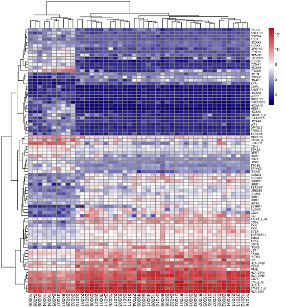
也可以很轻松的实现传统渐变填充色,红黄渐变。
> (p <- ggplot(data.m, aes(X2, X1)) + geom_tile(aes(fill = value), + colour = "white") + scale_fill_gradient(low = "yellow", + high = "red")) > p + theme_grey(base_size = base_size) + labs(x = "", + y = "") + scale_x_continuous(expand = c(0, 0),labels=coln,breaks=1:length(coln)) + + scale_y_continuous(expand = c(0, 0),labels=rown,breaks=1:length(rown)) + opts( + axis.ticks = theme_blank(), axis.text.x = theme_text(size = base_size * + 0.8, angle = 90, hjust = 0, colour = "grey50"), axis.text.y = theme_text( + size = base_size * 0.8, hjust=1, colour="grey50")) |
使用ggplot2中geom_tile函数,红黄渐变填充的热图
使用红绿渐变填充。
> (p <- ggplot(data.m, aes(X2, X1)) + geom_tile(aes(fill = value),
+ colour = "white") + scale_fill_gradient(low = "green",
+ high = "red"))
> p + theme_grey(base_size = base_size) + labs(x = "",
+ y = "") + scale_x_continuous(expand = c(0, 0),labels=coln,breaks=1:length(coln)) +
+ scale_y_continuous(expand = c(0, 0),labels=rown,breaks=1:length(rown)) + opts(
+ axis.ticks = theme_blank(), axis.text.x = theme_text(size = base_size *
+ 0.8, angle = 90, hjust = 0, colour = "grey50"), axis.text.y = theme_text(
+ size = base_size * 0.8, hjust=1, colour="grey50"))

使用ggplot2中geom_tile函数,红绿渐变填充的热图
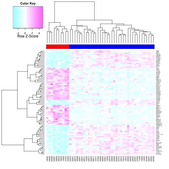
使用绿白渐变填充。
> (p <- ggplot(data.m, aes(X2, X1)) + geom_tile(aes(fill = value), + colour = "white") + scale_fill_gradient(low = "seagreen", + high = "white")) > p + theme_grey(base_size = base_size) + labs(x = "", + y = "") + scale_x_continuous(expand = c(0, 0),labels=coln,breaks=1:length(coln)) + + scale_y_continuous(expand = c(0, 0),labels=rown,breaks=1:length(rown)) + opts( + axis.ticks = theme_blank(), axis.text.x = theme_text(size = base_size * + 0.8, angle = 90, hjust = 0, colour = "grey50"), axis.text.y = theme_text( + size = base_size * 0.8, hjust=1, colour="grey50")) |
使用ggplot2中geom_tile函数,绿白渐变填充的热图
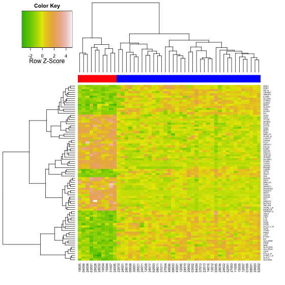
使用棕白渐变填充。
> (p <- ggplot(data.m, aes(X2, X1)) + geom_tile(aes(fill = value), + colour = "white") + scale_fill_gradient(low = "white", + high = "sienna4")) > p + theme_grey(base_size = base_size) + labs(x = "", + y = "") + scale_x_continuous(expand = c(0, 0),labels=coln,breaks=1:length(coln)) + + scale_y_continuous(expand = c(0, 0),labels=rown,breaks=1:length(rown)) + opts( + axis.ticks = theme_blank(), axis.text.x = theme_text(size = base_size * + 0.8, angle = 90, hjust = 0, colour = "grey50"), axis.text.y = theme_text( + size = base_size * 0.8, hjust=1, colour="grey50")) |
使用ggplot2中geom_tile函数,棕白渐变填充的热图
使用灰阶填充。
> (p <- ggplot(data.m, aes(X2, X1)) + geom_tile(aes(fill = value), + colour = "white") + scale_fill_gradient(low = "black", + high = "gray85")) > p + theme_grey(base_size = base_size) + labs(x = "", + y = "") + scale_x_continuous(expand = c(0, 0),labels=coln,breaks=1:length(coln)) + + scale_y_continuous(expand = c(0, 0),labels=rown,breaks=1:length(rown)) + opts( + axis.ticks = theme_blank(), axis.text.x = theme_text(size = base_size * + 0.8, angle = 90, hjust = 0, colour = "grey50"), axis.text.y = theme_text( + size = base_size * 0.8, hjust=1, colour="grey50")) |
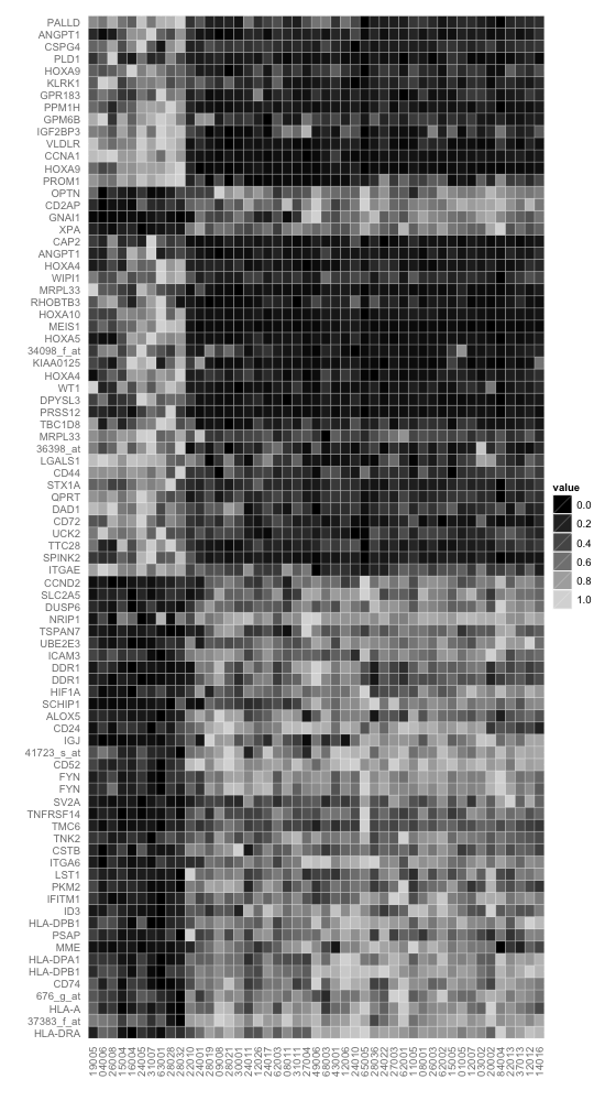
使用ggplot2中geom_tile函数,灰色渐变填充的热图
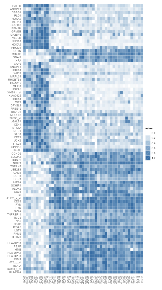
除了ggplot2,还有lattice也是不错的选择。我只使用一种填充色,生成两个图,以作示例。
> hc<-hclust(dist(data)) > dd.row<-as.dendrogram(hc) > row.ord<-order.dendrogram(dd.row) #介绍另一种获得排序的办法 > hc<-hclust(dist(t(data))) > dd.col<-as.dendrogram(hc) > col.ord<-order.dendrogram(dd.col) > data.m<-data[row.ord,col.ord] > library(ggplot2) > data.m<-apply(data.m,1,rescale) #rescale是ggplot2当中的一个函数 > library(lattice) > levelplot(data.m, + aspect = "fill",xlab="",ylab="", + scales = list(x = list(rot = 90, cex=0.8),y=list(cex=0.5)), + colorkey = list(space = "left"),col.regions = heat.colors) > library(latticeExtra) > levelplot(data.m, + aspect = "fill",xlab="",ylab="", + scales = list(x = list(rot = 90, cex=0.5),y=list(cex=0.4)), + colorkey = list(space = "left"),col.regions = heat.colors, + legend = + list(right = + list(fun = dendrogramGrob, #dendrogramGrob是latticeExtra中绘制树型图的一个函数 + args = + list(x = dd.row, ord = row.ord, + side = "right", + size = 5)), + top = + list(fun = dendrogramGrob, + args = + list(x = dd.col, + side = "top", + type = "triangle")))) #使用三角型构图 |
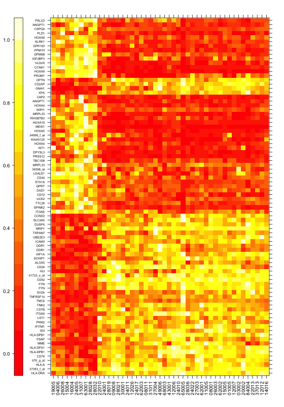
使用lattice中的levelplot函数,heat.colors填充绘制热图
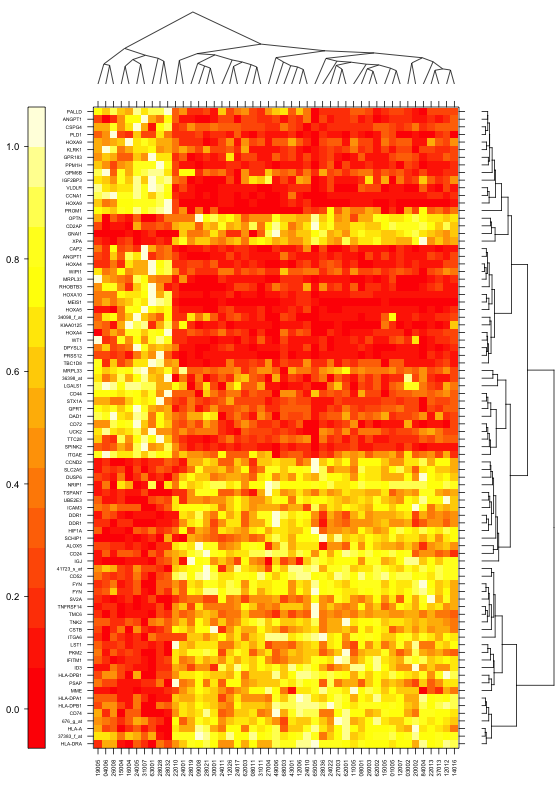
使用lattice中的levelplot函数,heat.colors填充,dendrogramGrob绘树型,绘制热图
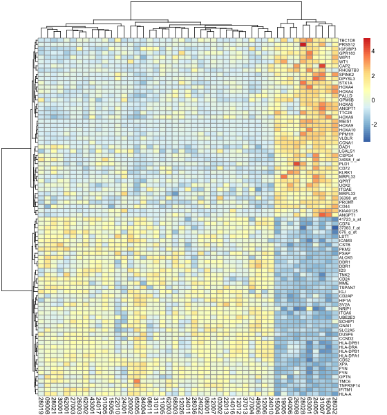
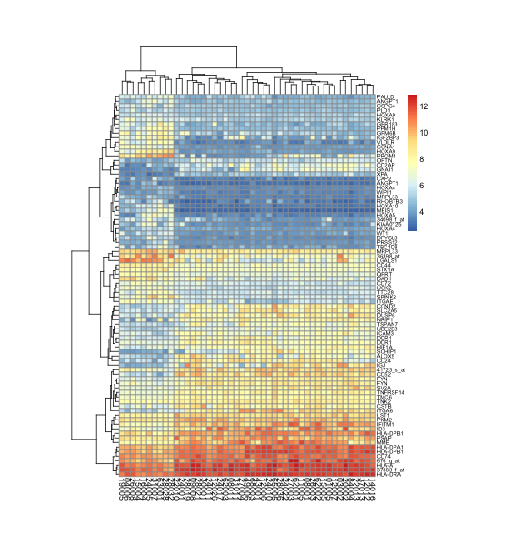
可是可是,绘制一个漂亮的热图这么难么?参数如此之多,设置如此复杂,色彩还需要自己指定。有没有简单到发指的函数呢?有!那就是pheatmap,全称pretty heatmaps.
> library(pheatmap)
> pheatmap(data,fontsize=9, fontsize_row=6) #最简单地直接出图
> pheatmap(data, scale = "row", clustering_distance_row = "correlation", fontsize=9, fontsize_row=6) #改变排序算法
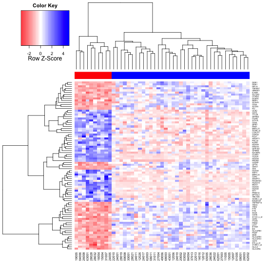
> pheatmap(data, color = colorRampPalette(c("navy", "white", "firebrick3"))(50), fontsize=9, fontsize_row=6) #自定义颜色
> pheatmap(data, cluster_row=FALSE, fontsize=9, fontsize_row=6) #关闭按行排序
> pheatmap(data, legend = FALSE, fontsize=9, fontsize_row=6) #关闭图例
> pheatmap(data, cellwidth = 6, cellheight = 5, fontsize=9, fontsize_row=6) #设定格子的尺寸
> color.map <- function(mol.biol) { if (mol.biol=="ALL1/AF4") 1 else 2 }
> patientcolors <- unlist(lapply(esetSel$mol.bio, color.map))
> hc<-hclust(dist(t(data)))
> dd.col<-as.dendrogram(hc)
> groups <- cutree(hc,k=7)
> annotation<-data.frame(Var1=factor(patientcolors,labels=c("class1","class2")),Var2=groups)
> pheatmap(data, annotation=annotation, fontsize=9, fontsize_row=6) #为样品分组
> Var1 = c("navy", "skyblue")
> Var2 = c("snow", "steelblue")
> names(Var1) = c("class1", "class2")
> ann_colors = list(Var1 = Var1, Var2 = Var2)
> pheatmap(data, annotation=annotation, annotation_colors = ann_colors, fontsize=9, fontsize_row=6) #为分组的样品设定颜色 |
pheatmap最简单地直接出图
pheatmap改变排序算法
pheatmap自定义颜色
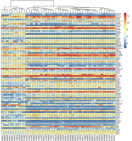
pheatmap关闭按行排序
pheatmap关闭图例
pheatmap设定格子的尺寸
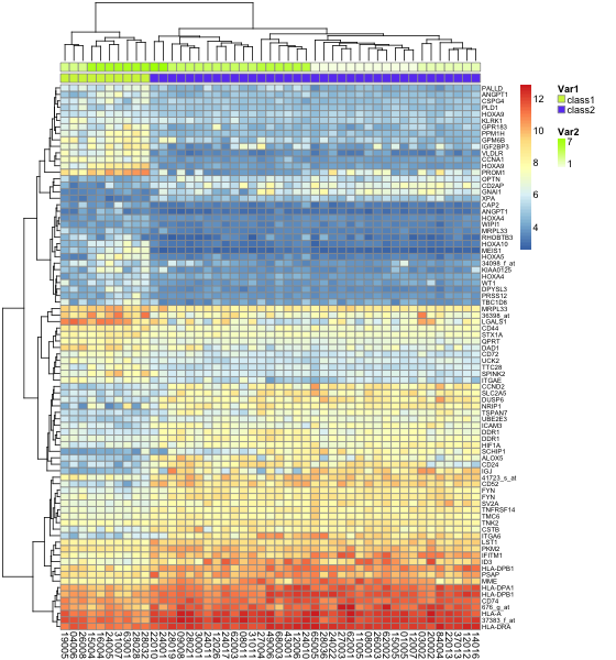
pheatmap为样品分组
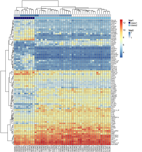
pheatmap为分组的样品设定颜色
1F
学习了,感谢
2F
很不错
3F
博主,您好,请问ALL是什么数据包啊
4F
为什么plob注册一直提醒验证数字错误呢