

地理课上,我们经常会看到等高线。在ggplot2中,也有实现一个和等高线差不多的利器
- stat_density2d()
看个例子先
	# The base plot
	p <- ggplot(faithful, aes(x=eruptions, y=waiting))
	p + geom_point() + stat_density2d()
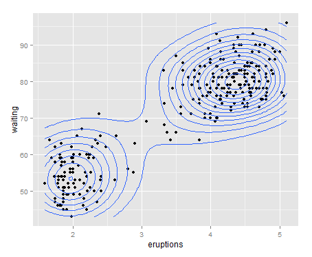
我们可以在原始图中添加类似登高线的表示,用以标记密集程度。
	# Contour lines, with "height" mapped to color
	p + stat_density2d(aes(colour=..level..))

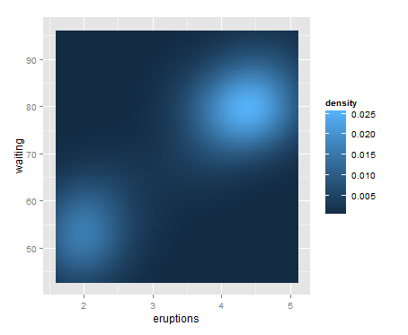
# Map density estimate to fill color
p + stat_density2d(aes(fill=..density..), geom="raster", contour=FALSE)
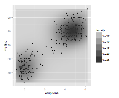
# With points, and map density estimate to alpha
p + geom_point() +stat_density2d(aes(alpha=..density..), geom="tile", contour=FALSE)
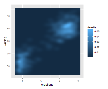
同一维的密度曲线一样,stat_density2d也可以调整binwidth用h()函数即可 体会下下面的这个例子
p + stat_density2d(aes(fill=..density..), geom="raster", contour=FALSE, h=c(.5,5))
原文来自:http://yangchao.me/2013/11/ggplot2-2d-density/
以上代码和图片可以从这里下载:http://pan.baidu.com/s/1sw5uP