
pheatmap是一个非常受欢迎的绘制热图的R包。ComplexHeatmap包即是受之启发而来。你可以发现Heatmap()函数中很多参数都与pheatmap()相同。在pheatmap的时代(请允许我这么说),pheatmap意思是pretty heatmap,但是随着时间推进,技术发展,各种新的数据出现,pretty is no more pretty,我们需要更加复杂和更有效率的热图可视化方法对庞大的数据进行快速并且有效的解读,因此我开发并且一直维护和改进着ComplexHeatmap包。为了使庞大并且“陈旧”的(对不起,我不应该这么说。)pheatmap用户群能够迅速并且无痛的迁移至ComplexHeatmap,从2.5.2版本开始,我在ComplexHeatmap包中加入了一个pheatmap()函数,它涵盖了pheatmap::pheatmap()所有的功能,也就是说,它提供了和pheatmap::pheatmap()一模一样的参数,并且生成的热图的样式也几乎相同。同时,ComplexHeatmap::pheatmap()函数也能使用ComplexHeatmap独有的功能,比如对行和列进行切分,加入自定义的annotation,多个热图和annotation的连接,或者创建一个互动的热图(interactive heatmap, 通过ht_shiny()函数)
ComplexHeatmap::pheatmap()包含了pheatmap::pheatmap()中所有的参数,这意味着,当你从pheatmap迁移至ComplexHeatmap时,你无需添加任何额外的步骤,你只需要载入ComplexHeatmap而不是pheatmap包,然后重新运行你原始的pheatmap代码。剩下的你只是去见证奇迹的发生。
注意如下五个pheatmap::pheatmap()的参数在ComplexHeatmap::pheatmap()中被忽视:
kmeans_k:在pheatmap::pheatmap()中,如果这个参数被设定,输入矩阵会进行k均值聚类,然后每个cluster使用其均值向量表示。最终的热图是k个均值向量的热图。此操作改变了原始矩阵的大小,而且每个cluster的大小信息丢失了,直接解读均值向量可能会造成对数据的误解。我不赞成此操作,因此我没有支持这个参数。在ComplexHeatmap中,row_km和column_km参数可能是一个更好的选择。filename:如果这个参数被设定,热图直接保存至指定的文件中。我认为这只是画蛇添足(没有贬低pheatmap的意思,只是最近在给小孩讲成语故事,然后想在这里使用一下)的一步,ComplexHeatmap::pheatmap()不支持此参数。width:filename的宽度。height:filename的长度。silent: 是否打印信息。
在pheatmap::pheatmap()中,color参数需要设置为一个长长的颜色向量(如果你想用100种颜色的话),比如:
pheatmap::pheatmap(mat,
    color = colorRampPalette(rev(brewer.pal(n = 7, name = "RdYlBu")))(100)
)
在ComplexHeatmap::pheatmap()中,你可以简化无需使用colorRampPalette()去扩展更多的颜色,你可以直接简化为如下,颜色会被自动插值和扩展。
ComplexHeatmap::pheatmap(mat,
    color = rev(brewer.pal(n = 7, name = "RdYlBu"))
)
例子
我们首先创建一个随机数据,这个来自于pheatmap包中提供的例子(https://rdrr.io/cran/pheatmap/man/pheatmap.html).
test = matrix(rnorm(200), 20, 10)
test[1:10, seq(1, 10, 2)] = test[1:10, seq(1, 10, 2)]   3
test[11:20, seq(2, 10, 2)] = test[11:20, seq(2, 10, 2)]   2
test[15:20, seq(2, 10, 2)] = test[15:20, seq(2, 10, 2)]   4
colnames(test) = paste("Test", 1:10, sep = "")
rownames(test) = paste("Gene", 1:20, sep = "")
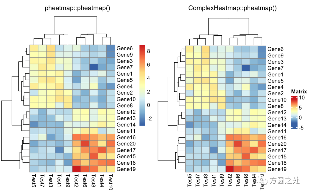
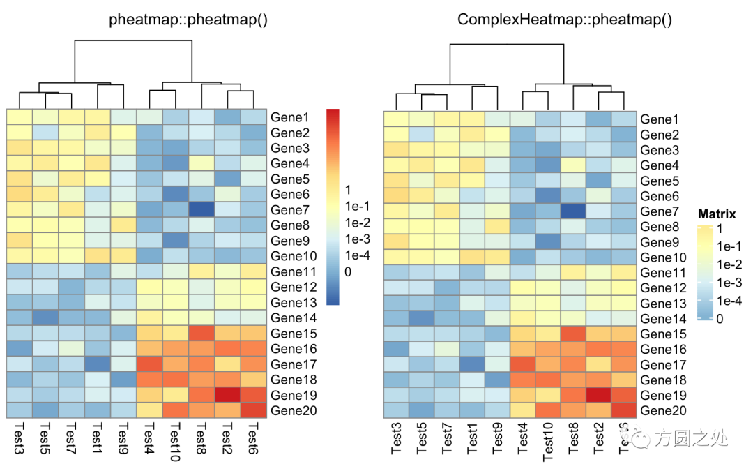
我们载入ComplexHeatmap包,然后执行pheatmap()函数,生成一副和pheatmap::pheatmap()非常类似的热图。
library(ComplexHeatmap)
# 注意这是ComplexHeatmap::pheatmap
pheatmap(test)
在ComplexHeatmap::pheatmap()中,按照pheatmap::pheatmap()的样式进行了相应的配置,因此,大部分元素的样式一模一样。只有少部分不一致,比如说热图的legend。
下一个例子是在热图中加入annotation。以下代码是在pheatmap()中添加annotation。如果你是pheatmap()用户,你应该对annotation的数据格式不太陌生。
annotation_col = data.frame(
    CellType = factor(rep(c("CT1", "CT2"), 5)),
    Time = 1:5
)
rownames(annotation_col) = paste("Test", 1:10, sep = "")

annotation_row = data.frame(
    GeneClass = factor(rep(c("Path1", "Path2", "Path3"), c(10, 4, 6)))
)
rownames(annotation_row) = paste("Gene", 1:20, sep = "")

ann_colors = list(
    Time = c("white", "firebrick"),
    CellType = c(CT1 = "#1B9E77", CT2 = "#D95F02"),
    GeneClass = c(Path1 = "#7570B3", Path2 = "#E7298A", Path3 = "#66A61E")
)

pheatmap(test,
    annotation_col = annotation_col,
    annotation_row = annotation_row,
    annotation_colors = ann_colors)
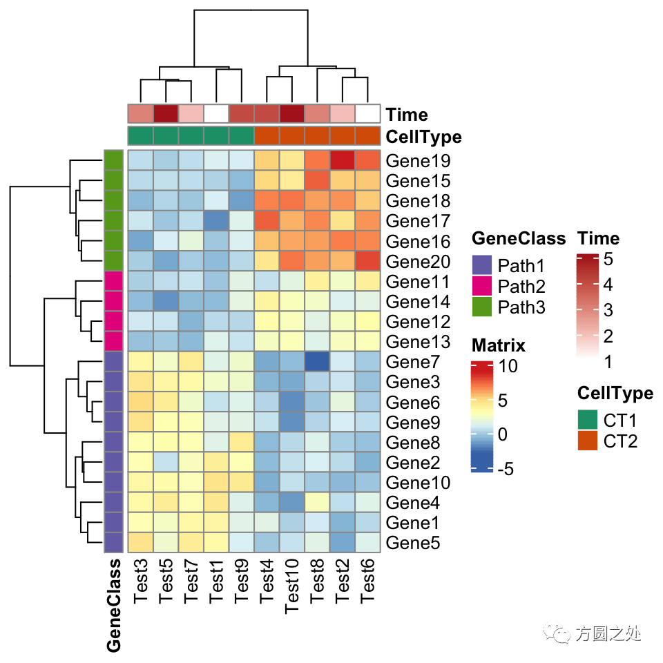
看起来和pheatmap::pheatmap()还是很一致。
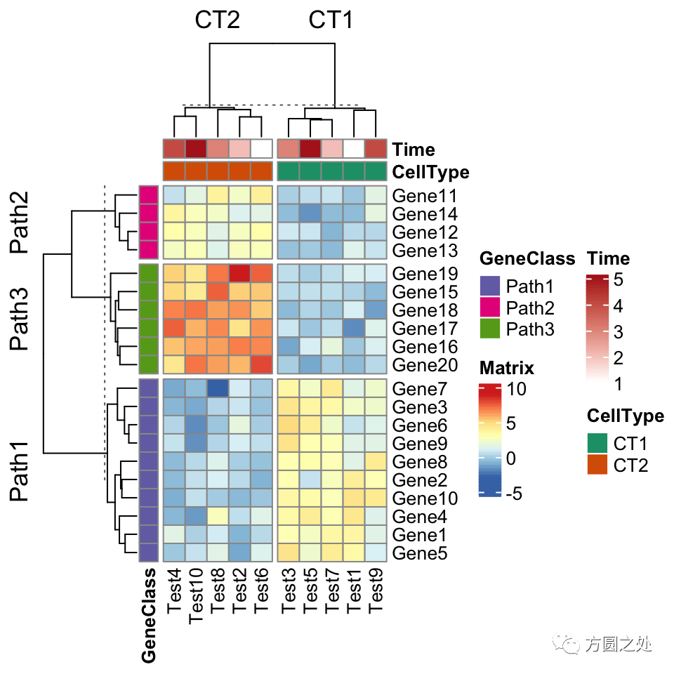
ComplexHeatmap::pheatmap()内部其实使用了Heatmap()函数,因此更多的参数都最终传递给了Heatmap()。我们可以在pheatmap()中使用一些Heatmap()特有的参数,比如row_split和column_split来对行和列进行切分。
pheatmap(test,
    annotation_col = annotation_col,
    annotation_row = annotation_row,
    annotation_colors = ann_colors,
    row_split = annotation_row$GeneClass,
    column_split = annotation_col$CellType)
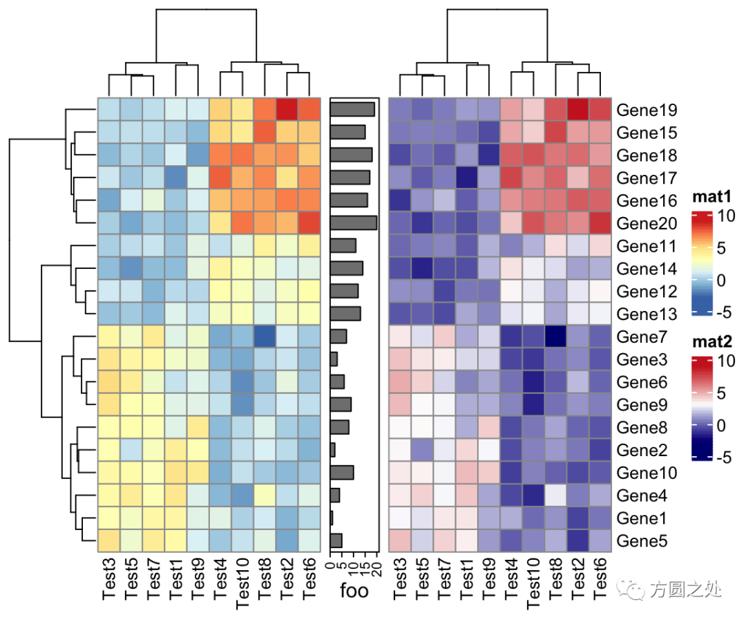
ComplexHeatmap::pheatmap()返回一个Heatmap对象,因此它可以与其他Heatmap/HeatmapAnnotation对象连接。换句话说,你可以使用炫酷的 或者%v%对多个pheatmap水平连接或者垂直连接。
p1 = pheatmap(test, name = "mat1")
p2 = rowAnnotation(foo = anno_barplot(1:nrow(test)))
p3 = pheatmap(test, name = "mat2",
    col = c("navy", "white", "firebrick3"))
p1   p2   p3
ComplexHeatmap支持将一个热图导出为一个shiny app,这也同样适用于pheatmap(),因此你可以这样做:
ht = pheatmap(...)
ht_shiny(ht) # 强烈建议试一试
还有一件重要的小事是,因为ComplexHeatmap::pheatmap()返回一个Heatmap对象,如果pheatmap()并没有在一个interactive的环境执行,比如说在一个R脚本中,或者在一个函数/for loop中,你应该显式的调用draw()函数进行画图。
for(...) {
    p = pheatmap(...)
    draw(p)
}
最后我想说的事,这篇文章的主旨并不是鼓励用户直接使用ComplexHeatmap::pheatmap(),我只是在此展示了pheatmap完全可以用ComplexHeatmap来代替,而且ComplexHeatmap提供了工具让用户无需任何额外的操作(zero effort)就可以迁移以前旧的代码。但是我还是强烈建议用户直接使用ComplexHeatmap中的“正经函数”。
从pheatmap到ComplexHeatmap的翻译
在“阅读原文”中,你可以找到一个表格,其中详细的列出了如何将pheatmap::pheatmap()中的参数对应到Heatmap()中。
比较
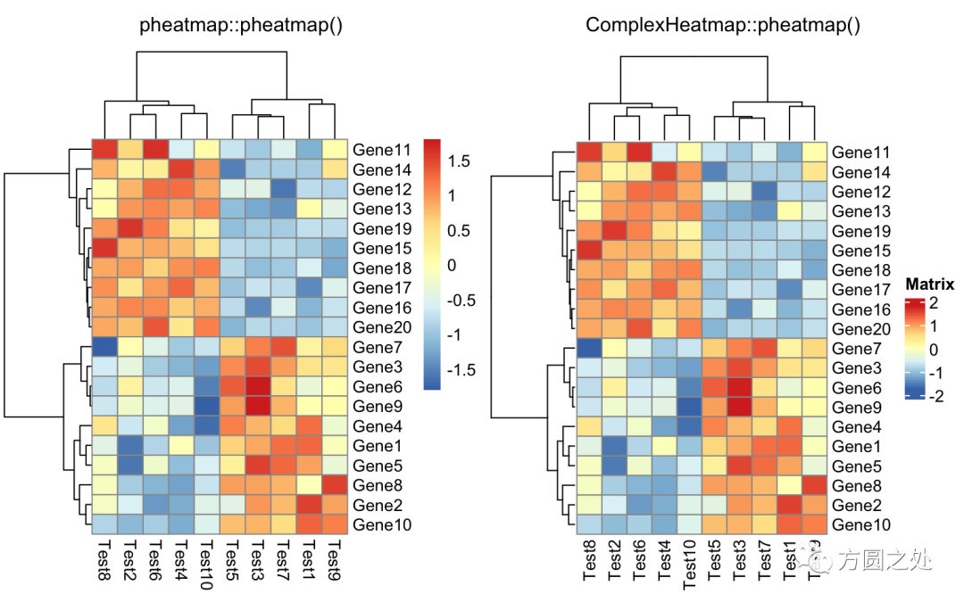
这一小节我比较了相同参数下pheatmap::pheatmap()生成的热图和ComplexHeatmap::pheatmap()的相似度。我使用了pheatmap包中所有的例子(https://rdrr.io/cran/pheatmap/man/pheatmap.html)。同时我也使用了ComplexHeatmap中提供的一个简单的帮助函数ComplexHeatmap::compare_pheatmap()。它的功能就是把参数同时传递给pheatmap::pheatmap()和ComplexHeatmap::pheatmap(),然后生成两幅热图,这样可以直接进行比较。因此如下代码
compare_pheatmap(test)
其实等同于:
pheatmap::pheatmap(test)
ComplexHeatmap::pheatmap(test)
在往下阅读之前,我先告诉你结论:pheatmap::pheatmap()和ComplexHeatmap::pheatmap()产生的热图几乎完全相同。
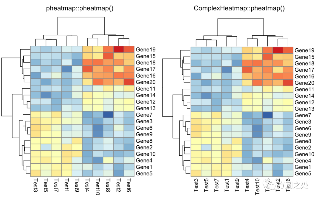
只提供一个矩阵:
compare_pheatmap(test)

对列进行z-score归一化,行聚类距离使用相关性距离:
compare_pheatmap(test,
    scale = "row",
    clustering_distance_rows = "correlation")
设定颜色:
compare_pheatmap(test,
    color = colorRampPalette(c("navy", "white", "firebrick3"))(50))
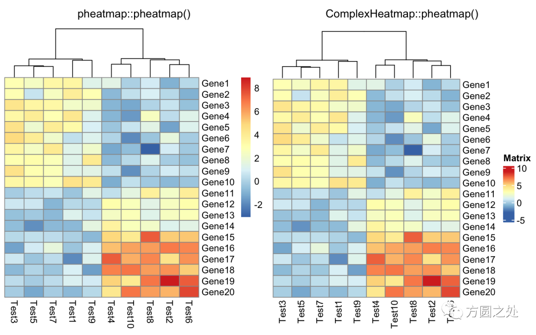
不对行聚类:
compare_pheatmap(test,
    cluster_row = FALSE)
不显示legend:
compare_pheatmap(test,
    legend = FALSE)
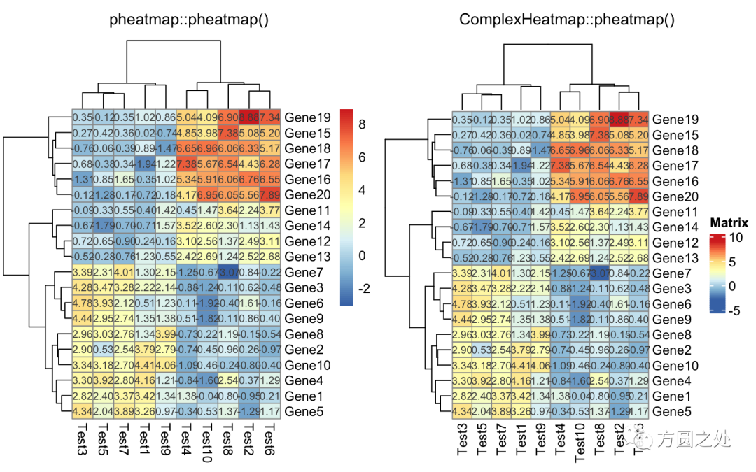
在矩阵格子上显示数值:
compare_pheatmap(test,
    display_numbers = TRUE)
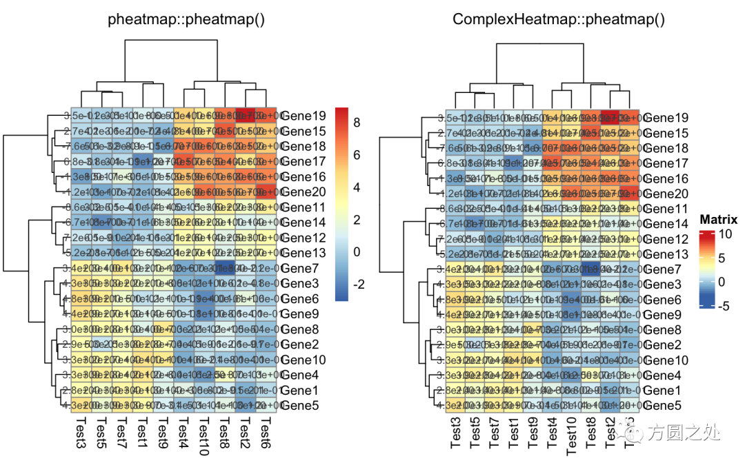
对矩阵格子上的数值进行格式化:
compare_pheatmap(test,
    display_numbers = TRUE,
    number_format = "%.1e")
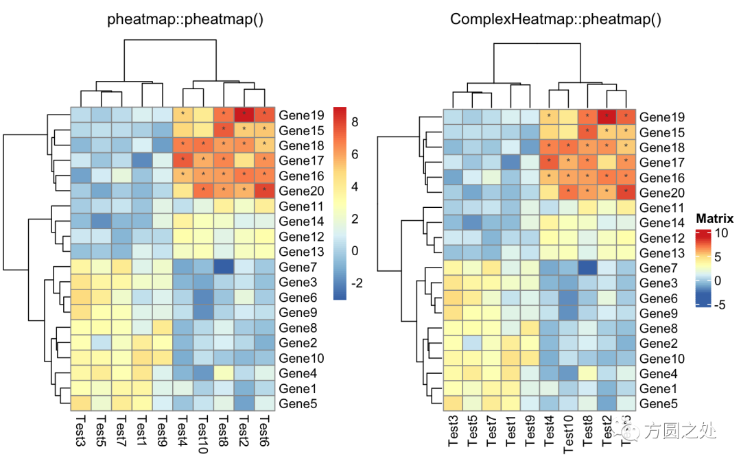
自定义矩阵格子上的文字:
compare_pheatmap(test,
    display_numbers = matrix(ifelse(test > 5, "*", ""),
                             nrow(test)))
定义legend上的label:
compare_pheatmap(test,
    cluster_row = FALSE,
    legend_breaks = -1:4,
    legend_labels = c("0", "1e-4", "1e-3", "1e-2", "1e-1", "1"))
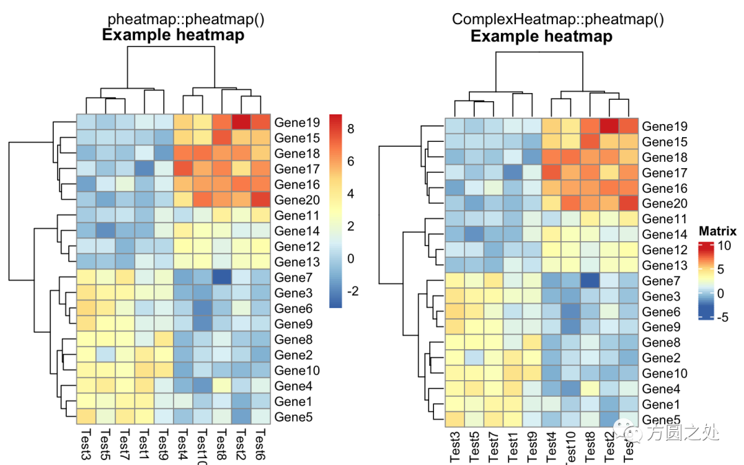
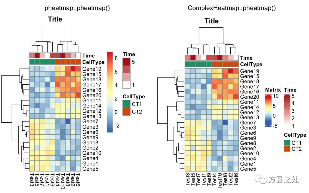
热图的标题:
compare_pheatmap(test,
    cellwidth = 15,
    cellheight = 12,
    main = "Example heatmap")
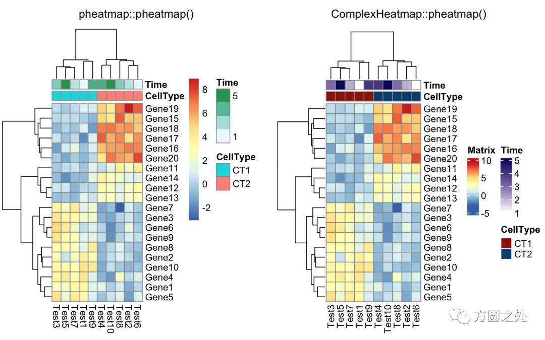
添加列的annotation:
annotation_col = data.frame(
    CellType = factor(rep(c("CT1", "CT2"), 5)),
    Time = 1:5
)
rownames(annotation_col) = paste("Test", 1:10, sep = "")

annotation_row = data.frame(
    GeneClass = factor(rep(c("Path1", "Path2", "Path3"), c(10, 4, 6)))
)
rownames(annotation_row) = paste("Gene", 1:20, sep = "")

compare_pheatmap(test,
    annotation_col = annotation_col)
不绘制annotation的legend:
compare_pheatmap(test,
    annotation_col = annotation_col,
    annotation_legend = FALSE)
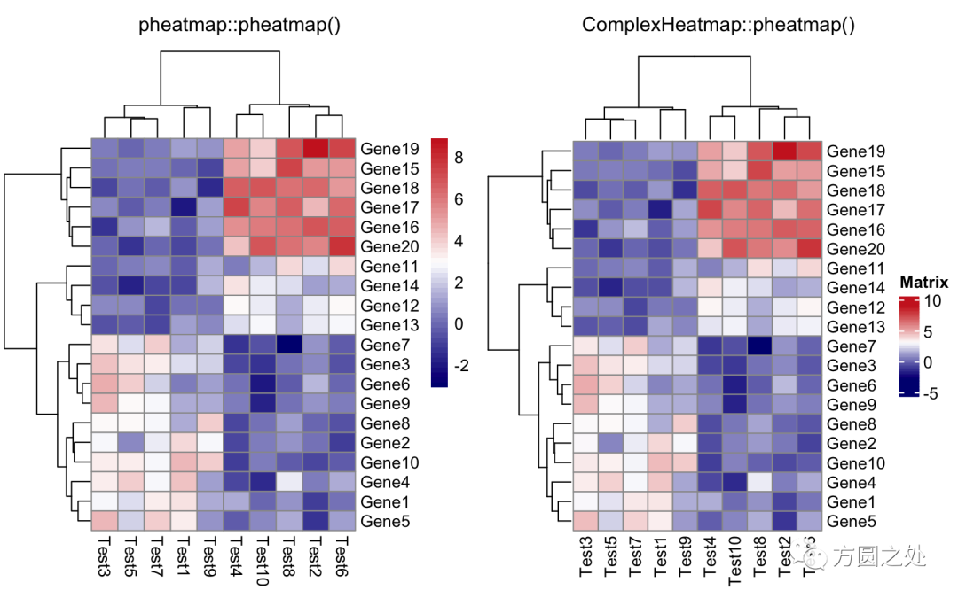
同时添加行和列的annotation:
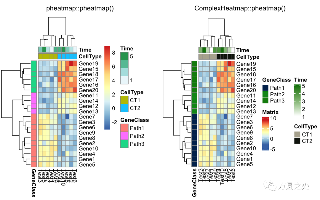
compare_pheatmap(test,
    annotation_col = annotation_col,
    annotation_row = annotation_row)
调整列名的旋转:
compare_pheatmap(test,
    annotation_col = annotation_col,
    annotation_row = annotation_row,
    angle_col = "45")
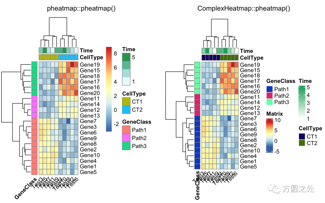
调整列名的旋转至水平方向:
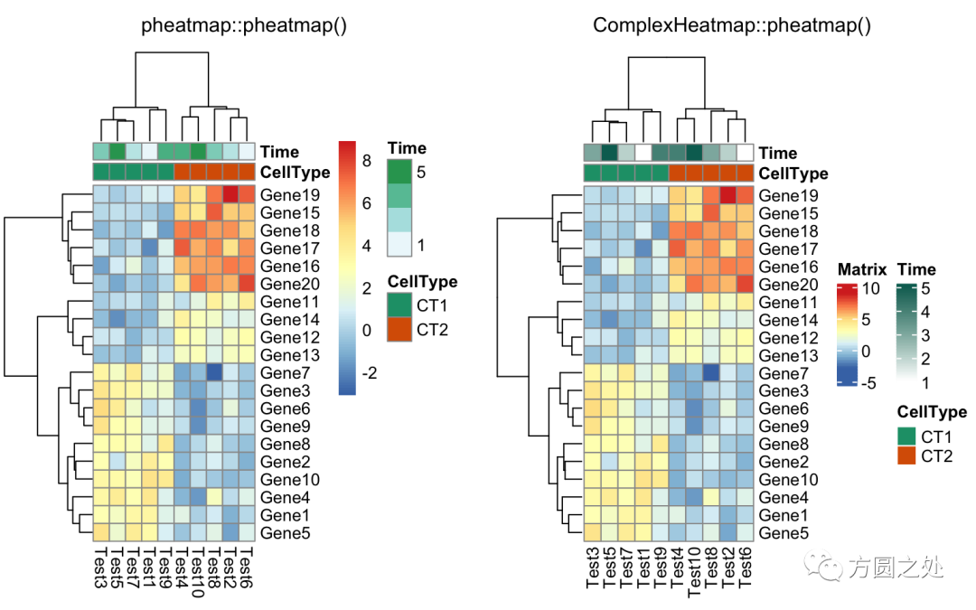
compare_pheatmap(test,
    annotation_col = annotation_col,
    angle_col = "0")
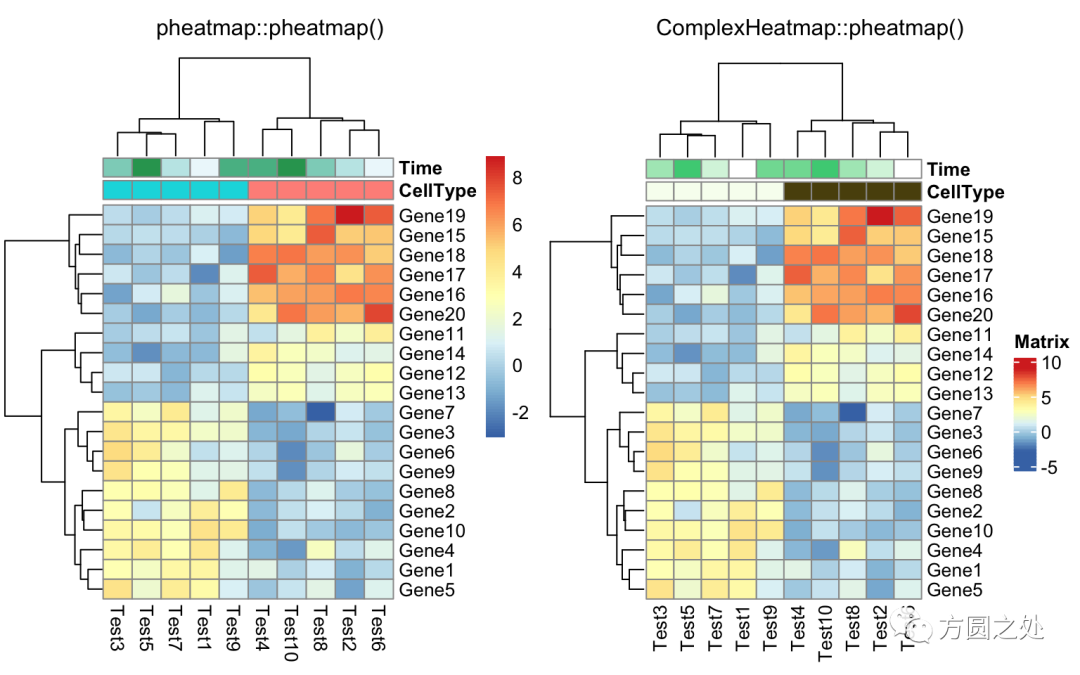
控制annotation的颜色:
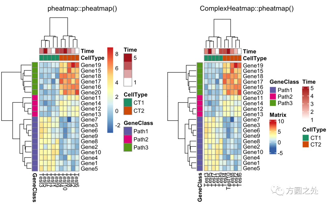
ann_colors = list(
    Time = c("white", "firebrick"),
    CellType = c(CT1 = "#1B9E77", CT2 = "#D95F02"),
    GeneClass = c(Path1 = "#7570B3", Path2 = "#E7298A", Path3 = "#66A61E")
)

compare_pheatmap(test,
    annotation_col = annotation_col,
    annotation_colors = ann_colors,
    main = "Title")
同时控制行和列annotation的颜色:
compare_pheatmap(test,
    annotation_col = annotation_col,
   annotation_row = annotation_row,
    annotation_colors = ann_colors)
只提供部分annotation的颜色,未提供颜色的annotation使用随机颜色:
compare_pheatmap(test,
    annotation_col = annotation_col,
    annotation_colors = ann_colors[2])
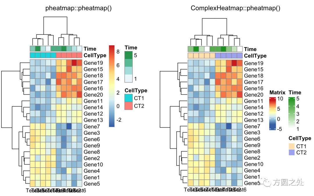
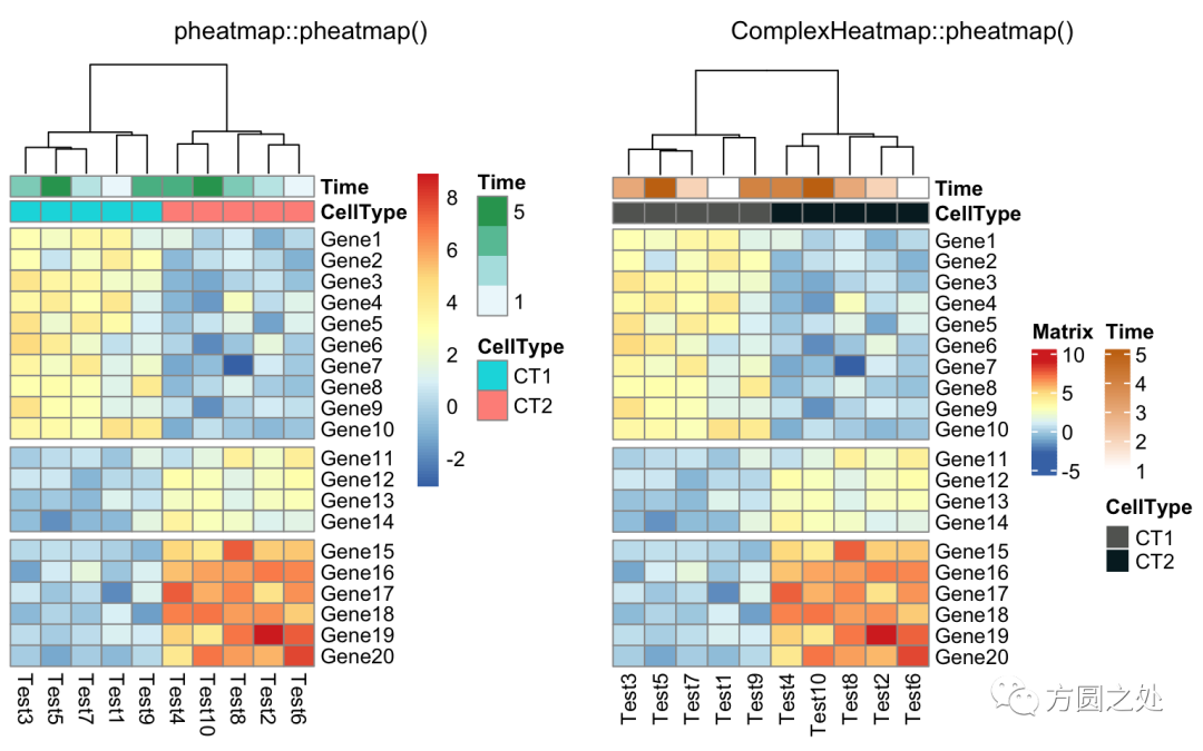
将热图分为两部分,我建议直接使用Heatmap()中的row_split或者row_km参数。
compare_pheatmap(test,
    annotation_col = annotation_col,
    cluster_rows = FALSE,
    gaps_row = c(10, 14))
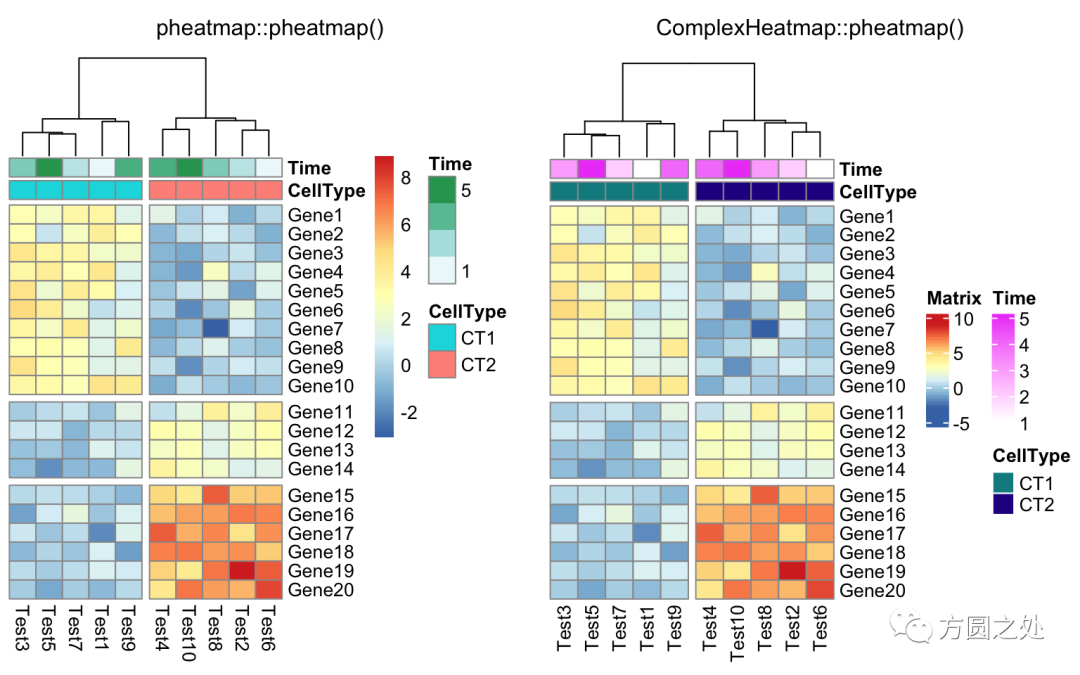
使用cutree()对列的dendrogram切分:
compare_pheatmap(test,
    annotation_col = annotation_col,
    cluster_rows = FALSE,
    gaps_row = c(10, 14),
    cutree_col = 2)
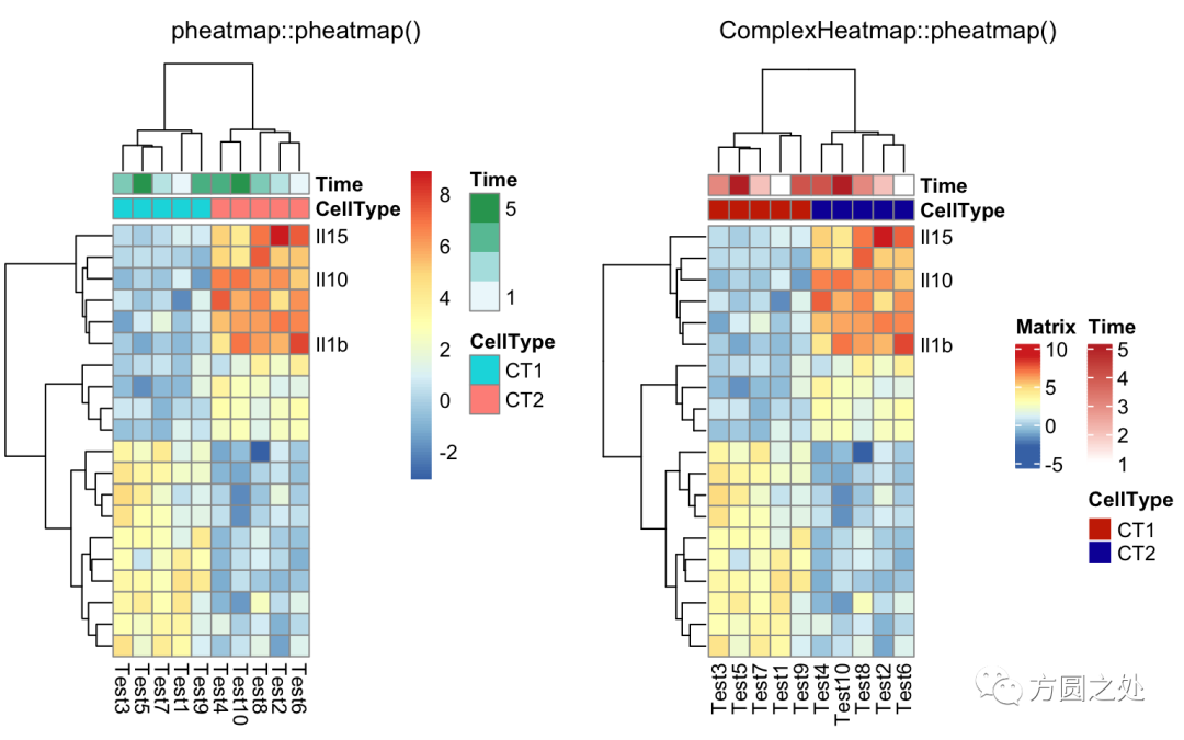
自定义行名:
labels_row = c("", "", "", "", "", "",
    "", "", "", "", "", "", "", "", "",
    "", "", "Il10", "Il15", "Il1b")
compare_pheatmap(test,
    annotation_col = annotation_col,
    labels_row = labels_row)
自定义聚类的距离:
drows = dist(test, method = "minkowski")
dcols = dist(t(test), method = "minkowski")
compare_pheatmap(test,
    clustering_distance_rows = drows,
    clustering_distance_cols = dcols)
对聚类的回调处理:
library(dendsort)
callback = function(hc, ...){dendsort(hc)}
compare_pheatmap(test,
    clustering_callback = callback)