

下载完原始数据,比对以及构建DESeqDataSet对象等一系列使用前准备完成后,我们便可以使用DESeq2进行后续的差异表达分析了。由于DESeq2的原理和内部的处理方法非常复杂,因此本文暂时不涉及原理的解释,后续可能会专门出一期来详解DESeq2的算法原理,感兴趣的同学也可以参考文献:Moderated estimation of fold change and dispersion for RNA-seq data with DESeq2。
首先导入Salmon比对后的数据,构建DESeqDataSet对象,代码参考DESeq2使用前准备。
############################################
## Project: DESeq2 learining
## Script Purpose: learn DESeq2
## Data: 2021.01.08
## Author: Yiming Sun
############################################
#sleep
ii <- 1
while(1){
  cat(paste("round",ii),sep = "n")
  ii <- ii 1
  Sys.sleep(30)
}
#work dir
setwd('/lustre/user/liclab/sunym/R/rstudio/deseq2/')
#load R package
.libPaths('/lustre/user/liclab/sunym/R/rstudio/Rlib/')
library(DESeq2)
library(airway)
library(tximeta)
library(GEOquery)
library(GenomicFeatures)
library(BiocParallel)
library(GenomicAlignments)
library(vsn)
library(dplyr)
library(ggplot2)
library(RColorBrewer)
library(pheatmap)
library(PoiClaClu)
library(glmpca)
library(ggbeeswarm)
library(apeglm)
library(Rmisc)
library(genefilter)
library(AnnotationDbi)
library(org.Hs.eg.db)
library(Gviz)
library(sva)
library(RUVSeq)
library(fission)
#load data
#-----------Transcript quantification by Salmon-----------------#
#metadata
dir <- system.file("extdata", package="airway", mustWork=TRUE)
csvfile <- file.path(dir, "sample_table.csv")
coldata <- read.csv(csvfile, row.names=1, stringsAsFactors=FALSE)
coldata$names <- coldata$Run
dir <- getwd()
dir <- paste(dir,'airway_salmon',sep = '/')
coldata$files <- file.path(dir,coldata$Run,'quant.sf')
file.exists(coldata$files)
#create SummarizedExperiment dataset
makeLinkedTxome(indexDir='/lustre/user/liclab/sunym/R/rstudio/deseq2/Salmon_index/gencode.v35_salmon_0.14.1/', source="GENCODE", organism="Homo sapiens",
                release="35", genome="GRCh38", fasta='/lustre/user/liclab/sunym/R/rstudio/deseq2/transcript/gencode.v35.transcripts.fa', gtf='/lustre/user/liclab/sunym/R/rstudio/deseq2/annotation_gencode/gencode.v35.annotation.gtf', write=FALSE)
se <- tximeta(coldata)
#explore se
dim(se)
head(rownames(se))
gse <- summarizeToGene(se)
dim(gse)
head(rownames(gse))
#DESeqDataSet
#start from SummarizedExperiment set
round( colSums(assay(gse))/1e6, 1 )
colData(gse)
gse$dex
dds <- DESeqDataSet(gse, design = ~ cell   dex)
dds$dex
dds$dex <- factor(dds$dex,levels = c('untrt','trt'))
dds$dex
探索性分析与可视化
在控制细胞类型的前提下,我们探究dex的处理对细胞转录组的影响。一方面,我们可以从降维的可视化图上,查看不同样本之间的聚类情况;另一方面我们也可以通过差异表达分析来探究药物的处理对哪些基因产生了影响。由于DESeq2使用负二项分布来对细胞的转录组进行建模,因此对于差异表达分析的部分,我们需要使用原始的counts矩阵;对于PCA等降维可视化的方法,由于存在高表达基因主导差异来源的情况,因此我们需要对表达矩阵进行适度的筛选和标准化,从而尽可能使得表达矩阵满足同方差性。
筛选表达矩阵
由于RNA-seq的表达矩阵中存在非常多的零,因此将这些完全没有检测到的基因预先筛选掉能够大大加速我们的计算,当然我们也可以选择其他标准进行筛选。这里,我们筛选掉在所有样本中基因表达小于等于1的基因。
> #1.Exploratory analysis and visualization
> head(assay(dds))
                   SRR1039508 SRR1039509 SRR1039512 SRR1039513 SRR1039516 SRR1039517 SRR1039520
ENSG00000000003.15        706        462        895        423       1183       1085        801
ENSG00000000005.6           0          0          0          0          0          0          0
ENSG00000000419.13        455        510        604        352        583        774        410
ENSG00000000457.14        310        268        360        222        358        428        298
ENSG00000000460.17         88         74         51         45        105         99         96
ENSG00000000938.13          0          0          2          0          1          0          0
                   SRR1039521
ENSG00000000003.15        597
ENSG00000000005.6           0
ENSG00000000419.13        499
ENSG00000000457.14        287
ENSG00000000460.17         84
ENSG00000000938.13          0
> #1.1 Pre-filtering the dataset
> #the minimal filter(the features that express)
> nrow(dds)
[1] 60237
> keep <- rownames(dds)[rowSums(counts(dds)) > 1]
> length(keep)
[1] 32920
> dds <- dds[keep,]
> nrow(dds)
[1] 32920
>
标准化
从直觉上来说,一个基因的表达量越高,则它的方差就容易越大。假设基因表达服从泊松分布,则显然其表达量的均值和方差均为lambda,均值越大方差也越大。
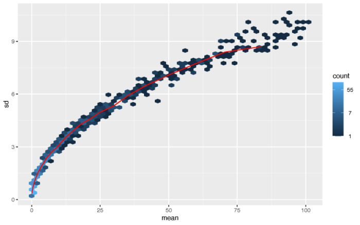
#1.2 The variance stabilizing transformation and the rlog
#varience increase along with mean(exampled by poisson distribution)
lambda <- 10^seq(from = -1, to = 2, length = 1000)
cts <- matrix(rpois(1000*200, lambda), ncol = 200)
pdf(file = './res/possion_mean_variance.pdf',width = 8,height = 5)
meanSdPlot(cts, ranks = FALSE)
dev.off()
最简单的标准化方法便是取对数。
#poisson processed by log
log.cts.one <- log2(cts   1)
pdf(file = './res/poisson_log_mean_variance.pdf',width = 8,height = 5)
meanSdPlot(log.cts.one, ranks = FALSE)
dev.off()
#conclusion:the simple log transform will increase the noise of the data close to 0
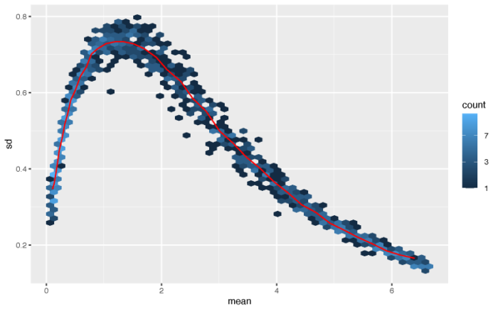
虽然高表达量的基因的方差被成功压制,但一部分表达量接近0的基因的方差则不能很好地进行矫正。作者这里提供了两种更为复杂和成熟的算法来对表达矩阵进行标准化,分别是vst和rlog。vst方法在计算上更快,并且对于高表达量的outlier更加不敏感;rlog对于小数据集(n < 30)的效果更好,对于测序深度差异广泛的一组数据的表现也会更好。因此作者建议,大中型的数据集可以选择vst,小型数据可以选择rlog,当然我们可以都做一下,然后选择最优的一种。
> #solution:vst and rlog
> #vst
> vsd <- vst(dds, blind = FALSE)
using 'avgTxLength' from assays(dds), correcting for library size
> head(assay(vsd), 3)
                   SRR1039508 SRR1039509 SRR1039512 SRR1039513 SRR1039516 SRR1039517 SRR1039520
ENSG00000000003.15  10.171389   9.696483  10.155402   9.858628  10.341690  10.174484  10.343805
ENSG00000000419.13   9.631483   9.871469   9.742678   9.736292   9.700797   9.813558   9.619015
ENSG00000000457.14   9.378150   9.226881   9.282191   9.373374   9.194730   9.314305   9.410820
                   SRR1039521
ENSG00000000003.15   9.892914
ENSG00000000419.13   9.787441
ENSG00000000457.14   9.398507
> colData(vsd)
DataFrame with 8 rows and 10 columns
            SampleName     cell      dex       albut         Run avgLength  Experiment      Sample

SRR1039508  GSM1275862   N61311    untrt       untrt  SRR1039508       126   SRX384345   SRS508568
SRR1039509  GSM1275863   N61311      trt       untrt  SRR1039509       126   SRX384346   SRS508567
SRR1039512  GSM1275866  N052611    untrt       untrt  SRR1039512       126   SRX384349   SRS508571
SRR1039513  GSM1275867  N052611      trt       untrt  SRR1039513        87   SRX384350   SRS508572
SRR1039516  GSM1275870  N080611    untrt       untrt  SRR1039516       120   SRX384353   SRS508575
SRR1039517  GSM1275871  N080611      trt       untrt  SRR1039517       126   SRX384354   SRS508576
SRR1039520  GSM1275874  N061011    untrt       untrt  SRR1039520       101   SRX384357   SRS508579
SRR1039521  GSM1275875  N061011      trt       untrt  SRR1039521        98   SRX384358   SRS508580
              BioSample       names

SRR1039508 SAMN02422669  SRR1039508
SRR1039509 SAMN02422675  SRR1039509
SRR1039512 SAMN02422678  SRR1039512
SRR1039513 SAMN02422670  SRR1039513
SRR1039516 SAMN02422682  SRR1039516
SRR1039517 SAMN02422673  SRR1039517
SRR1039520 SAMN02422683  SRR1039520
SRR1039521 SAMN02422677  SRR1039521
> #rlog
> rld <- rlog(dds, blind = FALSE)
using 'avgTxLength' from assays(dds), correcting for library size
> head(assay(rld), 3)
                   SRR1039508 SRR1039509 SRR1039512 SRR1039513 SRR1039516 SRR1039517 SRR1039520
ENSG00000000003.15   9.613929   9.047835   9.596064   9.249122   9.805339   9.618000   9.806436
ENSG00000000419.13   8.863465   9.154978   9.000860   8.993053   8.949360   9.086998   8.848148
ENSG00000000457.14   8.354403   8.153928   8.228018   8.347470   8.108486   8.270879   8.396243
                   SRR1039521
ENSG00000000003.15   9.288931
ENSG00000000419.13   9.055059
ENSG00000000457.14   8.380384
>
在上面的计算中,我们设置blind = FALSE,表示我们认为在design formula中的变量(细胞系与dex处理)并不会改变预期的表达量均值-方差趋势。默认情况下,DESeq2采取无监督的标准化转化,即blind = TRUE。下面我们展示经过测序深度矫正的取对数方法与vst和rlog的效果之间的差异。下图x轴与y轴分别对应经过变换后的两个样本的不同基因的表达强度,vst和rlog会默认矫正测序深度的效应,因此不需要特别指定normalized = TRUE。
#compare log transform with vst and rlog
dds <- estimateSizeFactors(dds)
df <- bind_rows(
  as_data_frame(log2(counts(dds, normalized=TRUE)[, 1:2] 1)) %>% mutate(transformation = "log2(x   1)"),
  as_data_frame(assay(vsd)[, 1:2]) %>% mutate(transformation = "vst"),
  as_data_frame(assay(rld)[, 1:2]) %>% mutate(transformation = "rlog"))
colnames(df)[1:2] <- c("x", "y")
lvls <- c("log2(x   1)", "vst", "rlog")
df$transformation <- factor(df$transformation, levels=lvls)
pdf(file = './res/compare_log_vst_rlog.pdf',width = 12,height = 6)
ggplot(df, aes(x = x, y = y))   geom_hex(bins = 80)
  coord_fixed()   facet_grid( . ~ transformation)
dev.off()
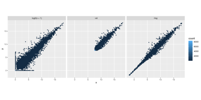
散点偏离对角线y = x的距离,则会贡献PCA的差异,可以看到rlog无论是在基因表达量的范围上,还是基因表达量方差的缩放上,都要一定程度优于另外两种算法,而vst则会一定程度上将低表达基因的表达量放大。取对数的方法虽然简单,但在低表达量的基因中的表现并不好,并不能很好地压制这部分基因的方差。
样本空间距离
我们可以计算样本在基因的高维空间中的欧式距离,从而比较不同细胞之间的整体相似性,从而一定程度上验证我们对于design formula的假设。需要注意的是dist函数要求每一行为一个不同的样本,每一列为不同的纬度。这里我们选择使用vst标准化后的表达矩阵。
#1.3 Sample distances
#Euclidean distance
sampleDists <- dist(t(assay(vsd)))
sampleDists
sampleDistMatrix <- as.matrix( sampleDists )
rownames(sampleDistMatrix) <- paste( vsd$dex, vsd$cell, sep = " - " )
colnames(sampleDistMatrix) <- NULL
colors <- colorRampPalette( rev(brewer.pal(9, "Blues")) )(255)
pdf(file = './res/sample_distance.pdf',width = 8,height = 6.5)
pheatmap(sampleDistMatrix,
         clustering_distance_rows = sampleDists,
         clustering_distance_cols = sampleDists,
         col = colors,
         main = 'sample euclidean distance')
dev.off()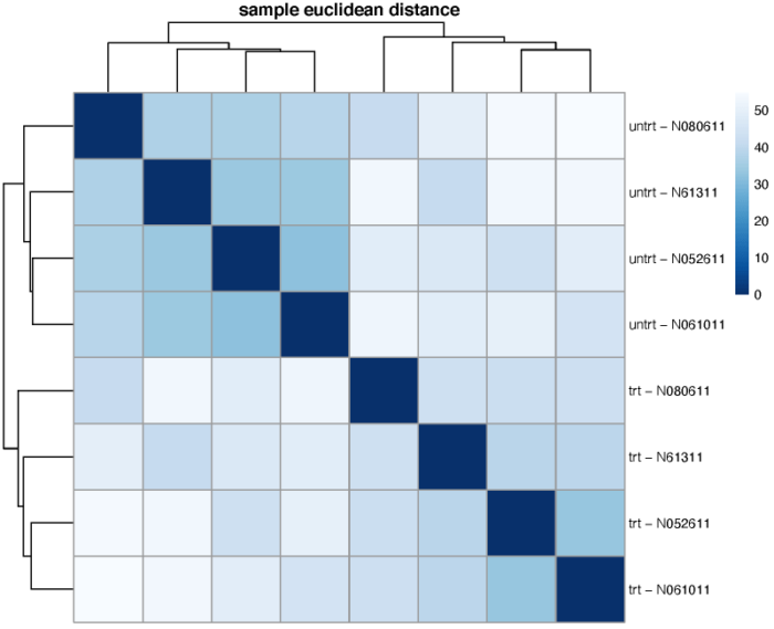
可以看到,不同的处理更倾向于聚在一起,即处理带来的差异大于细胞系之间的差异。当然,在不同的处理组中,我们也可以观察到,不同细胞系之间的相似关系也是类似的。另外,我们也可以使用泊松距离来度量样本间的差异程度,需要注意的是泊松距离的计算需要使用原始的表达矩阵。
#Poisson Distance
poisd <- PoissonDistance(t(counts(dds)))
samplePoisDistMatrix <- as.matrix( poisd$dd )
rownames(samplePoisDistMatrix) <- paste( dds$dex, dds$cell, sep=" - " )
colnames(samplePoisDistMatrix) <- NULL
pdf(file = './res/sample_poisson_distance.pdf',width = 8,height = 6.5)
pheatmap(samplePoisDistMatrix,
         clustering_distance_rows = poisd$dd,
         clustering_distance_cols = poisd$dd,
         col = colors,
         main = 'sample poisson distance')
dev.off()

结果同样是类似的。
PCA主成分分析
PCA是最常见的bulk数据降维聚类方法了,其中PC1解释了样本之间最大的差异,PC2则解释了样本之间次大的差异。PCA通常使用标准化过后的表达矩阵。
#1.4 PCA
#plot by func build in DESeq2
pdf(file = './res/PCA.pdf',width = 8,height = 4)
plotPCA(vsd, intgroup = c("dex", "cell"))
dev.off()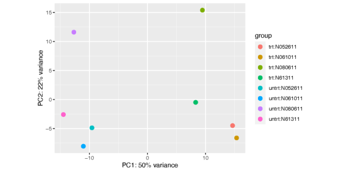
这个图不是特别美观和清楚,我们可以使用ggplot自己手动画一个。
#plot by ggplot2
pcaData <- plotPCA(vsd, intgroup = c( "dex", "cell"), returnData = TRUE)
pcaData
percentVar <- round(100 * attr(pcaData, "percentVar"))
percentVar
pdf(file = './res/PCA_by_ggplot.pdf',width = 8,height = 4)
ggplot(pcaData, aes(x = PC1, y = PC2, color = dex, shape = cell))
  geom_point(size =3)
  xlab(paste0("PC1: ", percentVar[1], "% variance"))
  ylab(paste0("PC2: ", percentVar[2], "% variance"))
  coord_fixed()
  ggtitle("PCA with VST data")
dev.off()
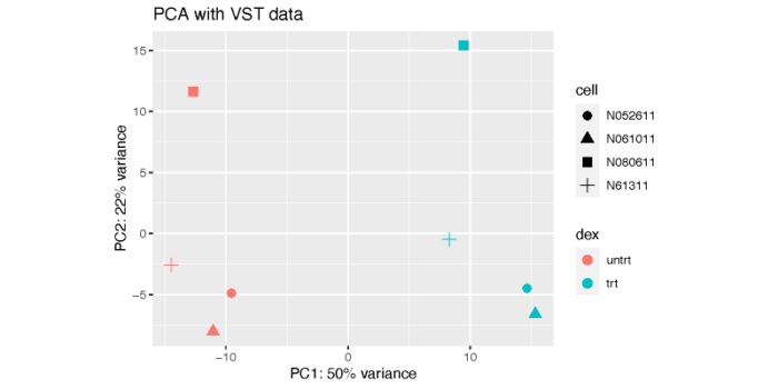
从图上可以看到,PC1解释了dex处理之间的差异,而PC2则解释了细胞系之间的差异。显然,细胞系之间的差异虽然小于dex处理所带来的差异,但依然是非常可观的。这也体现出了我们做配对比较的必要性,也就是在控制细胞系的条件下对dex处理和未处理进行比较,这在我们的design formula中已经设置好了。
广义PCA
对于非正态分布的数据,我们可以使用广义PCA(generalized PCA)进行降维可视化。广义PCA通常使用原始的表达矩阵进行计算。
#1.5 PCA plot using Generalized PCA
gpca <- glmpca(counts(dds), L=2)
gpca.dat <- gpca$factors
gpca.dat$dex <- dds$dex
gpca.dat$cell <- dds$cell
pdf(file = './res/glmpca.pdf',width = 8,height = 4)
ggplot(gpca.dat, aes(x = dim1, y = dim2, color = dex, shape = cell))
  geom_point(size =3)   coord_fixed()   ggtitle("glmpca - Generalized PCA")
dev.off()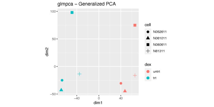
多维缩放
多维缩放的简单想法是将高维空间中的距离关系,尽可能保持不变地映射到低维空间。这在我们没有样本的表达矩阵,而只存在样本之间的相互距离的时候非常有用。这里,我们使用标准化后的表达矩阵所计算出的样本之间的相互距离。
#1.6 MDS plot
#MDS plot using vst data
mds <- as.data.frame(colData(vsd)) %>% cbind(cmdscale(sampleDistMatrix))
pdf(file = './res/MDS_VST_plot.pdf',width = 8,height = 4)
ggplot(mds, aes(x = `1`, y = `2`, color = dex, shape = cell))
  geom_point(size = 3)   coord_fixed()   ggtitle("MDS with VST data")
dev.off()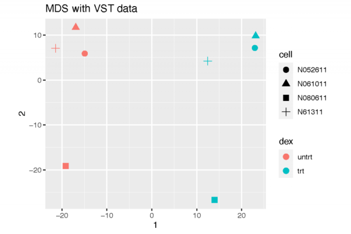
当然,我们也可以使用利用原始表达矩阵所计算出的泊松距离。
#MDS plot using poisson distance
mdsPois <- as.data.frame(colData(dds)) %>% cbind(cmdscale(samplePoisDistMatrix))
pdf(file = './res/MDS_Possion_plot.pdf',width = 8,height = 4)
ggplot(mdsPois, aes(x = `1`, y = `2`, color = dex, shape = cell))
  geom_point(size = 3)   coord_fixed()   ggtitle("MDS with PoissonDistances")
dev.off()
差异表达分析
除了从降维可视化的层面上对不同的样本进行相似性的分析,我们也可以利用原始的表达矩阵,计算不同样本之间的差异。在比较不同的组之前,我们需要先估计数据集的大小因子,从而来矫正测序深度带来的批次效应;另外,我们还需要估计各个基因在不同样本间表达的离散度;最后我们根据design formula,使用广义线性模型来拟合和建模矫正过后的表达矩阵。上述的三个步骤都可以使用DESeq函数轻松搞定,并将拟合的参数返回DESeqDataSet对象,我们只需要提取出这些结果就可以进行后续的比较了。
> #--------------------------------------------------------#
> #--------------------------------------------------------#
> #2.Differential expression analysis
> #2.1 Running the differential expression pipeline
> dds <- DESeq(dds)
using pre-existing normalization factors
estimating dispersions
gene-wise dispersion estimates
mean-dispersion relationship
final dispersion estimates
fitting model and testing
构建结果表格
我们可以直接用results函数提取出差异表达的计算结果,如果有多种比较方式,则results默认返回第一种比较的差异表达结果。如果p value出现NA,则说明该基因的表达量全部为0,不适用于任何检验方法,或者出现非常极端的outlier。大家感兴趣的话,可以进一步去研究一下DESeq2筛选outlier的方法,这里不对原理做具体的阐述。
> #2.2 Building the results table
> res <- results(dds)
> res
log2 fold change (MLE): dex trt vs untrt
Wald test p-value: dex trt vs untrt
DataFrame with 32920 rows and 6 columns
                            baseMean     log2FoldChange             lfcSE               stat

ENSG00000000003.15  742.027385348416 -0.501576985024735 0.129105068551828  -3.88502938460067
ENSG00000000419.13  511.733294147504  0.204616852714061 0.128576587230486   1.59140055838678
ENSG00000000457.14   312.29261469575 0.0251067981341494 0.159146442445286  0.157759091239385
ENSG00000000460.17  79.3907526709186 -0.111406959051003 0.319164050388844 -0.349058607682394
ENSG00000000938.13 0.307079546955295  -1.36851064387886  3.50376299451696 -0.390583109080277
...                              ...                ...               ...                ...
ENSG00000288636.1   3.34150352168806  -3.33576637787421  1.57307985327023  -2.12053213378811
ENSG00000288637.1   14.0035268554639 -0.427472592993911 0.611570416082812  -0.69897526393106
ENSG00000288640.1    25.576775477853  0.224597114398936 0.443043875359963  0.506941020720478
ENSG00000288642.1   2.70286053446089  -1.59495281968392  2.20717217902031 -0.722622745449729
ENSG00000288644.1  0.923439930859957  -1.05728198235034  3.42054519810226 -0.309097503794697
                                 pvalue                 padj

ENSG00000000003.15 0.000102317512305595 0.000973479685222727
ENSG00000000419.13    0.111519458749328    0.294711851453744
ENSG00000000457.14    0.874646635361525     0.95097361100203
ENSG00000000460.17    0.727045310707714    0.879978596275505
ENSG00000000938.13    0.696105412837306                   NA
...                                 ...                  ...
ENSG00000288636.1    0.0339611945802605                   NA
ENSG00000288637.1     0.484567489650358    0.720059819063478
ENSG00000288640.1     0.612196202195972    0.808631021762538
ENSG00000288642.1     0.469911690167384                   NA
ENSG00000288644.1     0.757247357961551                   NA
当然,我们也可以指定比较的方式。
> resultsNames(dds)
[1] "Intercept"               "cell_N061011_vs_N052611" "cell_N080611_vs_N052611"
[4] "cell_N61311_vs_N052611"  "dex_trt_vs_untrt"
> res <- results(dds, contrast=c("dex","trt","untrt"))
> mcols(res, use.names = TRUE)
DataFrame with 6 rows and 2 columns
                       type                               description

baseMean       intermediate mean of normalized counts for all samples
log2FoldChange      results  log2 fold change (MLE): dex trt vs untrt
lfcSE               results          standard error: dex trt vs untrt
stat                results          Wald statistic: dex trt vs untrt
pvalue              results       Wald test p-value: dex trt vs untrt
padj                results                      BH adjusted p-values
> summary(res)

out of 32920 with nonzero total read count
adjusted p-value < 0.1
LFC > 0 (up)       : 2401, 7.3%
LFC < 0 (down)     : 1972, 6%
outliers [1]       : 0, 0%
low counts [2]     : 15956, 48%
(mean count < 9)
[1] see 'cooksCutoff' argument of ?results
[2] see 'independentFiltering' argument of ?results

>
看到,总共有4种比较方式,这里我们依然设置dex的实验组和对照组之间的差异表达。summary函数可以返回按照我们设置的阈值标准通过的差异表达基因的数量。baseMean表示各个基因在不同样本间的标准化后的表达矩阵的平均值;log2FoldChange则是我们比较关心的差异表达的强度变化;当然,这种表达强度的变化并不是在每个(细胞类型)组的比较都是一致的,因此我们用标准差来描述这种差异的变异情况,也就是lfcSE。当然还有wald检验后得到的p value以及使用BH矫正后的p value都可以用来描述这种表达强度变化的不确定性。
当然我们也可以改变差异表达的阈值来改变最终通过差异表达的基因的数量。下面的代码分别通过的卡假阳性率(padj)以及卡差异表达强度的变化(lfc)的方法,对差异表达基因进行了进一步的筛选。
> #decrease the false discovery rate (FDR)
> res.05 <- results(dds, alpha = 0.05)
> summary(res.05)

out of 32920 with nonzero total read count
adjusted p-value < 0.05
LFC > 0 (up)       : 2015, 6.1%
LFC < 0 (down)     : 1603, 4.9%
outliers [1]       : 0, 0%
low counts [2]     : 16594, 50%
(mean count < 11)
[1] see 'cooksCutoff' argument of ?results
[2] see 'independentFiltering' argument of ?results

> table(res.05$padj < 0.05)

FALSE  TRUE
12708  3618
> #raise the fold change
> resLFC1 <- results(dds, lfcThreshold=1)
> summary(resLFC1)

out of 32920 with nonzero total read count
adjusted p-value < 0.1
LFC > 1.00 (up)    : 143, 0.43%
LFC < -1.00 (down) : 76, 0.23%
outliers [1]       : 0, 0%
low counts [2]     : 13403, 41%
(mean count < 5)
[1] see 'cooksCutoff' argument of ?results
[2] see 'independentFiltering' argument of ?results

> table(resLFC1$padj < 0.1)

FALSE  TRUE
19298   219
>
其他比较
当然我们也可以使用results函数中的contrast参数和name参数进行各种我们想要的比较。
> #2.3 Other comparisons
> results(dds, contrast = c("cell", "N061011", "N61311"))
log2 fold change (MLE): cell N061011 vs N61311
Wald test p-value: cell N061011 vs N61311
DataFrame with 32920 rows and 6 columns
                            baseMean      log2FoldChange             lfcSE                stat

ENSG00000000003.15  742.027385348416   0.268736206423564  0.18342134708472    1.46513048069284
ENSG00000000419.13  511.733294147504 -0.0769346903889134  0.18269336402621  -0.421113765127649
ENSG00000000457.14   312.29261469575   0.183307224602225 0.225831447498455   0.811699285607592
ENSG00000000460.17  79.3907526709186   -0.15753454183667 0.447319749296685   -0.35217434974503
ENSG00000000938.13 0.307079546955295                   0   4.9975798104491                   0
...                              ...                 ...               ...                 ...
ENSG00000288636.1   3.34150352168806   0.512761341689826   2.2443030878119   0.228472412872607
ENSG00000288637.1   14.0035268554639    1.62456410843762 0.884427160806683    1.83685461101834
ENSG00000288640.1    25.576775477853 -0.0272704904165941 0.632018225775059 -0.0431482658322893
ENSG00000288642.1   2.70286053446089   -3.46055682956256   3.1930099143229   -1.08379144519393
ENSG00000288644.1  0.923439930859957     2.0935591646235  4.93399742969465    0.42431298241537
                               pvalue              padj

ENSG00000000003.15  0.142885322019071 0.517056988815031
ENSG00000000419.13  0.673672010481914 0.923753118447307
ENSG00000000457.14  0.416964204379591 0.814864516519577
ENSG00000000460.17  0.724707512192108 0.943151150723668
ENSG00000000938.13                  1                NA
...                               ...               ...
ENSG00000288636.1   0.819279000336978                NA
ENSG00000288637.1  0.0662313613909477 0.349822008801278
ENSG00000288640.1   0.965583344530636 0.992049518979949
ENSG00000288642.1   0.278457279130544                NA
ENSG00000288644.1     0.6713375724719                NA
>
多重检验
在高通量的测序数据中,我们通常尽可能避免直接使用p value,由于我们有大量的基因数,因此即使选择很小的p value,也有可能带来相当巨大的假阳性率。
> #2.4 Multiple testing
> #the false discovery rate due to multiple test
> sum(res$pvalue < 0.05, na.rm=TRUE)
[1] 5263
> sum(!is.na(res$pvalue))
[1] 32920
> #if p threshold = 0.05
> fdr = (0.05*sum(!is.na(res$pvalue)))/5263
> fdr
[1] 0.3127494
>
从上面的分析可以看到,p value小于0.05的基因数有5263个,全部的筛选后的基因有32920个。那么,假设我们的数据服从null假设,即处理前后没有变化,那么根据p value的定义,我们知道会有5%的基因被错误地分类为阳性结果,也就是假阳性的结果。我们可以看到这部分假阳性的结果占到所有阳性结果的31%,因此我们可以说:直接使用p value来作为判断的标准,难以控制阳性结果中的假阳性率。当然,在这方面我们也有非常多成熟的算法来对结果进行修正,最常见的就是BH矫正,矫正的结果一般称之为FDR或padj。一般来说,BH矫正的阈值直接决定了假阳性率的大小(in brief, this method calculates for each gene an adjusted p value that answers the following question: if one called significant all genes with an adjusted p value less than or equal to this gene’s adjusted p value threshold, what would be the fraction of false positives (the false discovery rate, FDR) among them)。
> #if false discovery fate = 0.1
> sum(res$padj < 0.1, na.rm=TRUE)
[1] 4373
> #get significant genes
> resSig <- subset(res, padj < 0.1)
> #strongest down-regulation
> head(resSig[order(resSig$log2FoldChange,decreasing = FALSE),])
log2 fold change (MLE): dex trt vs untrt
Wald test p-value: dex trt vs untrt
DataFrame with 6 rows and 6 columns
                           baseMean    log2FoldChange             lfcSE              stat

ENSG00000235174.1   11.559747104067 -7.72171774800333  3.38538757988485 -2.28089622407901
ENSG00000280852.2  16.4764928902195  -5.2675486636711  2.00031644174996 -2.63335767967933
ENSG00000257542.5  19.3345948420855 -5.00272789483913   2.0574374082432 -2.43153345749208
ENSG00000146006.8  55.5996261041168 -4.28395099706049 0.650053973930185 -6.59014661684166
ENSG00000108700.5  14.5099736013949 -4.08037596598935 0.939294244818382 -4.34408705099468
ENSG00000155897.10 22.9776308925677 -4.03144853094491 0.845023966288923 -4.77080969507854
                                 pvalue                 padj

ENSG00000235174.1    0.0225545884487648   0.0904387185320246
ENSG00000280852.2   0.00845452601041571   0.0415958756498527
ENSG00000257542.5    0.0150350596501083   0.0659567499106379
ENSG00000146006.8  4.39392443858689e-11 1.22596273316099e-09
ENSG00000108700.5  1.39856053242458e-05 0.000164872695427732
ENSG00000155897.10  1.8348683549146e-06 2.62894482878136e-05
> #strongest up-regulation
> head(resSig[order(resSig$log2FoldChange,decreasing = TRUE),])
log2 fold change (MLE): dex trt vs untrt
Wald test p-value: dex trt vs untrt
DataFrame with 6 rows and 6 columns
                           baseMean   log2FoldChange             lfcSE             stat

ENSG00000179593.16 67.1461478274207 9.50575055732586  1.07612899394557 8.83328170768219
ENSG00000224712.12 35.3836081465072 7.14509353707476  2.16130265497796 3.30591993704261
ENSG00000109906.14 1033.70021615222 6.66901385295929  0.39773436123582 16.7675074193682
ENSG00000250978.5  45.4578052875013 5.91313864050675 0.720209179506691 8.21030723956749
ENSG00000101342.10  39.217785350109 5.72927135957107  1.45533465210653 3.93673809063654
ENSG00000249364.6   14.460887352797 5.67220252036344  1.17631737724728  4.8220001081996
                                 pvalue                 padj

ENSG00000179593.16 1.01648597959634e-18 6.34131307724195e-17
ENSG00000224712.12 0.000946651328083399  0.00666444712676844
ENSG00000109906.14 4.21836791193269e-63 2.98168305241775e-60
ENSG00000250978.5  2.20623227036585e-16 1.12055461779899e-14
ENSG00000101342.10 8.25966685528947e-05 0.000803884042071891
ENSG00000249364.6  1.42125868688356e-06 2.08205806254687e-05
>
差异表达结果可视化
counts数变化
最简单的,我们可以展示某个差异表达基因在处理前后的counts数的变化。
#---------------------------------------------------#
#---------------------------------------------------#
#3.Plotting results
#3.1 Counts plot -- visualize the count of a particular gene
topGene <- rownames(res)[which.min(res$padj)]
pdf(file = './res/plotcounts_function.pdf',width = 8,height = 6)
plotCounts(dds, gene = topGene, intgroup=c("dex"))
dev.off()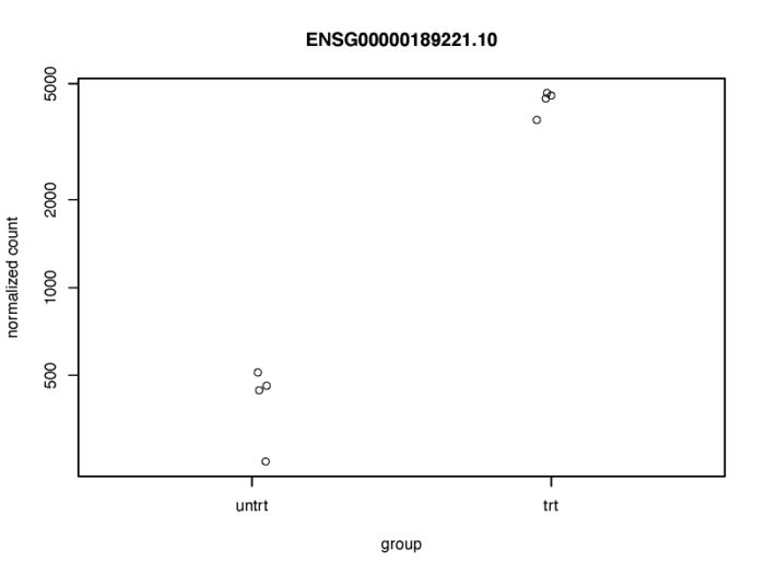
当然这个图不是特别好看,我们可以使用ggplot画个更好看的图。
# counts plot using ggplot2
geneCounts <- plotCounts(dds, gene = topGene, intgroup = c("dex","cell"),returnData = TRUE)
geneCounts
p1 <- ggplot(geneCounts, aes(x = dex, y = count, color = cell))   scale_y_log10()   geom_beeswarm(cex = 3)
p2 <- ggplot(geneCounts, aes(x = dex, y = count, color = cell, group = cell))   scale_y_log10()   geom_point(size = 3)   geom_line()
pdf(file = './res/count_plot_using_ggplot.pdf',width = 8,height = 6)
Rmisc::multiplot(p1,p2,cols = 1)
dev.off()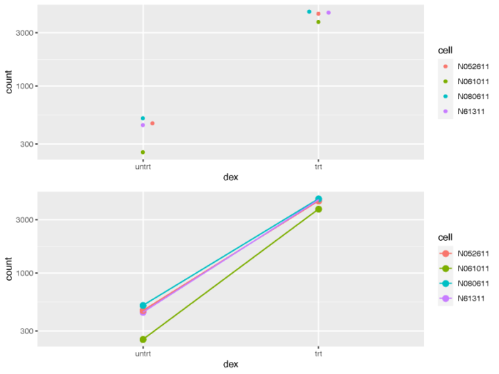
从处理前和处理后的不同细胞系的连线图来看,我们也可以清楚的意识到,不同的细胞系对于处理所表现出的影响并不是完全相同的,我们在做差异比较分析的时候应当牢牢记住这一点。
MA plot
MA图也能够帮助我们了解差异表达基因的分布情况。M代表minus,是取对数后表达量的差值,其实就是lfc,A表示average,是基因的平均表达量的分布。注意:plotMA函数在其他的包中也存在,有时会引起冲突出现错误,这时候不妨试一下指定函数的包来源。
# MA plot without shrink
res.noshr <- results(dds, name="dex_trt_vs_untrt")
pdf(file = './res/MA_plot_without_shrink.pdf',width = 8,height = 6)
plotMA(res.noshr, ylim = c(-5, 5))
dev.off()
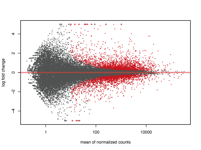
我们会发现,对于低表达量的基因,表达量的一些轻微变化就会引起lfc的巨大变化,但显然这种变化极有可能是噪声造成的,并没有明显的生物学意义,因此我们需要对lfc进行一定的缩放。在lfcShrink函数中内置了三种缩放的方法,一般可以直接采用广义线性模型的方法,他对于噪声的缩放以及真实生物学信号的还原有着非常好的效果。
#3.2 MA plot
resultsNames(dds)
res <- lfcShrink(dds, coef="dex_trt_vs_untrt", type="apeglm")
pdf(file = './res/MA_plot.pdf',width = 8,height = 6)
plotMA(res, ylim = c(-5, 5))
dev.off()
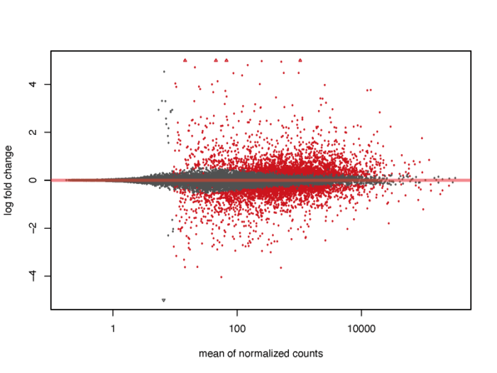
当然,我们也可以在图上标注出我们感兴趣的基因。
# show the gene we interested about on the MA plot
pdf(file = './res/MA_plot_with_gene.pdf',width = 8,height = 6)
plotMA(res, ylim = c(-5,5))
topGene <- rownames(res)[which.min(res$padj)]
with(res[topGene, ], {
  points(baseMean, log2FoldChange, col="dodgerblue", cex=2, lwd=2)
  text(baseMean, log2FoldChange, topGene, pos=2, col="dodgerblue")
})
dev.off()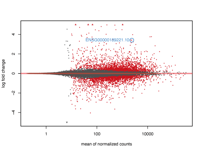
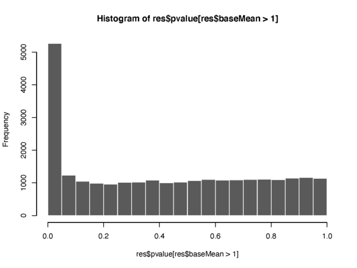
另外,p value的分布情况也值得我们的关注。
# histogram show the distribution of p value
pdf(file = './res/histogram_show_the_distribution_of_p_value.pdf',width = 8,height = 6)
hist(res$pvalue[res$baseMean > 1], breaks = (0:20)/20,col = "grey50", border = "white")
dev.off()
基因聚类
我们可以对一群高差异表达的基因进行聚类,观察他们在不同样本间的表达情况。
#3.3 gene cluster
topVarGenes <- head(order(rowVars(assay(vsd)), decreasing = TRUE), 20)
mat <- assay(vsd)[topVarGenes, ]
mat <- mat - rowMeans(mat)
anno <- as.data.frame(colData(vsd)[, c("cell","dex")])
pdf(file = './res/pheatmap_top_20_variable_gene.pdf',width = 8,height = 6)
pheatmap(mat, annotation_col = anno,scale = 'none')
dev.off()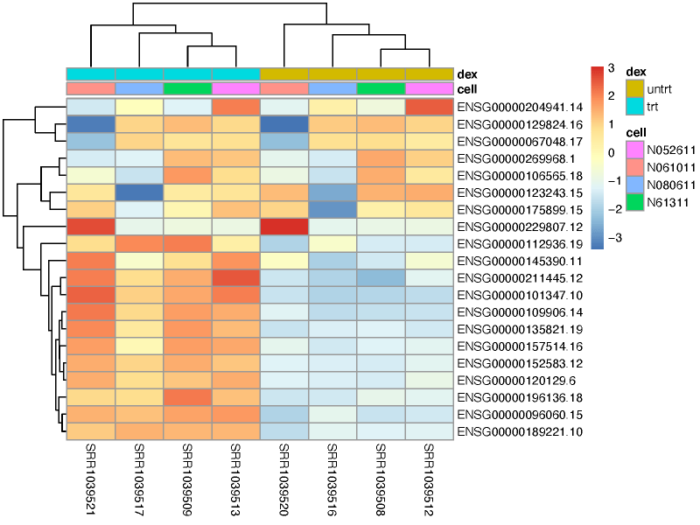
独立过滤
从之前的MA图我们便可以了解到,低表达量的基因由于混杂了大量的噪声,因此难以提供可靠的生物学信号,通常我们可以把这部分基因预先筛选掉,从而大大提高我们利用padj发现差异表达基因的能力。
#3.4 independent filtering
#filter the low counts gene to improve FDR
qs <- c(0, quantile(resLFC1$baseMean[resLFC1$baseMean > 0], 0:6/6))
bins <- cut(resLFC1$baseMean, qs)
levels(bins) <- paste0("~", round(signif((qs[-1]   qs[-length(qs)])/2, 2)))
fractionSig <- tapply(resLFC1$pvalue, bins, function(p){mean(p < .05, na.rm = TRUE)})
pdf(file = './res/proportion_of_small_p_value.pdf',width = 8,height = 6)
barplot(fractionSig, xlab = "mean normalized count",
        ylab = "fraction of small p values")
dev.off()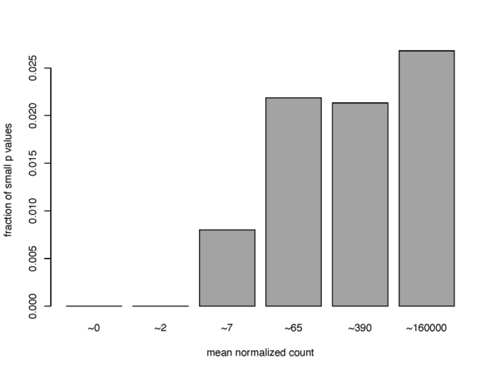
可以看到,对于低表达量的基因来说,满足高显著性(p value < 0.05)的基因的比例非常低,通常可以直接删去。在DESeq2中,results函数中的相关参数会默认执行独立过滤,从而得到尽可能多的,通过padj的基因数。
独立假设权重(Independent Hypothesis Weighting)
p值过滤的一个一般性想法是对假设的权重进行打分,从而优化检验的效力(纯翻译,我没看懂是啥意思,哭了)。我们可以使用IHW包来进行这项操作,感兴趣的同学可以参考这个包的说明文档以及相关的文献。
结果注释与导出
前面所有的结果,基因的名字都是用ensembl id来表示的,但我们通常更倾向于使用symbol来命名基因,因此我们需要做一个基因id的转换。在bioconductor上有非常多的生物注释包,我们可以直接利用这些包中存储的相关注释信息来对我们的结果进行相应的注释。
#---------------------------------------------------#
#---------------------------------------------------#
#4.Annotating and exporting results
#rename gene
columns(org.Hs.eg.db)
ens.str <- substr(rownames(res), 1, 15)
res$symbol <- mapIds(org.Hs.eg.db,
                     keys=ens.str,
                     column="SYMBOL",
                     keytype="ENSEMBL",
                     multiVals="first")
res$entrez <- mapIds(org.Hs.eg.db,
                     keys=ens.str,
                     column="ENTREZID",
                     keytype="ENSEMBL",
                     multiVals="first")
resOrdered <- res[order(res$pvalue),]
head(resOrdered)
这样,我们就成功为我们的结果表格增加了两个注释列。
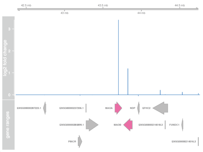
在基因组空间上展示表达强度变化
我们可以在基因组的track图上,展示出相应位置上的基因,以及这些基因的表达强度变化(lfc)。如果我们在DESeq2的准备工作中使用了tximeta函数来读取原始测序文件的比对结果并导入DESeq2,那我们的DESeqDataSet对象中则自动包含了每个基因所在的基因组位置信息(gene range),当然,我们也可以尝试进行手动的注释。下面直接使用lfcShrink函数,在对差异表达进行缩放的同时,加入基因组位置的信息。
> #4.1 Plotting fold changes in genomic space
> resGR <- lfcShrink(dds, coef="dex_trt_vs_untrt", type="apeglm", format="GRanges")
using 'apeglm' for LFC shrinkage. If used in published research, please cite:
    Zhu, A., Ibrahim, J.G., Love, M.I. (2018) Heavy-tailed prior distributions for
    sequence count data: removing the noise and preserving large differences.
    Bioinformatics. https://doi.org/10.1093/bioinformatics/bty895
> resGR
GRanges object with 32920 ranges and 5 metadata columns:
                     seqnames              ranges strand |          baseMean       log2FoldChange
                                      |
  ENSG00000000003.15     chrX 100627108-100639991      - |  742.027385348416   -0.462006977773251
  ENSG00000000419.13    chr20   50934867-50958555      - |  511.733294147504    0.175874104721422
  ENSG00000000457.14     chr1 169849631-169894267      - |   312.29261469575   0.0210504596782739
  ENSG00000000460.17     chr1 169662007-169854080        |  79.3907526709186  -0.0525107381932432
  ENSG00000000938.13     chr1   27612064-27635185      - | 0.307079546955295  -0.0115833528835126
                 ...      ...                 ...    ... .               ...                  ...
   ENSG00000288636.1     chr1   17005068-17011757      - |  3.34150352168806   -0.111244739220307
   ENSG00000288637.1     chr4 153152435-153415081        |  14.0035268554639  -0.0856302687213988
   ENSG00000288640.1     chr7 112450460-112490941        |   25.576775477853   0.0731990767853117
   ENSG00000288642.1     chrX 140783578-140784366      - |  2.70286053446089  -0.0231619748179045
   ENSG00000288644.1     chr1 203802094-203802192        | 0.923439930859957 -0.00513130945288652
                                 lfcSE               pvalue                 padj

  ENSG00000000003.15 0.129731785360462 0.000102317512305595 0.000973479685222727
  ENSG00000000419.13 0.122266659157736    0.111519458749328    0.294711851453744
  ENSG00000000457.14 0.141312325328858    0.874646635361525     0.95097361100203
  ENSG00000000460.17 0.223920772734305    0.727045310707714    0.879978596275505
  ENSG00000000938.13 0.304446602085739    0.696105412837306
                 ...               ...                  ...                  ...
   ENSG00000288636.1  0.33098831652559   0.0339611945802605
   ENSG00000288637.1 0.286103379083077    0.484567489650358    0.720059819063478
   ENSG00000288640.1 0.258699729044232    0.612196202195972    0.808631021762538
   ENSG00000288642.1  0.30456581058953    0.469911690167384
   ENSG00000288644.1 0.304189947166826    0.757247357961551
  -------
  seqinfo: 25 sequences (1 circular) from hg38 genome
> ens.str <- substr(names(resGR), 1, 15)
> resGR$symbol <- mapIds(org.Hs.eg.db, ens.str, "SYMBOL", "ENSEMBL")
'select()' returned 1:many mapping between keys and columns
>
接着我们需要用Gviz包,画出相应的GRanges窗口,并加上相应的基因注释以及表达强度变化信息。下面的代码,我们挑选出我们感兴趣的基因上下游一百万个碱基的窗口,找到这个窗口中相应的基因,最后从上到下构建出相应的染色体区域,基因表达强度变化的峰图,以及相应的基因注释框。
# specify the window and filter the symbol
window <- resGR[topGene]   1e6
strand(window) <- "*"
resGRsub <- resGR[resGR %over% window]
naOrDup <- is.na(resGRsub$symbol) | duplicated(resGRsub$symbol)
resGRsub$group <- ifelse(naOrDup, names(resGRsub), resGRsub$symbol)
status <- factor(ifelse(resGRsub$padj < 0.05 & !is.na(resGRsub$padj),"sig", "notsig"))
# ploting the result using Gviz
options(ucscChromosomeNames = FALSE)
g <- GenomeAxisTrack()
a <- AnnotationTrack(resGRsub, name = "gene ranges", feature = status)
d <- DataTrack(resGRsub, data = "log2FoldChange", baseline = 0, type = "h", name = "log2 fold change", strand = " ")
pdf(file = './res/plot_lfc_in_genomic_space.pdf',width = 8,height = 6)
plotTracks(list(g, d, a), groupAnnotation = "group", notsig = "grey", sig = "hotpink")
dev.off()
矫正潜在批次效应
假设我们不知道我们的八个样本存在细胞系之间的差异,而这种细胞系对于差异表达的影响又是实实在在存在的,因此这种细胞系的差异带来的影响成为了一种潜在的批次效应。我们可以利用sva包或者RUVSeq包对这些潜在的批次效应进行建模,并在构建DESeqDataSet的过程中将这些批次效应一并写入design formula。
SVA
首先我们得到经过测序深度矫正过后的表达矩阵,筛选出其中在各个样本间平均表达量大于1的基因;接着我们依照dex处理构建一个全模型,一个null模型,并且设定两个替代变量(surrogate variable)。
> #---------------------------------------------------#
> #---------------------------------------------------#
> #5.remove hiddden batch effects
> #5.1 use SVA with DESeq2
> # fillter the gene has normalized counts > 1
> dat  <- counts(dds, normalized = TRUE)
> idx  <- rowMeans(dat) > 1
> dat  <- dat[idx, ]
> # build two model, one account for dex and one for null hypothesis
> mod  <- model.matrix(~ dex, colData(dds))
> mod0 <- model.matrix(~   1, colData(dds))
> # set two surrogate variables
> svseq <- svaseq(dat, mod, mod0, n.sv = 2)
Number of significant surrogate variables is:  2
Iteration (out of 5 ):1  2  3  4  5  > svseq$sv
           [,1]        [,2]
[1,] -0.2716054 -0.51274255
[2,] -0.2841240 -0.56748944
[3,] -0.1329942  0.28279655
[4,] -0.1925966  0.43526264
[5,]  0.6021702 -0.08935819
[6,]  0.6107734 -0.06471253
[7,] -0.1722518  0.26804837
[8,] -0.1593716  0.24819515
>
我们可以看下返回的替代变量与细胞系之间的关系。
# show the correlation of the sv with the cellline
pdf(file = './res/ralationship_between_sv_and_celline.pdf',width = 8,height = 6)
par(mfrow = c(2, 1), mar = c(3,5,3,1))
for (i in 1:2) {
  stripchart(svseq$sv[, i] ~ dds$cell, vertical = TRUE, main = paste0("SV", i))
  abline(h = 0)
}
dev.off()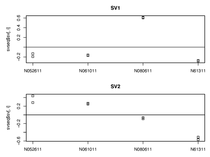
可以看到,建模得到的替代变量很好地捕捉到了来自细胞系之间的差异,在后续DESeqDataSet进行广义线性模型建模的时候,我们可以通过控制这两个替代变量从而专注于dex处理所带来的变化。
# use sva to remove the batch effect
ddssva <- dds
ddssva$SV1 <- svseq$sv[,1]
ddssva$SV2 <- svseq$sv[,2]
design(ddssva) <- ~ SV1   SV2   dex
RUVSeq
我们也可以类似地使用RUVSeq包对潜在的批次效应进行建模。需要注意的是RUVSeq需要先根据已知的处理或批次,构建全模型,从而获得差异表达分析的结果;再从中挑选出差异表达不显著的基因作为经验控制基因,进一步用这些基因的表达量进行建模,从而找到相应的unwanted variable。
#5.2 Using RUV with DESeq2
set <- newSeqExpressionSet(counts(dds))
idx  <- rowSums(counts(set) > 5) >= 2
set  <- set[idx, ]
set <- betweenLaneNormalization(set, which="upper")
res <- results(DESeq(DESeqDataSet(gse, design = ~ dex)))
not.sig <- rownames(res)[which(res$pvalue > .1)]
empirical <- rownames(set)[ rownames(set) %in% not.sig ]
set <- RUVg(set, empirical, k=2)
pData(set)

pdf(file = './res/ralationship_between_unwanted_variation_and_celline.pdf',width = 8,height = 6)
par(mfrow = c(2, 1), mar = c(3,5,3,1))
for (i in 1:2) {
  stripchart(pData(set)[, i] ~ dds$cell, vertical = TRUE, main = paste0("W", i))
  abline(h = 0)
}
dev.off()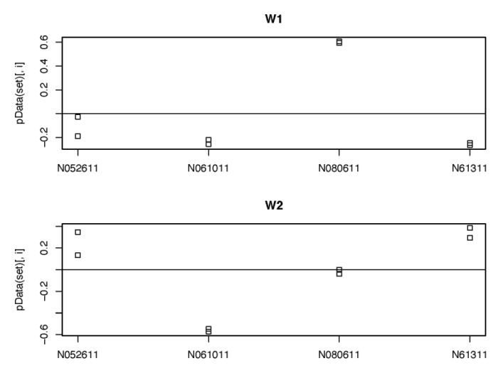
同样的,我们也可以矫正这些unwanted variable的影响。
# use unwanted factor with DESeq2
ddsruv <- dds
ddsruv$W1 <- set$W_1
ddsruv$W2 <- set$W_2
design(ddsruv) <- ~ W1   W2   dex
当然,我们矫正完潜在的批次效应后应当重新跑一下DESeq函数,从而来估计和修正新的参数和影响。
时序研究
DESeq2也可用于存在一系列时间点的时序实验中,从而探究特定条件下,与基准样本相比,基因表达随时间的变化。这里我们利用fission包中关于酵母分裂过程中一系列时间点的bulk测序数据来简要说明如何利用DESeq2进行相关的时序分析。我们在控制品系和时间的基础上,探究品系与时间的互作项对基因表达的影响。
#---------------------------------------------------#
#---------------------------------------------------#
#6.Time course experiments
# use a yeast fission data, control the effect of strain and time, investigate the strain-specific difference over time
data("fission")
ddsTC <- DESeqDataSet(fission, ~ strain   minute   strain:minute)
我们使用似然性检验进行差异表达分析,并去除品系之间随时间变化的差异表达,从而关注于在一个或多个时间点,在不同的品系间存在显著差异表达的基因。
> ddsTC <- DESeq(ddsTC, test="LRT", reduced = ~ strain   minute)
estimating size factors
estimating dispersions
gene-wise dispersion estimates
mean-dispersion relationship
final dispersion estimates
fitting model and testing
> resTC <- results(ddsTC)
> resTC$symbol <- mcols(ddsTC)$symbol
> head(resTC[order(resTC$padj),], 4)
log2 fold change (MLE): strainmut.minute180
LRT p-value: '~ strain   minute   strain:minute' vs '~ strain   minute'
DataFrame with 4 rows and 7 columns
                     baseMean     log2FoldChange             lfcSE             stat               pvalue

SPBC2F12.09c 174.671161802578  -2.65671953167539 0.752261272510015 97.2833864066372 1.97415107456139e-19
SPAC1002.18  444.504950375698 -0.050932139511341 0.204299484855662 56.9535986228365 5.16955159218189e-11
SPAC1002.19  336.373206596558 -0.392748982380864  0.57349400917308  43.533908577047 2.87980357351979e-08
SPAC1002.17c 261.773132733438  -1.13876476912801  0.60612875682785 39.3158355351572 2.05137078379603e-07
                             padj      symbol

SPBC2F12.09c  1.3345261264035e-15       atf21
SPAC1002.18  1.74730843815748e-07        urg3
SPAC1002.19   6.4891573856646e-05        urg1
SPAC1002.17c 0.000346681662461529        urg2
>
我们可以挑出最显著的差异表达基因,画出其在不同的品系中,随时间变化的趋势。需要注意的是,这里的差异表达是在矫正了起始时间点差异后,在一段时间内,两个品系之间的差异表达(Keep in mind that the interaction terms are the difference between the two groups at a given time after accounting for the difference at time 0)。
fiss <- plotCounts(ddsTC, which.min(resTC$padj), intgroup = c("minute","strain"), returnData = TRUE)
fiss$minute <- as.numeric(as.character(fiss$minute))
pdf(file = './res/show_strain_independent_fiss_gene_change_through_time.pdf',width = 8,height = 4)
ggplot(fiss, aes(x = minute, y = count, color = strain, group = strain))
  geom_point()
  stat_summary(fun.y=mean, geom="line")
  scale_y_log10()
dev.off()
在各个时间点的不同品系间的差异表达分析也可以使用results函数中的name参数加以指定。
> # Wald test
> resultsNames(ddsTC)
[1] "Intercept" "strain_mut_vs_wt" "minute_15_vs_0" "minute_30_vs_0"
[5] "minute_60_vs_0" "minute_120_vs_0" "minute_180_vs_0" "strainmut.minute15"
[9] "strainmut.minute30" "strainmut.minute60" "strainmut.minute120" "strainmut.minute180"
> res30 <- results(ddsTC, name="strainmut.minute30", test="Wald")
> res30[which.min(resTC$padj),]
log2 fold change (MLE): strainmut.minute30
Wald test p-value: strainmut.minute30
DataFrame with 1 row and 6 columns
baseMean log2FoldChange lfcSE stat pvalue
SPBC2F12.09c 174.671161802578 -2.60046902875454 0.634342916342929 -4.09946885471125 4.14099389594983e-05
padj
SPBC2F12.09c 0.279931187366209
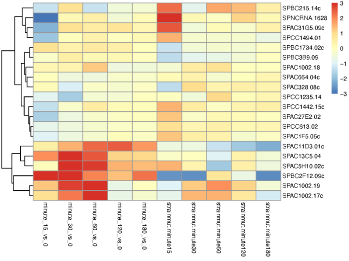
>我们也可以根据不同的条件对基因进行聚类。利用coef函数取出不同比较条件下的lfc值,聚类画热图。
# Extract a matrix of model coefficients/standard errors
betas <- coef(ddsTC)
colnames(betas)
# cluster significant genes by their profiles
topGenes <- head(order(resTC$padj),20)
mat <- betas[topGenes, -c(1,2)]
thr <- 3
mat[mat < -thr] <- -thr
mat[mat > thr] <- thr
pdf(file = './res/cluster_gene_by_coef_of_different_conditions.pdf',width = 8,height = 6)
pheatmap(mat, breaks=seq(from=-thr, to=thr, length=101), cluster_col=FALSE)
dev.off()
完整代码
最后老规矩,贴一个完整代码。另外,由于这里的命名有些混乱,因此简单总结下DESeq2的基本流程:
SummarizedExperiment类 —- DESeqDataSet函数 —-> DESeqDataSet对象 —- DESeq函数 —-> 差异表达分析后的DESeqDataSet对象 —- results/lfcShrink函数 —-> 提取差异表达基因
############################################
## Project: DESeq2 learining
## Script Purpose: learn DESeq2
## Data: 2021.01.08
## Author: Yiming Sun
############################################
#sleep
ii <- 1
while(1){
  cat(paste("round",ii),sep = "n")
  ii <- ii 1
  Sys.sleep(30)
}
#work dir
setwd('/lustre/user/liclab/sunym/R/rstudio/deseq2/')
#load R package
.libPaths('/lustre/user/liclab/sunym/R/rstudio/Rlib/')
library(DESeq2)
library(airway)
library(tximeta)
library(GEOquery)
library(GenomicFeatures)
library(BiocParallel)
library(GenomicAlignments)
library(vsn)
library(dplyr)
library(ggplot2)
library(RColorBrewer)
library(pheatmap)
library(PoiClaClu)
library(glmpca)
library(ggbeeswarm)
library(apeglm)
library(Rmisc)
library(genefilter)
library(AnnotationDbi)
library(org.Hs.eg.db)
library(Gviz)
library(sva)
library(RUVSeq)
library(fission)
#load data
#-----------Transcript quantification by Salmon-----------------#
#metadata
dir <- system.file("extdata", package="airway", mustWork=TRUE)
csvfile <- file.path(dir, "sample_table.csv")
coldata <- read.csv(csvfile, row.names=1, stringsAsFactors=FALSE)
coldata$names <- coldata$Run
dir <- getwd()
dir <- paste(dir,'airway_salmon',sep = '/')
coldata$files <- file.path(dir,coldata$Run,'quant.sf')
file.exists(coldata$files)
#create SummarizedExperiment dataset
makeLinkedTxome(indexDir='/lustre/user/liclab/sunym/R/rstudio/deseq2/Salmon_index/gencode.v35_salmon_0.14.1/', source="GENCODE", organism="Homo sapiens",
                release="35", genome="GRCh38", fasta='/lustre/user/liclab/sunym/R/rstudio/deseq2/transcript/gencode.v35.transcripts.fa', gtf='/lustre/user/liclab/sunym/R/rstudio/deseq2/annotation_gencode/gencode.v35.annotation.gtf', write=FALSE)
se <- tximeta(coldata)
#explore se
dim(se)
head(rownames(se))
gse <- summarizeToGene(se)
dim(gse)
head(rownames(gse))
#DESeqDataSet
#start from SummarizedExperiment set
round( colSums(assay(gse))/1e6, 1 )
colData(gse)
gse$dex
dds <- DESeqDataSet(gse, design = ~ cell   dex)
dds$dex
dds$dex <- factor(dds$dex,levels = c('untrt','trt'))
dds$dex
#1.Exploratory analysis and visualization
head(assay(dds))
#1.1 Pre-filtering the dataset
#the minimal filter(the features that express)
nrow(dds)
keep <- rownames(dds)[rowSums(counts(dds)) > 1]
length(keep)
dds <- dds[keep,]
nrow(dds)

#1.2 The variance stabilizing transformation and the rlog
#varience increase along with mean(exampled by poisson distribution)
lambda <- 10^seq(from = -1, to = 2, length = 1000)
cts <- matrix(rpois(1000*200, lambda), ncol = 200)
pdf(file = './res/possion_mean_variance.pdf',width = 8,height = 5)
meanSdPlot(cts, ranks = FALSE)
dev.off()
#poisson processed by log
log.cts.one <- log2(cts   1)
pdf(file = './res/poisson_log_mean_variance.pdf',width = 8,height = 5)
meanSdPlot(log.cts.one, ranks = FALSE)
dev.off()
#conclusion:the simple log transform will increase the noise of the data close to 0
#solution:vst and rlog
#vst
vsd <- vst(dds, blind = FALSE)
head(assay(vsd), 3)
colData(vsd)
#rlog
rld <- rlog(dds, blind = FALSE)
head(assay(rld), 3)
#compare log transform with vst and rlog
dds <- estimateSizeFactors(dds)
df <- bind_rows(
  as_data_frame(log2(counts(dds, normalized=TRUE)[, 1:2] 1)) %>% mutate(transformation = "log2(x   1)"),
  as_data_frame(assay(vsd)[, 1:2]) %>% mutate(transformation = "vst"),
  as_data_frame(assay(rld)[, 1:2]) %>% mutate(transformation = "rlog"))
colnames(df)[1:2] <- c("x", "y")
lvls <- c("log2(x   1)", "vst", "rlog")
df$transformation <- factor(df$transformation, levels=lvls)
pdf(file = './res/compare_log_vst_rlog.pdf',width = 12,height = 6)
ggplot(df, aes(x = x, y = y))   geom_hex(bins = 80)
  coord_fixed()   facet_grid( . ~ transformation)
dev.off()

#1.3 Sample distances
#Euclidean distance
sampleDists <- dist(t(assay(vsd)))
sampleDists
sampleDistMatrix <- as.matrix( sampleDists )
rownames(sampleDistMatrix) <- paste( vsd$dex, vsd$cell, sep = " - " )
colnames(sampleDistMatrix) <- NULL
colors <- colorRampPalette( rev(brewer.pal(9, "Blues")) )(255)
pdf(file = './res/sample_distance.pdf',width = 8,height = 6.5)
pheatmap(sampleDistMatrix,
         clustering_distance_rows = sampleDists,
         clustering_distance_cols = sampleDists,
         col = colors,
         main = 'sample euclidean distance')
dev.off()
#Poisson Distance
poisd <- PoissonDistance(t(counts(dds)))
samplePoisDistMatrix <- as.matrix( poisd$dd )
rownames(samplePoisDistMatrix) <- paste( dds$dex, dds$cell, sep=" - " )
colnames(samplePoisDistMatrix) <- NULL
pdf(file = './res/sample_poisson_distance.pdf',width = 8,height = 6.5)
pheatmap(samplePoisDistMatrix,
         clustering_distance_rows = poisd$dd,
         clustering_distance_cols = poisd$dd,
         col = colors,
         main = 'sample poisson distance')
dev.off()

#1.4 PCA
#plot by func build in DESeq2
pdf(file = './res/PCA.pdf',width = 8,height = 4)
plotPCA(vsd, intgroup = c("dex", "cell"))
dev.off()
#plot by ggplot2
pcaData <- plotPCA(vsd, intgroup = c( "dex", "cell"), returnData = TRUE)
pcaData
percentVar <- round(100 * attr(pcaData, "percentVar"))
percentVar
pdf(file = './res/PCA_by_ggplot.pdf',width = 8,height = 4)
ggplot(pcaData, aes(x = PC1, y = PC2, color = dex, shape = cell))
  geom_point(size =3)
  xlab(paste0("PC1: ", percentVar[1], "% variance"))
  ylab(paste0("PC2: ", percentVar[2], "% variance"))
  coord_fixed()
  ggtitle("PCA with VST data")
dev.off()

#1.5 PCA plot using Generalized PCA
gpca <- glmpca(counts(dds), L=2)
gpca.dat <- gpca$factors
gpca.dat$dex <- dds$dex
gpca.dat$cell <- dds$cell
pdf(file = './res/glmpca.pdf',width = 8,height = 4)
ggplot(gpca.dat, aes(x = dim1, y = dim2, color = dex, shape = cell))
  geom_point(size =3)   coord_fixed()   ggtitle("glmpca - Generalized PCA")
dev.off()
#1.6 MDS plot
#MDS plot using vst data
mds <- as.data.frame(colData(vsd)) %>% cbind(cmdscale(sampleDistMatrix))
pdf(file = './res/MDS_VST_plot.pdf',width = 8,height = 4)
ggplot(mds, aes(x = `1`, y = `2`, color = dex, shape = cell))
  geom_point(size = 3)   coord_fixed()   ggtitle("MDS with VST data")
dev.off()
#MDS plot using poisson distance
mdsPois <- as.data.frame(colData(dds)) %>% cbind(cmdscale(samplePoisDistMatrix))
pdf(file = './res/MDS_Possion_plot.pdf',width = 8,height = 4)
ggplot(mdsPois, aes(x = `1`, y = `2`, color = dex, shape = cell))
  geom_point(size = 3)   coord_fixed()   ggtitle("MDS with PoissonDistances")
dev.off()


#--------------------------------------------------------#
#--------------------------------------------------------#
#2.Differential expression analysis
#2.1 Running the differential expression pipeline
dds <- DESeq(dds)
#2.2 Building the results table
res <- results(dds)
res
resultsNames(dds)
res <- results(dds, contrast=c("dex","trt","untrt"))
mcols(res, use.names = TRUE)
summary(res)
#decrease the false discovery rate (FDR)
res.05 <- results(dds, alpha = 0.05)
summary(res.05)
table(res.05$padj < 0.05)
#raise the fold change
resLFC1 <- results(dds, lfcThreshold=1)
summary(resLFC1)
table(resLFC1$padj < 0.1)
#2.3 Other comparisons
results(dds, contrast = c("cell", "N061011", "N61311"))
#2.4 Multiple testing
#the false discovery rate due to multiple test
sum(res$pvalue < 0.05, na.rm=TRUE)
sum(!is.na(res$pvalue))
#if p threshold = 0.05
fdr = (0.05*sum(!is.na(res$pvalue)))/5263
fdr
#if false discovery fate = 0.1
sum(res$padj < 0.1, na.rm=TRUE)
#get significant genes
resSig <- subset(res, padj < 0.1)
#strongest down-regulation
head(resSig[order(resSig$log2FoldChange,decreasing = FALSE),])
#strongest up-regulation
head(resSig[order(resSig$log2FoldChange,decreasing = TRUE),])

#---------------------------------------------------#
#---------------------------------------------------#
#3.Plotting results
#3.1 Counts plot -- visualize the count of a particular gene
topGene <- rownames(res)[which.min(res$padj)]
pdf(file = './res/plotcounts_function.pdf',width = 8,height = 6)
plotCounts(dds, gene = topGene, intgroup=c("dex"))
dev.off()
# counts plot using ggplot2
geneCounts <- plotCounts(dds, gene = topGene, intgroup = c("dex","cell"),returnData = TRUE)
geneCounts
p1 <- ggplot(geneCounts, aes(x = dex, y = count, color = cell))   scale_y_log10()   geom_beeswarm(cex = 3)
p2 <- ggplot(geneCounts, aes(x = dex, y = count, color = cell, group = cell))   scale_y_log10()   geom_point(size = 3)   geom_line()
pdf(file = './res/count_plot_using_ggplot.pdf',width = 8,height = 6)
Rmisc::multiplot(p1,p2,cols = 1)
dev.off()
#3.2 MA plot
resultsNames(dds)
res <- lfcShrink(dds, coef="dex_trt_vs_untrt", type="apeglm")
pdf(file = './res/MA_plot.pdf',width = 8,height = 6)
DESeq2::plotMA(res, ylim = c(-5, 5))
dev.off()

# MA plot without shrink
res.noshr <- results(dds, name="dex_trt_vs_untrt")
pdf(file = './res/MA_plot_without_shrink.pdf',width = 8,height = 6)
DESeq2::plotMA(res.noshr, ylim = c(-5, 5))
dev.off()

# show the gene we interested about on the MA plot
pdf(file = './res/MA_plot_with_gene.pdf',width = 8,height = 6)
DESeq2::plotMA(res, ylim = c(-5,5))
topGene <- rownames(res)[which.min(res$padj)]
with(res[topGene, ], {
  points(baseMean, log2FoldChange, col="dodgerblue", cex=2, lwd=2)
  text(baseMean, log2FoldChange, topGene, pos=2, col="dodgerblue")
})
dev.off()

# histogram show the distribution of p value
pdf(file = './res/histogram_show_the_distribution_of_p_value.pdf',width = 8,height = 6)
hist(res$pvalue[res$baseMean > 1], breaks = (0:20)/20,col = "grey50", border = "white")
dev.off()

#3.3 gene cluster
topVarGenes <- head(order(rowVars(assay(vsd)), decreasing = TRUE), 20)
mat <- assay(vsd)[topVarGenes, ]
mat <- mat - rowMeans(mat)
anno <- as.data.frame(colData(vsd)[, c("cell","dex")])
pdf(file = './res/pheatmap_top_20_variable_gene.pdf',width = 8,height = 6)
pheatmap(mat, annotation_col = anno,scale = 'none')
dev.off()

#3.4 independent filtering
#filter the low counts gene to improve FDR
qs <- c(0, quantile(resLFC1$baseMean[resLFC1$baseMean > 0], 0:6/6))
bins <- cut(resLFC1$baseMean, qs)
levels(bins) <- paste0("~", round(signif((qs[-1]   qs[-length(qs)])/2, 2)))
fractionSig <- tapply(resLFC1$pvalue, bins, function(p){mean(p < .05, na.rm = TRUE)})
pdf(file = './res/proportion_of_small_p_value.pdf',width = 8,height = 6)
barplot(fractionSig, xlab = "mean normalized count",
        ylab = "fraction of small p values")
dev.off()

#---------------------------------------------------#
#---------------------------------------------------#
#4.Annotating and exporting results
#rename gene
columns(org.Hs.eg.db)
ens.str <- substr(rownames(res), 1, 15)
res$symbol <- mapIds(org.Hs.eg.db,
                     keys=ens.str,
                     column="SYMBOL",
                     keytype="ENSEMBL",
                     multiVals="first")
res$entrez <- mapIds(org.Hs.eg.db,
                     keys=ens.str,
                     column="ENTREZID",
                     keytype="ENSEMBL",
                     multiVals="first")
resOrdered <- res[order(res$pvalue),]
head(resOrdered)

#4.1 Plotting fold changes in genomic space
resGR <- lfcShrink(dds, coef="dex_trt_vs_untrt", type="apeglm", format="GRanges")
resGR
ens.str <- substr(names(resGR), 1, 15)
resGR$symbol <- mapIds(org.Hs.eg.db, ens.str, "SYMBOL", "ENSEMBL")
# specify the window and filter the symbol
window <- resGR[topGene]   1e6
strand(window) <- "*"
resGRsub <- resGR[resGR %over% window]
naOrDup <- is.na(resGRsub$symbol) | duplicated(resGRsub$symbol)
resGRsub$group <- ifelse(naOrDup, names(resGRsub), resGRsub$symbol)
status <- factor(ifelse(resGRsub$padj < 0.05 & !is.na(resGRsub$padj),"sig", "notsig"))
# ploting the result using Gviz
options(ucscChromosomeNames = FALSE)
g <- GenomeAxisTrack()
a <- AnnotationTrack(resGRsub, name = "gene ranges", feature = status)
d <- DataTrack(resGRsub, data = "log2FoldChange", baseline = 0, type = "h", name = "log2 fold change", strand = " ")
pdf(file = './res/plot_lfc_in_genomic_space.pdf',width = 8,height = 6)
plotTracks(list(g, d, a), groupAnnotation = "group", notsig = "grey", sig = "hotpink")
dev.off()

#---------------------------------------------------#
#---------------------------------------------------#
#5.remove hiddden batch effects
#5.1 use SVA with DESeq2
# fillter the gene has normalized counts > 1
dat  <- counts(dds, normalized = TRUE)
idx  <- rowMeans(dat) > 1
dat  <- dat[idx, ]
# build two model, one account for dex and one for null hypothesis
mod  <- model.matrix(~ dex, colData(dds))
mod0 <- model.matrix(~   1, colData(dds))
# set two surrogate variables
svseq <- svaseq(dat, mod, mod0, n.sv = 2)
svseq$sv
# show the correlation of the sv with the cellline
pdf(file = './res/ralationship_between_sv_and_celline.pdf',width = 8,height = 6)
par(mfrow = c(2, 1), mar = c(3,5,3,1))
for (i in 1:2) {
  stripchart(svseq$sv[, i] ~ dds$cell, vertical = TRUE, main = paste0("SV", i))
  abline(h = 0)
}
dev.off()
# use sva to remove the batch effect
ddssva <- dds
ddssva$SV1 <- svseq$sv[,1]
ddssva$SV2 <- svseq$sv[,2]
design(ddssva) <- ~ SV1   SV2   dex

#5.2 Using RUV with DESeq2
set <- newSeqExpressionSet(counts(dds))
idx  <- rowSums(counts(set) > 5) >= 2
set  <- set[idx, ]
set <- betweenLaneNormalization(set, which="upper")
res <- results(DESeq(DESeqDataSet(gse, design = ~ dex)))
not.sig <- rownames(res)[which(res$pvalue > .1)]
empirical <- rownames(set)[ rownames(set) %in% not.sig ]
set <- RUVg(set, empirical, k=2)
pData(set)

pdf(file = './res/ralationship_between_unwanted_variation_and_celline.pdf',width = 8,height = 6)
par(mfrow = c(2, 1), mar = c(3,5,3,1))
for (i in 1:2) {
  stripchart(pData(set)[, i] ~ dds$cell, vertical = TRUE, main = paste0("W", i))
  abline(h = 0)
}
dev.off()

# use unwanted factor with DESeq2
ddsruv <- dds
ddsruv$W1 <- set$W_1
ddsruv$W2 <- set$W_2
design(ddsruv) <- ~ W1   W2   dex

#---------------------------------------------------#
#---------------------------------------------------#
#6.Time course experiments
# use a yeast fission data, control the effect of strain and time, investigate the strain-specific difference over time
data("fission")
ddsTC <- DESeqDataSet(fission, ~ strain   minute   strain:minute)

ddsTC <- DESeq(ddsTC, test="LRT", reduced = ~ strain   minute)
resTC <- results(ddsTC)
resTC$symbol <- mcols(ddsTC)$symbol
head(resTC[order(resTC$padj),], 4)

fiss <- plotCounts(ddsTC, which.min(resTC$padj), intgroup = c("minute","strain"), returnData = TRUE)
fiss$minute <- as.numeric(as.character(fiss$minute))
pdf(file = './res/show_strain_independent_fiss_gene_change_through_time.pdf',width = 8,height = 4)
ggplot(fiss, aes(x = minute, y = count, color = strain, group = strain))
  geom_point()
  stat_summary(fun.y=mean, geom="line")
  scale_y_log10()
dev.off()
# Wald test
resultsNames(ddsTC)
res30 <- results(ddsTC, name="strainmut.minute30", test="Wald")
res30[which.min(resTC$padj),]
# Extract a matrix of model coefficients/standard errors
betas <- coef(ddsTC)
colnames(betas)
# cluster significant genes by their profiles
topGenes <- head(order(resTC$padj),20)
mat <- betas[topGenes, -c(1,2)]
thr <- 3
mat[mat < -thr] <- -thr
mat[mat > thr] <- thr
pdf(file = './res/cluster_gene_by_coef_of_different_conditions.pdf',width = 8,height = 6)
pheatmap(mat, breaks=seq(from=-thr, to=thr, length=101), cluster_col=FALSE)
dev.off()