

1、点,线,面
点:points,线:abline,lines,segments,面:box,polygon,polypath,rect,特殊的:arrows,symbols
points不仅仅可以画前文中pch所设定的任意一个符号,还可以以字符为符号。
> ## ------------ test code for various pch specifications -------------
> # Try this in various font families (including Hershey)
> # and locales.  Use sign=-1 asserts we want Latin-1.
> # Standard cases in a MBCS locale will not plot the top half.
> TestChars <- function(sign=1, font=1, ...)
+ {
+    if(font == 5) { sign <- 1; r <- c(32:126, 160:254)
+    } else if (l10n_info()$MBCS) r <- 32:126 else r <- 32:255
+    if (sign == -1) r <- c(32:126, 160:255)
+    par(pty="s")
+    plot(c(-1,16), c(-1,16), type="n", xlab="", ylab="",
+         xaxs="i", yaxs="i")
+    grid(17, 17, lty=1)
+    for(i in r) try(points(i%%16, i%/%16, pch=sign*i, font=font,...))
+ }
> TestChars()
> try(TestChars(sign=-1)) |
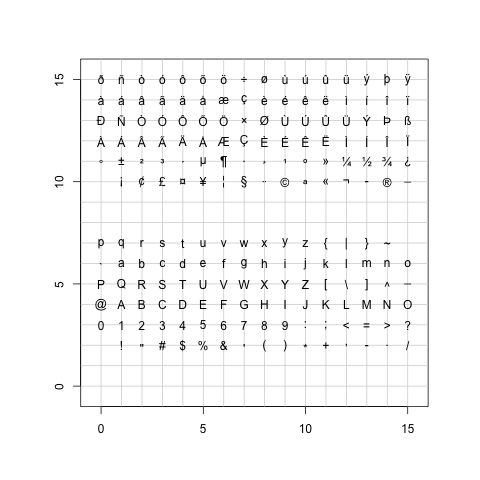
画点
abline可以由斜率和截距来确定一条直线,lines可以连接两个或者多个点,segments可以按起止位置画线。
> require(stats) > sale5 <- c(6, 4, 9, 7, 6, 12, 8, 10, 9, 13) > plot(sale5,new=T) > abline(lsfit(1:10,sale5)) > abline(lsfit(1:10,sale5, intercept = FALSE), col= 4) > abline(h=6, v=8, col = "gray60") > text(8,6, "abline( h = 6 )", col = "gray60", adj = c(0, -.1)) > abline(h = 4:8, v = 6:12, col = "lightgray", lty=3) > abline(a=1, b=2, col = 2) > text(5,11, "abline( 1, 2 )", col=2, adj=c(-.1,-.1)) > segments(6,4,9,5,col="green") > text(6,5,"segments(6,4,9,5)") > lines(sale5,col="pink") |

线段
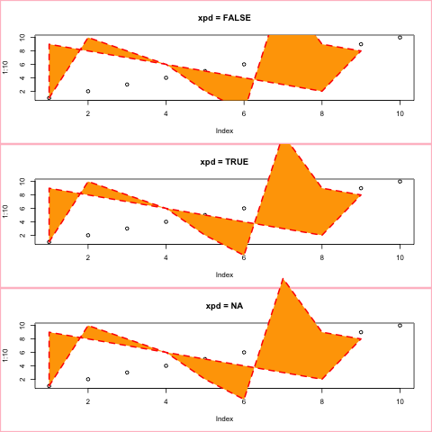
box画出当前盒子的边界,polygon画多边形,polypath画路径,rect画距形。
> x <- c(1:9,8:1)
> y <- c(1,2*(5:3),2,-1,17,9,8,2:9)
> op <- par(mfcol=c(3,1))
> for(xpd in c(FALSE,TRUE,NA)) {
+   plot(1:10, main = paste("xpd =", xpd))
+   box("figure", col = "pink", lwd=3)
+   polygon(x,y, xpd=xpd, col="orange", lty=2, lwd=2, border="red")
+ }
> par(op)
> plotPath <- function(x, y, col = "grey", rule = "winding") {
+     plot.new()
+     plot.window(range(x, na.rm = TRUE), range(y, na.rm = TRUE))
+     polypath(x, y, col = col, rule = rule)
+     if (!is.na(col))
+         mtext(paste("Rule:", rule), side = 1, line = 0)
+ }
>
> plotRules <- function(x, y, title) {
+     plotPath(x, y)
+     plotPath(x, y, rule = "evenodd")
+     mtext(title, side = 3, line = 0)
+     plotPath(x, y, col = NA)
+ }
>
> op <- par(mfrow = c(5, 3), mar = c(2, 1, 1, 1))
>
> plotRules(c(.1, .1, .9, .9, NA, .2, .2, .8, .8),
+           c(.1, .9, .9, .1, NA, .2, .8, .8, .2),
+           "Nested rectangles, both clockwise")
> plotRules(c(.1, .1, .9, .9, NA, .2, .8, .8, .2),
+           c(.1, .9, .9, .1, NA, .2, .2, .8, .8),
+           "Nested rectangles, outer clockwise, inner anti-clockwise")
> plotRules(c(.1, .1, .4, .4, NA, .6, .9, .9, .6),
+           c(.1, .4, .4, .1, NA, .6, .6, .9, .9),
+           "Disjoint rectangles")
> plotRules(c(.1, .1, .6, .6, NA, .4, .4, .9, .9),
+           c(.1, .6, .6, .1, NA, .4, .9, .9, .4),
+           "Overlapping rectangles, both clockwise")
> plotRules(c(.1, .1, .6, .6, NA, .4, .9, .9, .4),
+           c(.1, .6, .6, .1, NA, .4, .4, .9, .9),
+           "Overlapping rectangles, one clockwise, other anti-clockwise")
>
> par(op)
> require(grDevices)
> ## set up the plot region:
> op <- par(bg = "thistle")
> plot(c(100, 250), c(300, 450), type = "n", xlab="", ylab="",
+      main = "2 x 11 rectangles; 'rect(100+i,300+i,  150+i,380+i)'")
> i <- 4*(0:10)
> ## draw rectangles with bottom left (100, 300)+i
> ## and top right (150, 380)+i
> rect(100+i, 300+i, 150+i, 380+i, col=rainbow(11, start=.7,end=.1))
> rect(240-i, 320+i, 250-i, 410+i, col=heat.colors(11), lwd=i/5)
> ## Background alternating  ( transparent / "bg" ) :
> j <- 10*(0:5)
> rect(125+j, 360+j,   141+j, 405+j/2, col = c(NA,0),
+      border = "gold", lwd = 2)
> rect(125+j, 296+j/2, 141+j, 331+j/5, col = c(NA,"midnightblue"))
> mtext("+ 2 x 6 rect(*, col = c(NA,0)) and col = c(NA,\"m..blue\"))") |
多边形
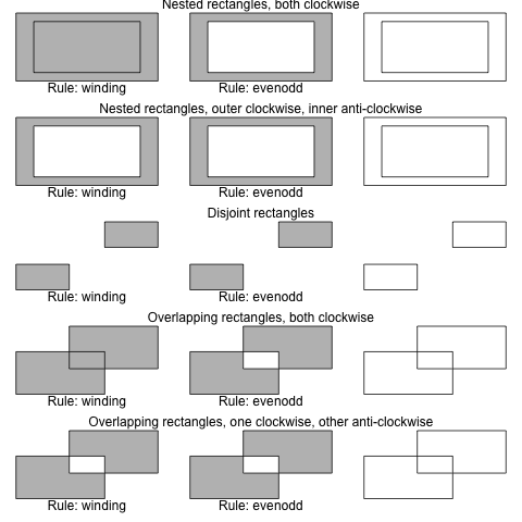
路径
矩形
arrows用于画箭头,symbols用于画符号
> ## Note that  example(trees)  shows more sensible plots!
> N <- nrow(trees)
> with(trees, {
+ ## Girth is diameter in inches
+ symbols(Height, Volume, circles = Girth/24, inches = FALSE,
+         main = "Trees' Girth") # xlab and ylab automatically
+ ## Colours too:
+ op <- palette(rainbow(N, end = 0.9))
+ symbols(Height, Volume, circles = Girth/16, inches = FALSE, bg = 1:N,
+         fg = "gray30", main = "symbols(*, circles = Girth/16, bg = 1:N)")
+ palette(op)
+ }) |
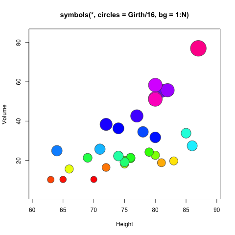
符号
画圆
> library(plotrix)
> plot(1:5,seq(1,10,length=5),type="n",xlab="",ylab="",main="Test draw.circle")
>  draw.circle(2,4,c(1,0.66,0.33),border="purple",
+   col=c("#ff00ff","#ff77ff","#ffccff"),lty=1,lwd=1)
>  draw.circle(2.5,8,0.6,border="red",lty=3,lwd=3)
>  draw.circle(4,3,0.7,border="green",lty=1,lwd=1)
> draw.circle(3.5,7,0.8,border="blue",lty=2,lwd=2) |
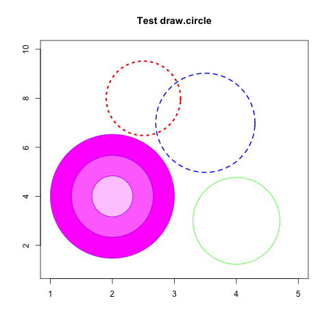
圆
2、散点图及趋势线
一维点图使用dotchart函数。
> # Dotplot: Grouped Sorted and Colored > # Sort by mpg, group and color by cylinder > x <- mtcars[order(mtcars$mpg),] # sort by mpg > x$cyl <- factor(x$cyl) # it must be a factor > x$color[x$cyl==4] <- "red" > x$color[x$cyl==6] <- "blue" > x$color[x$cyl==8] <- "darkgreen" > dotchart(x$mpg,labels=row.names(x),cex=.7,groups= x$cyl, + main="Gas Milage for Car Models\ngrouped by cylinder", + xlab="Miles Per Gallon", gcolor="black", color=x$color) |
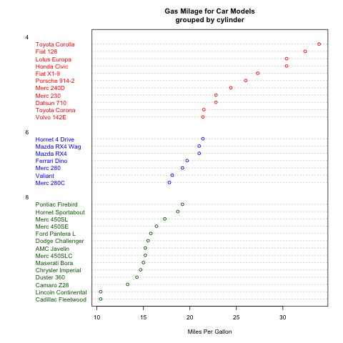
一维点图
二维散点图使用plot函数。直趋势线使用abline函数,拟合曲线在拟合后使用line函数绘制。
> attach(mtcars) > plot(wt, mpg, main="Scatterplot Example", + xlab="Car Weight ", ylab="Miles Per Gallon ", pch=19) > # Add fit lines > abline(lm(mpg~wt), col="red") # regression line (y~x) > lines(lowess(wt,mpg), col="blue") # lowess line (x,y) |
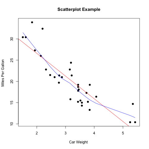
点阵图
3、曲线
曲线使用lines函数。其type参数可以使用”p”,”l”,”o”,”b,c”,”s,S”,”h”,”n”等。
> x <- c(1:5); y <- x # create some data
> par(pch=22, col="blue") # plotting symbol and color
> par(mfrow=c(2,4)) # all plots on one page
> opts = c("p","l","o","b","c","s","S","h")
> for(i in 1:length(opts)){
+   heading = paste("type=",opts[i])
+   plot(x, y, main=heading)
+   lines(x, y, type=opts[i])
+ } |
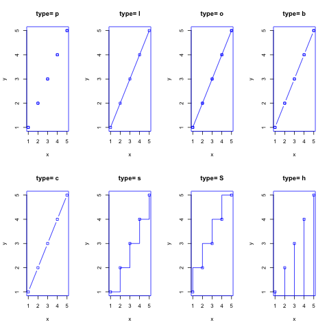
曲线
4、柱状图
普通的柱状图使用barplot函数。其参数horiz=TRUE表示水平画图,beside=TRUE表示如果是多组数据的话,在并排画图,否则原位堆叠画图。
> par(mfrow=c(1,2))
> counts <- table(mtcars$vs, mtcars$gear)
> barplot(counts, main="Car Distribution by Gears and VS",
+   xlab="Number of Gears", col=c("darkblue","red"),
+  	 legend = rownames(counts),horiz=TRUE)
> barplot(counts, main="Car Distribution by Gears and VS",
+   xlab="Number of Gears", col=c("darkblue","red"),
+ legend = rownames(counts), beside=TRUE) |
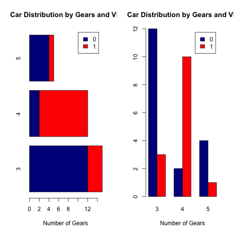
bar图
柱状统计图使用hist函数。其breaks参数设置每组的范围。使用density函数可以拟合曲线。
> hist(mtcars$mpg, breaks=12) > dens<-density(mtcars$mpg) > lines(dens$x,dens$y*100,col="red") |
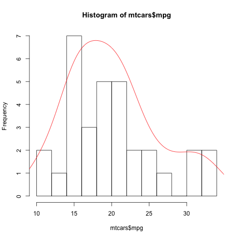
柱状图
5、饼图
饼图使用pie函数。
> x<-table(mtcars$gear)
> pie(x,label=paste("gear=",rownames(x),sep="")) |
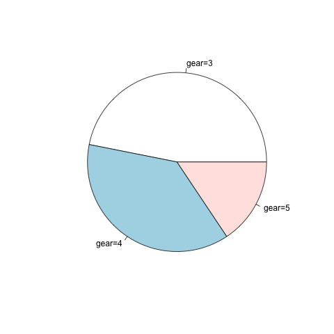
饼图
3维饼图使用plotrix库中的pie3D函数。
> x<-table(mtcars$gear)
> pie3D(x,labels=paste("gear=",rownames(x),sep=""),explode=0.1) |
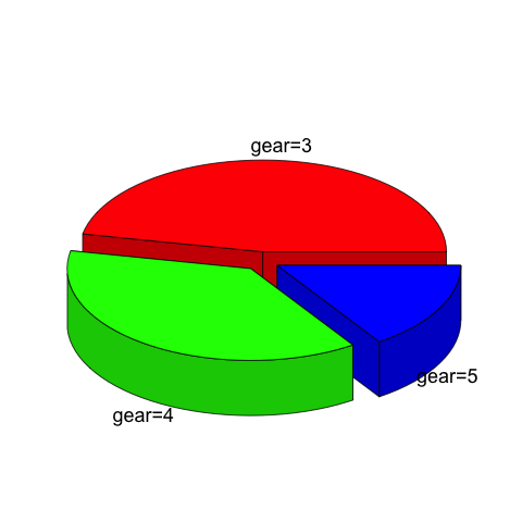
3D饼图
6、箱线图
箱线图使用boxplot函数。boxplot中参数x为公式。R中的公式如何定义呢?最简单的 y ~ x 就是y是x的一次函数。好了,下面就是相关的符号代表的意思:
| 符号 | 示例 | 意义 |
| + | +x | 包括该变量 |
| – | -x | 不包括该变量 |
| : | x:z | 包括两变量的相互关系 |
| * | x*z | 包括两变量,以及它们之间的相互关系 |
| / | x/z | nesting: include z nested within x |
| | | x|z | 条件或分组:包括指定z的x |
| ^ | (u+v+w)^3 | include these variables and all interactions up to three way |
| poly | poly(x,3) | polynomial regression: orthogonal polynomials |
| Error | Error(a/b) | specify the error term |
| I | I(x*z) | as is: include a new variable consisting of these variables multiplied |
| 1 | -1 | 截距:减去该截距 |
> boxplot(mpg~cyl,data=mtcars, main="Car Milage Data",
+   	 xlab="Number of Cylinders", ylab="Miles Per Gallon")
> boxplot(len~supp*dose, data=ToothGrowth, notch=TRUE,
+   col=(c("gold","darkgreen")),
+ main="Tooth Growth", xlab="Suppliment and Dose") |
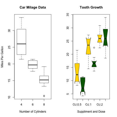
箱线图
如果我想在箱线图上叠加样品点,即所谓的蜂群图,如何做呢?
> source("http://bioconductor.org/biocLite.R")
> biocLite(c("beeswarm","ggplot2"))
> library(beeswarm)
> library(ggplot2)
> data(breast)
> beeswarm <- beeswarm(time_survival ~ event_survival,
+             data = breast, method = 'swarm',
+             pwcol = ER)[, c(1, 2, 4, 6)]
> colnames(beeswarm) <- c("x", "y", "ER", "event_survival")
>
> beeswarm.plot <- ggplot(beeswarm, aes(x, y)) +
+   xlab("") +
+   scale_y_continuous(expression("Follow-up time (months)"))
> beeswarm.plot2 <- beeswarm.plot + geom_boxplot(aes(x, y,
+   group = round(x)), outlier.shape = NA)
> beeswarm.plot3 <- beeswarm.plot2 + geom_point(aes(colour = ER)) +
+   scale_colour_manual(values = c("black", "red")) +
+   scale_x_continuous(breaks = c(1:2),
+ labels = c("Censored", "Metastasis"), expand = c(0, 0.5))
> print(beeswarm.plot3) |
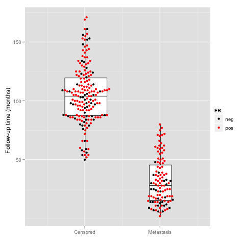
蜂群图
> require(beeswarm)
> data(breast)
>
> beeswarm(time_survival ~ event_survival, data = breast,
+         method = 'swarm',
+         pch = 16, pwcol = as.numeric(ER),
+         xlab = '', ylab = 'Follow-up time (months)',
+         labels = c('Censored', 'Metastasis'))
>
> boxplot(time_survival ~ event_survival,
+         data = breast, add = T,
+ names = c("",""), col="#0000ff22") |
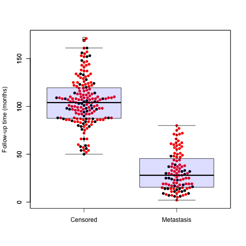
蜂群图
7、分枝树
> require(graphics) > opar<-par(mfrow=c(2,1),mar=c(4,3,0.5,0.5)) > hc <- hclust(dist(USArrests), "ave") > plot(hc,main="") > plot(hc, hang = -1,main="") > par(opar) |
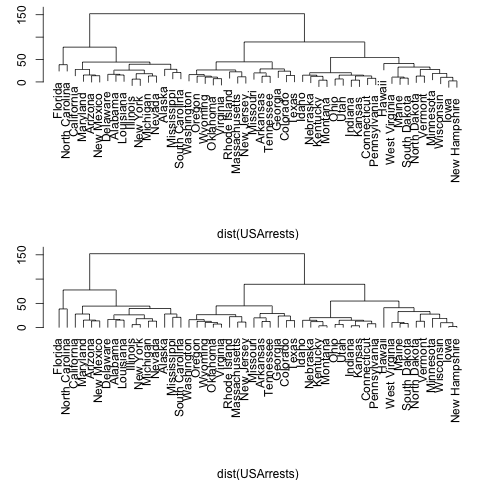
分枝树
8、文氏图
> library(limma)
> Y <- matrix(rnorm(100*6),100,6)
> Y[1:10,3:4] <- Y[1:10,3:4]+3
> Y[1:20,5:6] <- Y[1:20,5:6]+3
> design <- cbind(1,c(0,0,1,1,0,0),c(0,0,0,0,1,1))
> fit <- eBayes(lmFit(Y,design))
> results <- decideTests(fit)
> a <- vennCounts(results)
> print(a)
     x1 x2 x3 Counts
[1,]  0  0  0     89
[2,]  0  0  1     11
[3,]  0  1  0      0
[4,]  0  1  1      0
[5,]  1  0  0      0
[6,]  1  0  1      0
[7,]  1  1  0      0
[8,]  1  1  1      0
attr(,"class")
[1] "VennCounts"
> vennDiagram(a)
> vennDiagram(results,include=c("up","down"),counts.col=c("red","green")) |
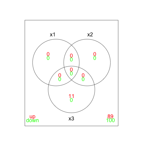
文氏图