

1、点阵图加两方向柱状图
> def.par <- par(no.readonly = TRUE) # save default, for resetting... > > x <- pmin(3, pmax(-3, rnorm(50))) > y <- pmin(3, pmax(-3, rnorm(50))) > xhist <- hist(x, breaks=seq(-3,3,0.5), plot=FALSE) > yhist <- hist(y, breaks=seq(-3,3,0.5), plot=FALSE) > top <- max(c(xhist$counts, yhist$counts)) > xrange <- c(-3,3) > yrange <- c(-3,3) > nf <- layout(matrix(c(2,0,1,3),2,2,byrow=TRUE), c(3,1), c(1,3), TRUE) > #layout.show(nf) > > par(mar=c(3,3,1,1)) > plot(x, y, xlim=xrange, ylim=yrange, xlab="", ylab="") > par(mar=c(0,3,1,1)) > barplot(xhist$counts, axes=FALSE, ylim=c(0, top), space=0) > par(mar=c(3,0,1,1)) > barplot(yhist$counts, axes=FALSE, xlim=c(0, top), space=0, horiz=TRUE) > > par(def.par) |
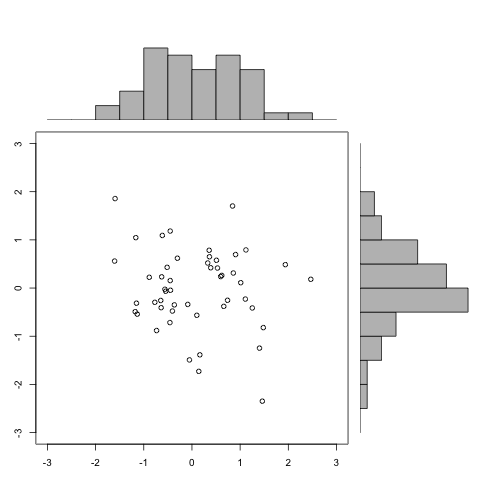
点阵+柱状
2、带误差的点线图
> # Clustered Error Bar for Groups of Cases.
> # Example: Experimental Condition (Stereotype Threat Yes/No) x Gender (Male / Female)
> # The following values would be calculated from data and are set fixed now for
> # code reproduction
>
> means.females <- c(0.08306698, -0.83376319)
> stderr.females <- c(0.13655378, 0.06973371)
>
> names(means.females) <- c("No","Yes")
> names(stderr.females) <- c("No","Yes")
>
> means.males <- c(0.4942997, 0.2845608)
> stderr.males <- c(0.07493673, 0.18479661)
>
> names(means.males) <- c("No","Yes")
> names(stderr.males) <- c("No","Yes")
>
> # Error Bar Plot
>
> library (gplots)
>
> # Draw the error bar for female experiment participants:
> plotCI(x = means.females, uiw = stderr.females, lty = 2, xaxt ="n", xlim = c(0.5,2.5), ylim = c(-1,1), gap = 0, ylab="Microworld Performance (Z Score)", xlab="Stereotype Threat", main = "Microworld performance over experimental conditions")
>
> # Add the males to the existing plot
> plotCI(x = means.males, uiw = stderr.males, lty = 1, xaxt ="n", xlim = c(0.5,2.5), ylim = c(-1,1), gap = 0, add = TRUE)
>
> # Draw the x-axis (omitted above)
> axis(side = 1, at = 1:2, labels = names(stderr.males), cex = 0.7)
>
> # Add legend for male and female participants
> legend(2,1,legend=c("Male","Female"),lty=1:2) |
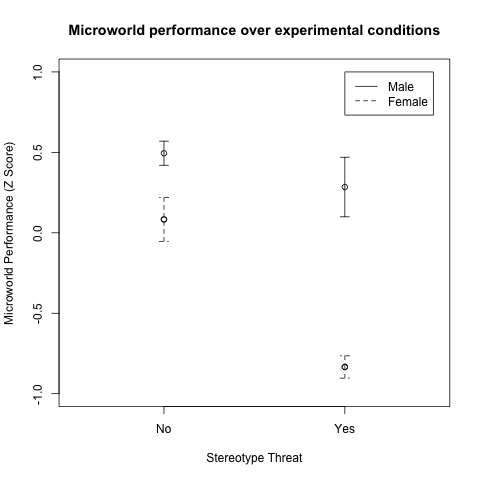
误差图
误差绘图plotCI加强版是plotmeans,具体可使用?plotmeans来试用它。这里就不多讲了。
3、带误差的柱状图。
还是使用gplots包
> library(gplots)
> # Example with confidence intervals and grid
> hh <- t(VADeaths)[, 5:1]
> mybarcol <- "gray20"
> ci.l <- hh * 0.85
> ci.u <- hh * 1.15
> mp <- barplot2(hh, beside = TRUE,
+         col = c("lightblue", "mistyrose",
+                 "lightcyan", "lavender"),
+         legend = colnames(VADeaths), ylim = c(0, 100),
+         main = "Death Rates in Virginia", font.main = 4,
+         sub = "Faked 95 percent error bars", col.sub = mybarcol,
+         cex.names = 1.5, plot.ci = TRUE, ci.l = ci.l, ci.u = ci.u,
+         plot.grid = TRUE)
> mtext(side = 1, at = colMeans(mp), line = 2,
+       text = paste("Mean", formatC(colMeans(hh))), col = "red")
> box() |
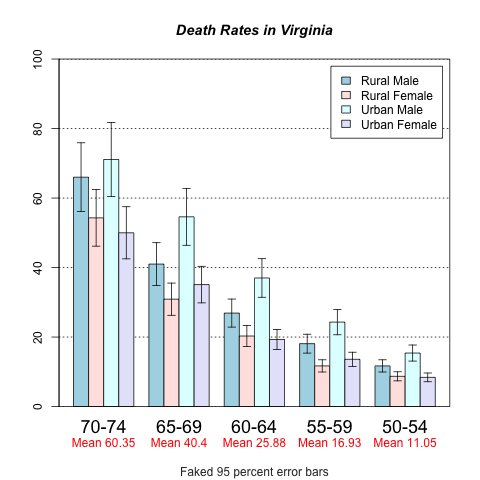
带误差的柱状图
4、漂亮的箱线图
> require(gplots) #for smartlegend
>
> data(ToothGrowth)
> boxplot(len ~ dose, data = ToothGrowth,
+         boxwex = 0.25, at = 1:3 - 0.2,
+         subset= supp == "VC", col="yellow",
+         main="Guinea Pigs' Tooth Growth",
+         xlab="Vitamin C dose mg",
+         ylab="tooth length", ylim=c(0,35))
> boxplot(len ~ dose, data = ToothGrowth, add = TRUE,
+         boxwex = 0.25, at = 1:3 + 0.2,
+         subset= supp == "OJ", col="orange")
>
> smartlegend(x="left",y="top", inset = 0,
+             c("Ascorbic acid", "Orange juice"),
+ fill = c("yellow", "orange")) |
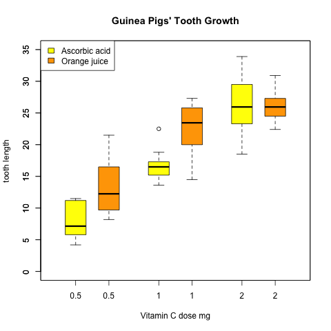
箱线图
5、基因芯片热图,
具体参考http://www2.warwick.ac.uk/fac/sci/moac/students/peter_cock/r/heatmap/
> library("ALL")
> data("ALL")
> eset <- ALL[, ALL$mol.biol %in% c("BCR/ABL", "ALL1/AF4")]
> library("limma")
> f <- factor(as.character(eset$mol.biol))
> design <- model.matrix(~f)
> fit <- eBayes(lmFit(eset,design))
> selected  <- p.adjust(fit$p.value[, 2]) <0.005
> esetSel <- eset [selected, ]
> color.map <- function(mol.biol) { if (mol.biol=="ALL1/AF4") "#FF0000" else "#0000FF" }
> patientcolors <- unlist(lapply(esetSel$mol.bio, color.map))
> library("gplots")
> heatmap.2(exprs(esetSel), col=redgreen(75), scale="row", ColSideColors=patientcolors,
+ key=TRUE, symkey=FALSE, density.info="none", trace="none", cexRow=0.5) |