
图目录:
- 基本散点图;200 个正态分布的随机数
- point 散点图;200 个正态分布的随机数
- geom_point 散点图;200 个正态分布的随机数
- 基本折线图;10 个正态分布的随机数
- lines() 折线图;刹车速度与滑行距离的关系
- geom_line() 连接观测值;美国人口失业情况折线图
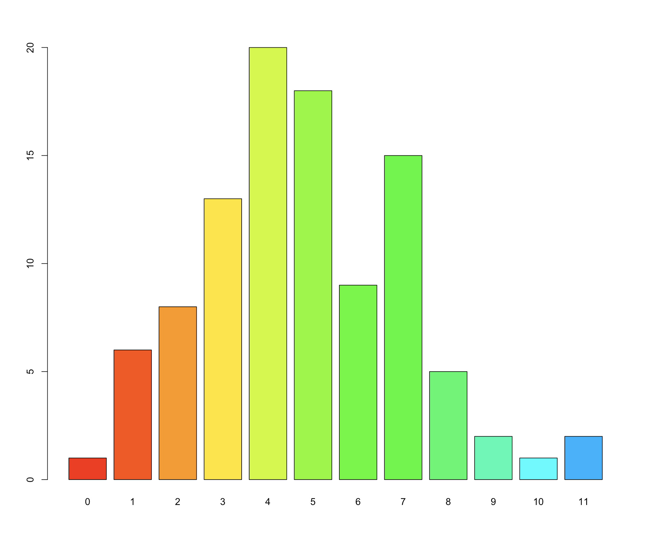
- barplot() 基本条形图;统计泊松分布随机数
- barplot() 堆栈式条形图;分年龄的人口信息被叠加在一起
- barplot() 按分类依次排列的条形图
- geom_bar() 基本条形图
- geom_bar() 堆栈式条形图
- geom_bar() 依次排列式条形图
- geom_bar() 比列式条形图
- polygon() 密度图
- polygon() 面积堆积图
- geom_area() 堆积面积图
- 密度估计图
- 两个核密度估计图
- geom_density() 核密度估计图
- 用 Graphics 函数画频率图
- geom_freqpoly() 频率图
- hist() 直方图
- geom_hist() 直方图
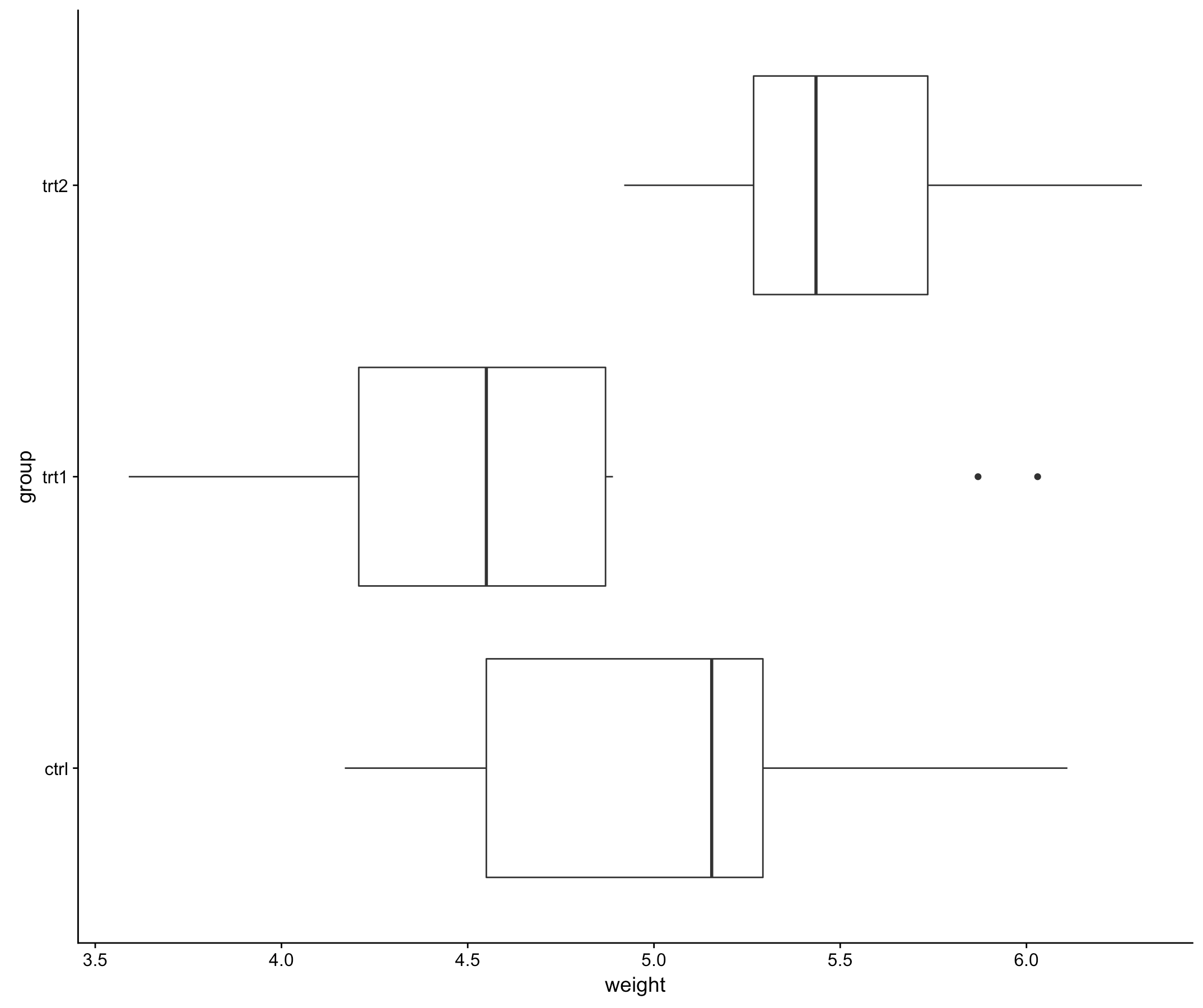
- boxplot() 箱线图
- geom_boxplot() 箱线图
- 错误的 error bar 箱线图
- 带 error bar 的箱线图
- vioplot() 提琴图
- geom_violin() 提琴图
- 添加箱线图信息的提琴图
- 添加均值和标准差信息的提琴图
- dotchart() 绘制 Cleveland 点图
- geom_dotplot() 绘制 Cleveland 点图
- 用 heatmap() 绘制热图
- geom_tile() 绘制热图
- pheatmap() 绘制热图
- 主成分分析图
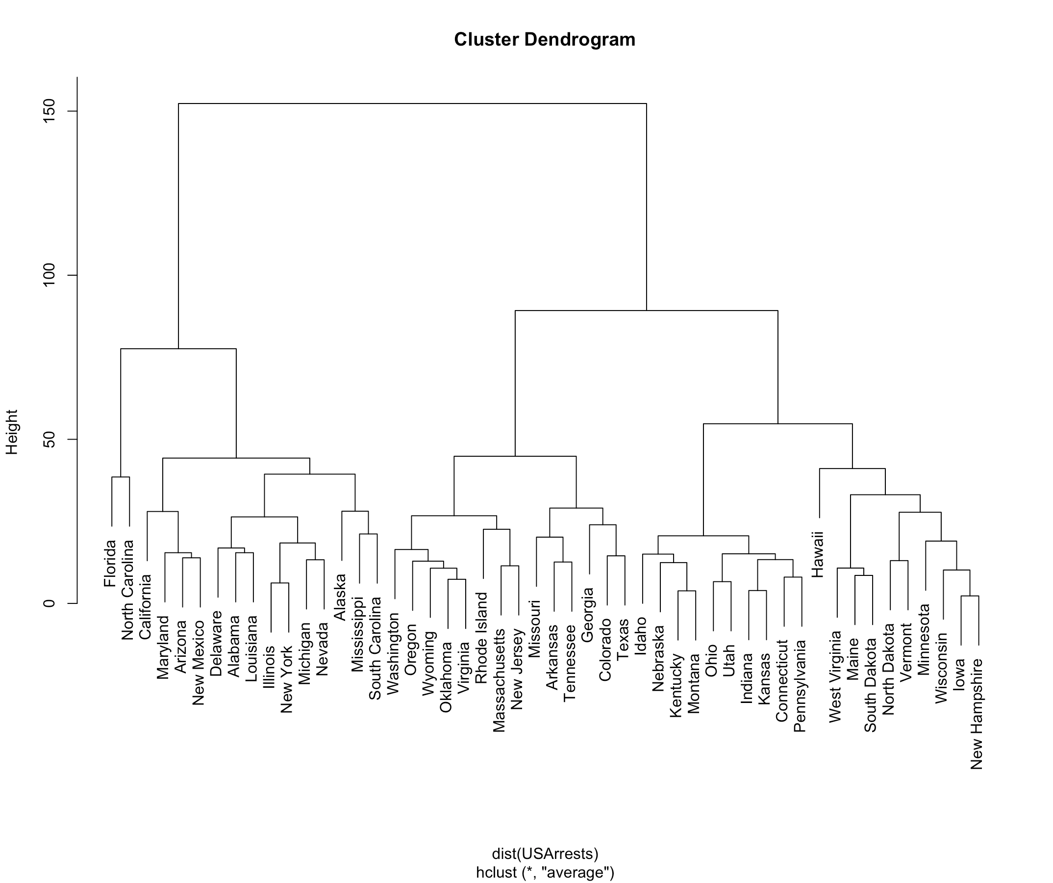
- 基本层次聚类图
- dendrograms() 绘制层次聚类图
- plot.phylo() 绘制层次聚类图
- graphics 包里如何添加图片标题
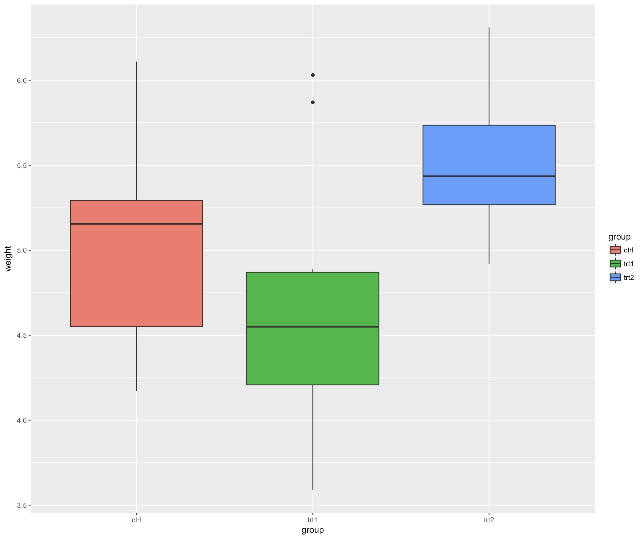
- ggplot2 包里如何添加图片标题
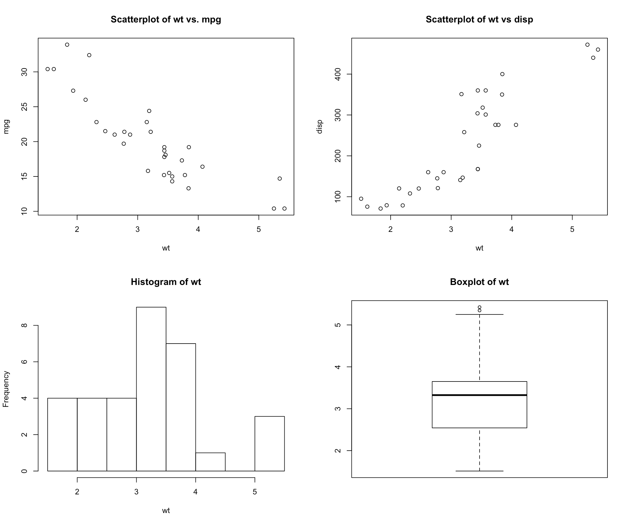
- par() 函数 mfrow 设置多个图片同个画布
- layout() 设置多个图片同个画布
- cowlplot::ggdraw() 设置多个图片同 个画布
- gridExtra::grid.arrange() 设置多个图片同个画布
- barplot() 水平显示条形图
- coord_ ip() 水平显示直方图
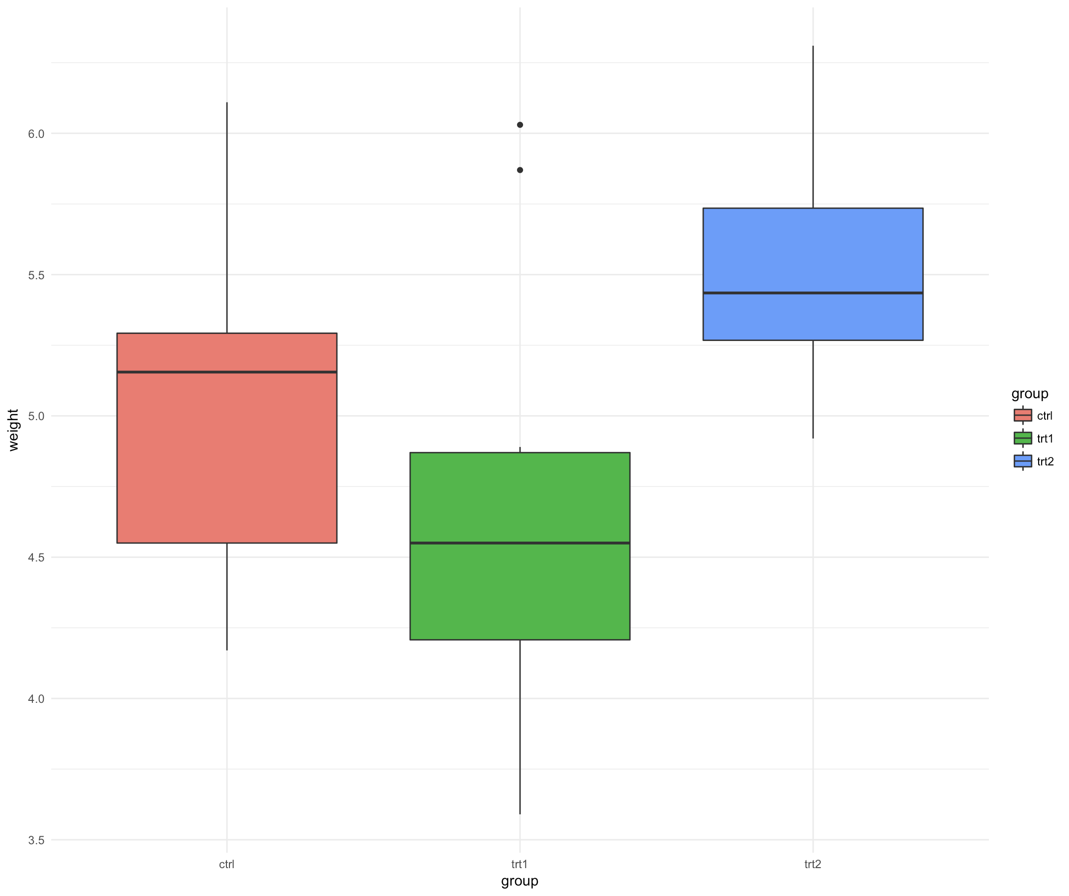
- theme_grey() 背景
- theme_gray() 背景
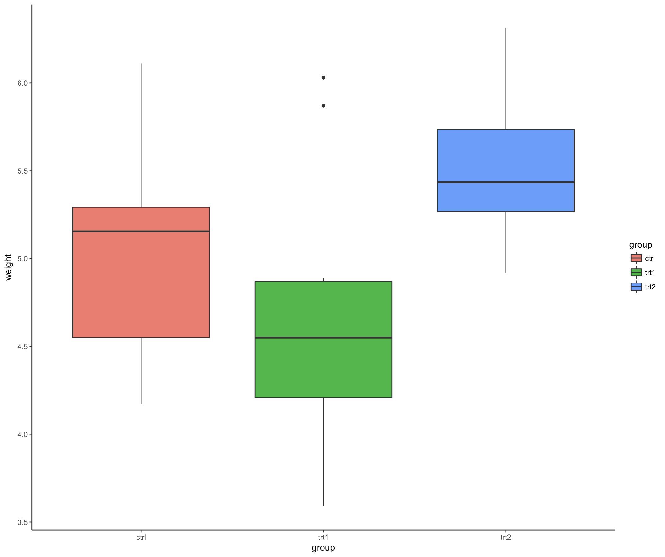
- theme_bw() 背景
- theme_linedraw() 背景
- theme_light() 背景
- ggplot2 包里如何更改背景
- theme_classic() 背景
- theme_dark() 背景
- theme_void() 背景
- 去掉背景仅显示坐标轴
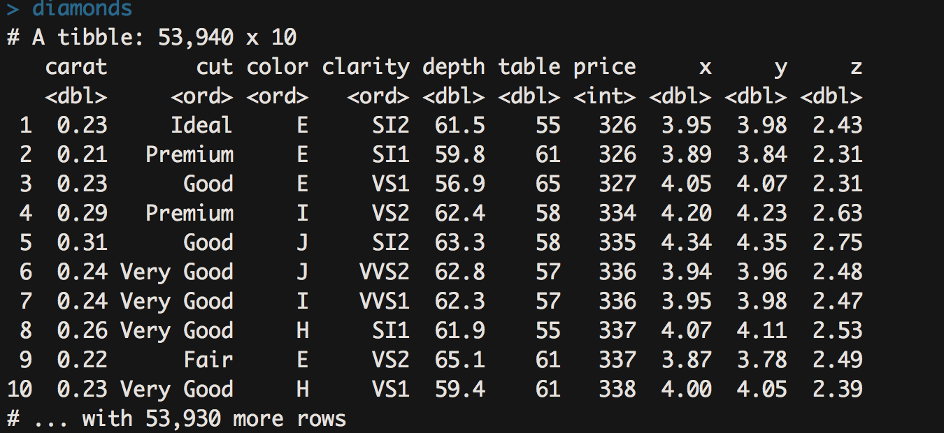
1 基本散点图;200 个正态分布的随机数
- 散点图用于研究两组个变量(x,y)在坐标平面上的关系。
# p 是point
# rnorm(n, mean = 0, sd = 1) 生成随机正态分布的序列
plot(rnorm(200), rnorm(200), type="p")
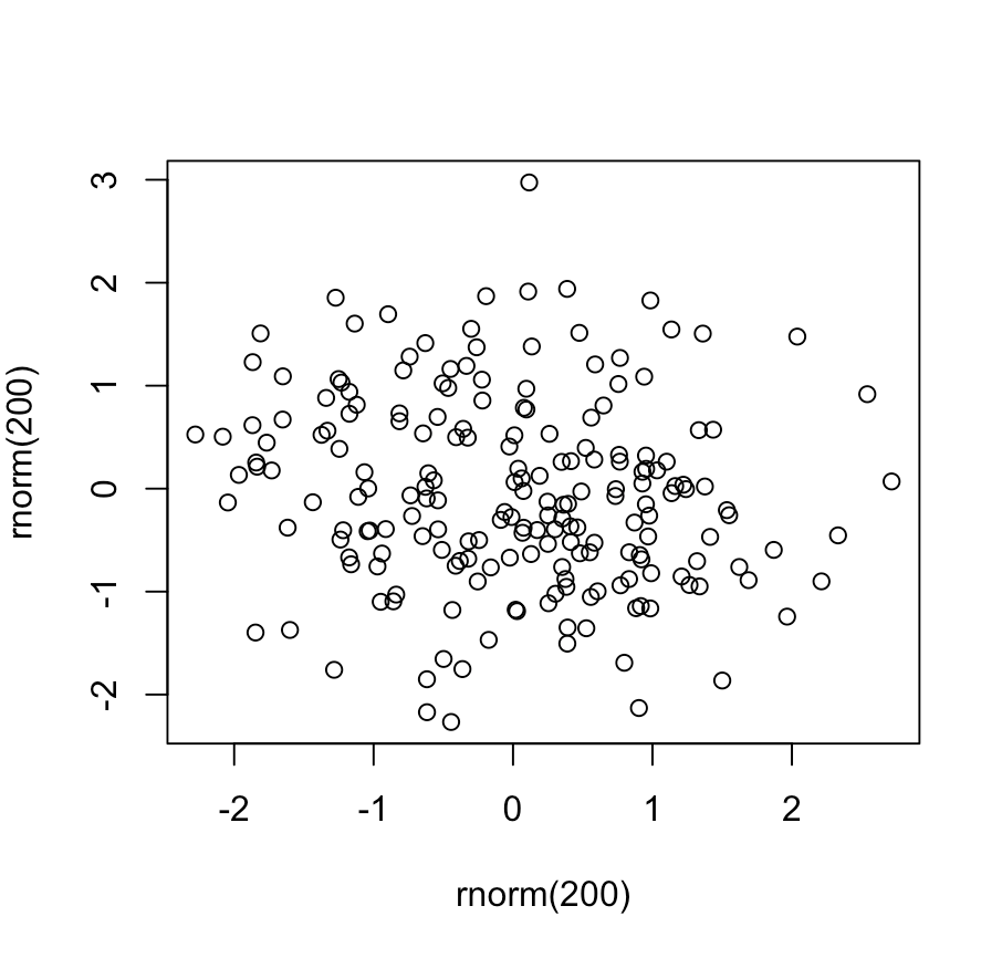
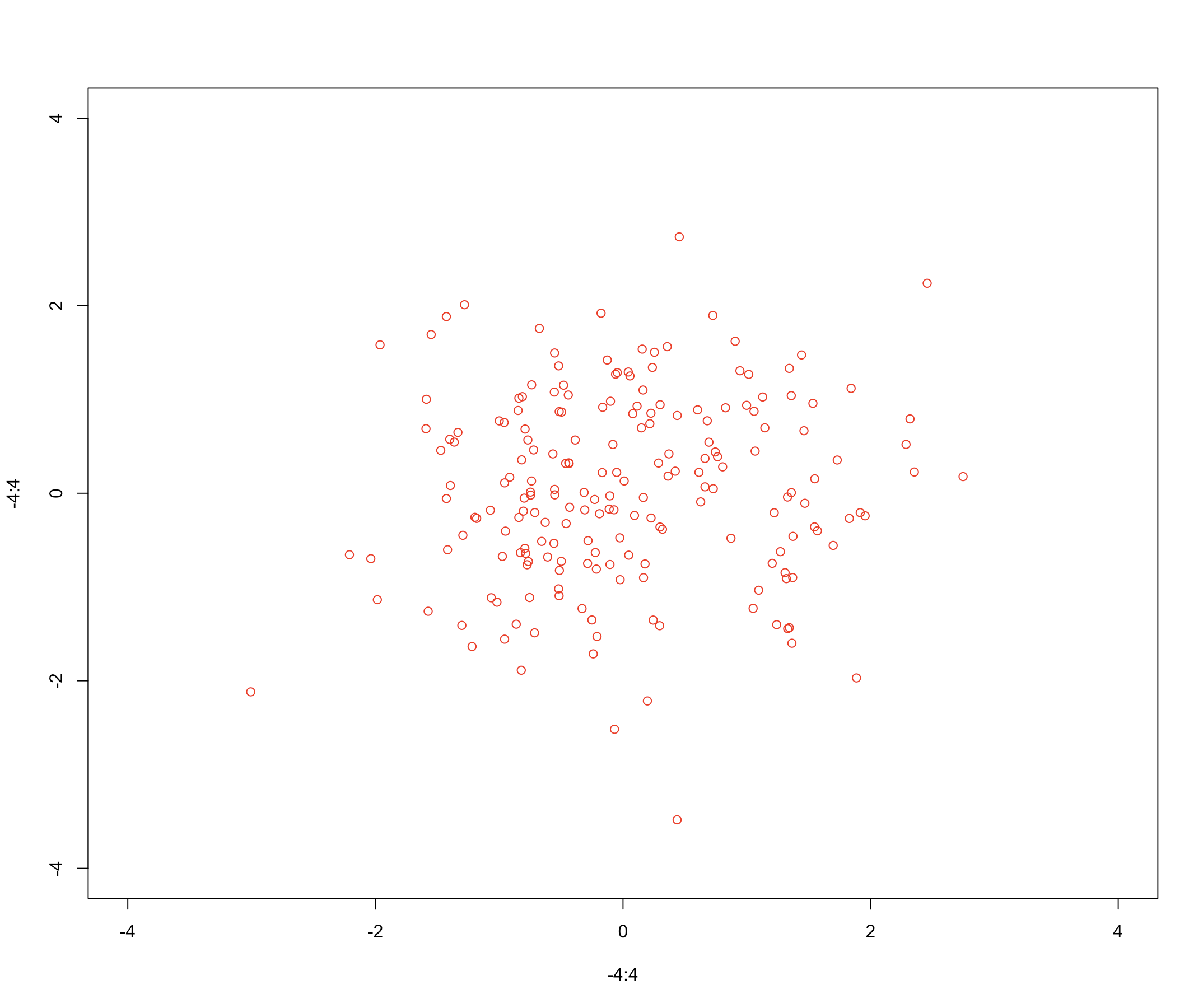
2 point 散点图;200 个正态分布的随机数
# type = "n" 没有对角线的意思
plot(-4:4, -4:4, type = "n")
points(rnorm(200), rnorm(200), col = "red")
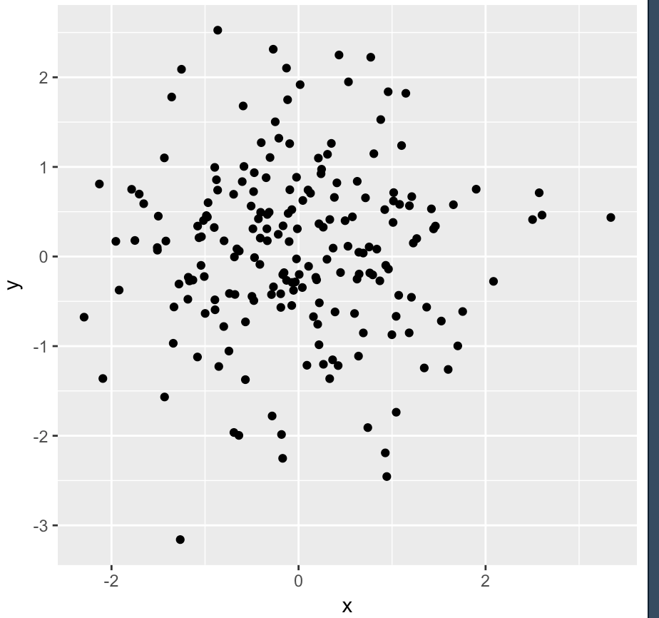
3 geom_point 散点图;200 个正态分布的随机数
library(ggplot2)
df <- data.frame(x=rnorm(200), y=rnorm(200))
ggplot(df, aes(x, y))+geom_point()
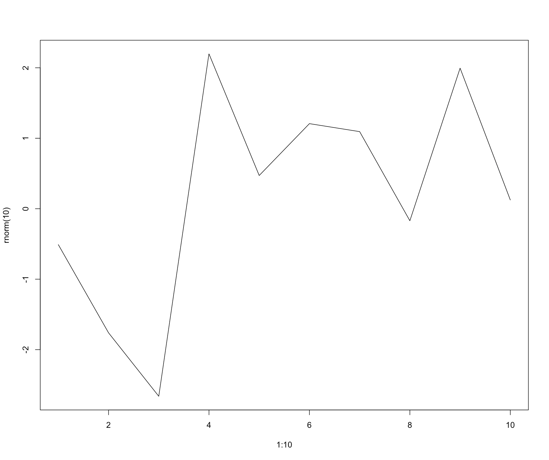
4 基本折线图;10 个正态分布的随机数
- 折线图用于显示随某个变量变化的数据。
# l 是line的意思
plot(1:10, rnorm(10), type="l")
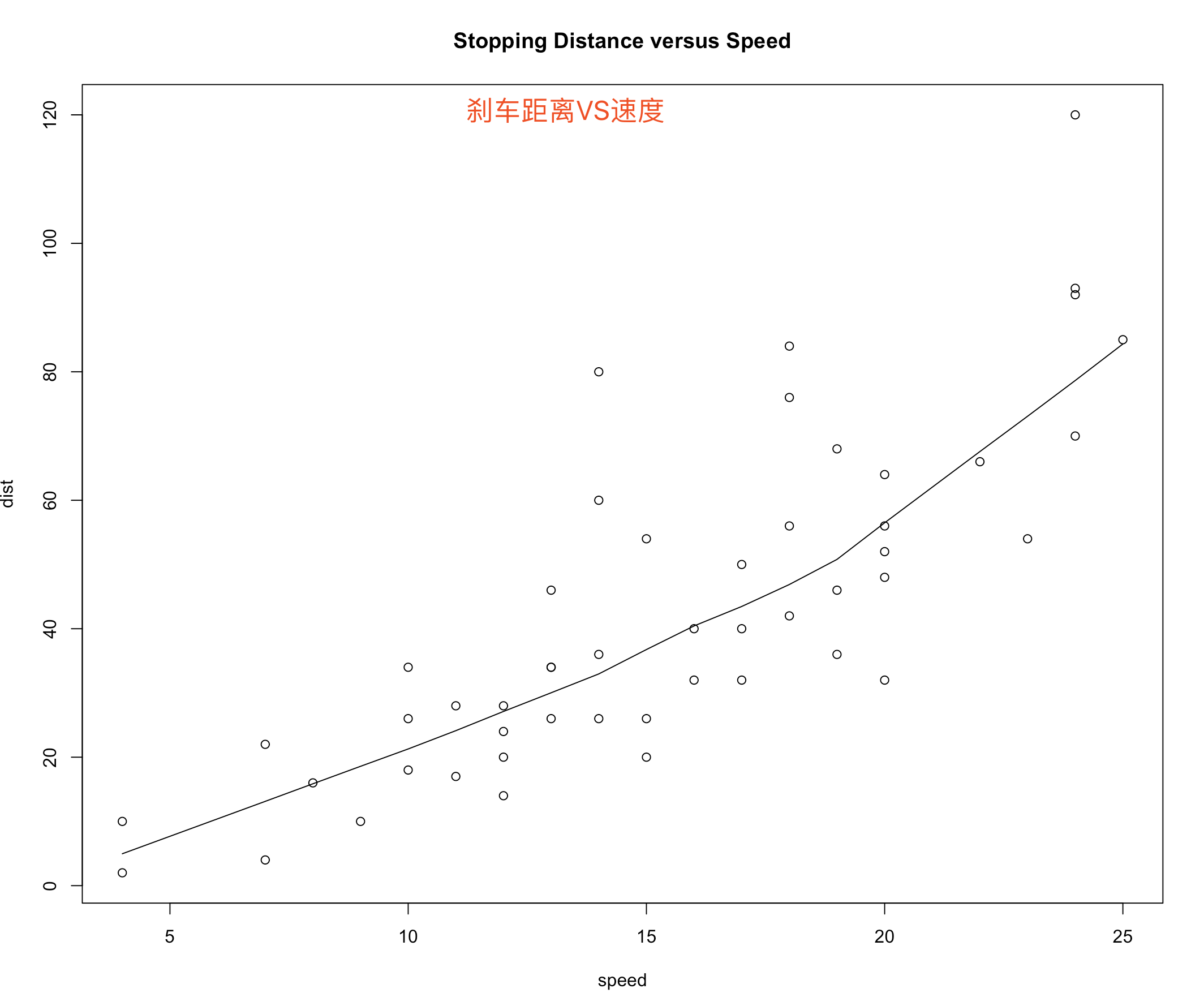
5 lines() 折线图;刹车速度与滑行距离的关系
plot(cars, main = "Stopping Distance versus Speed")
#
lines(stats::lowess(cars))
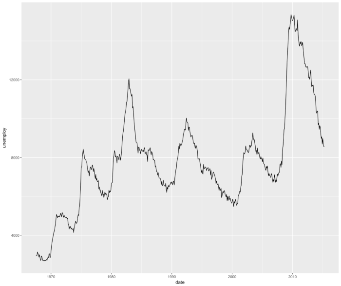
6 geom_line() 连接观测值;美国人口失业情况折线图
ggplot(economics, aes(date, unemploy)) + geom_line()
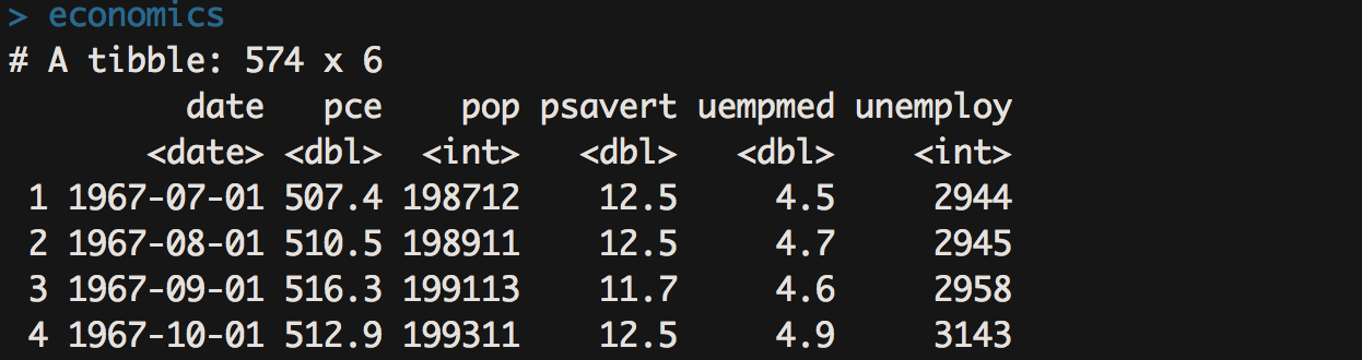
- pce 个人消费支出
- pop 人口
- psavert 个人存款率
- uempmed 每周失业人口中位数
- unemploy 失业人口

7 barplot() 基本条形图;统计泊松分布随机数
- 条形图主要描述一组样本之间某个变量的差异情况。
# 生成 100 个服从泊松分布 λ = 5 的随机数,并对随机数做列联表统计,条形图展示了列联表统计的结果。
tN <- table(Ni <- stats::rpois(100, lambda = 5))
barplot(tN, col = rainbow(20))
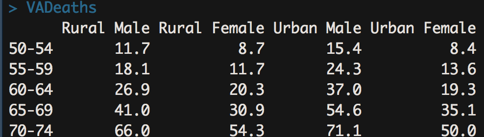
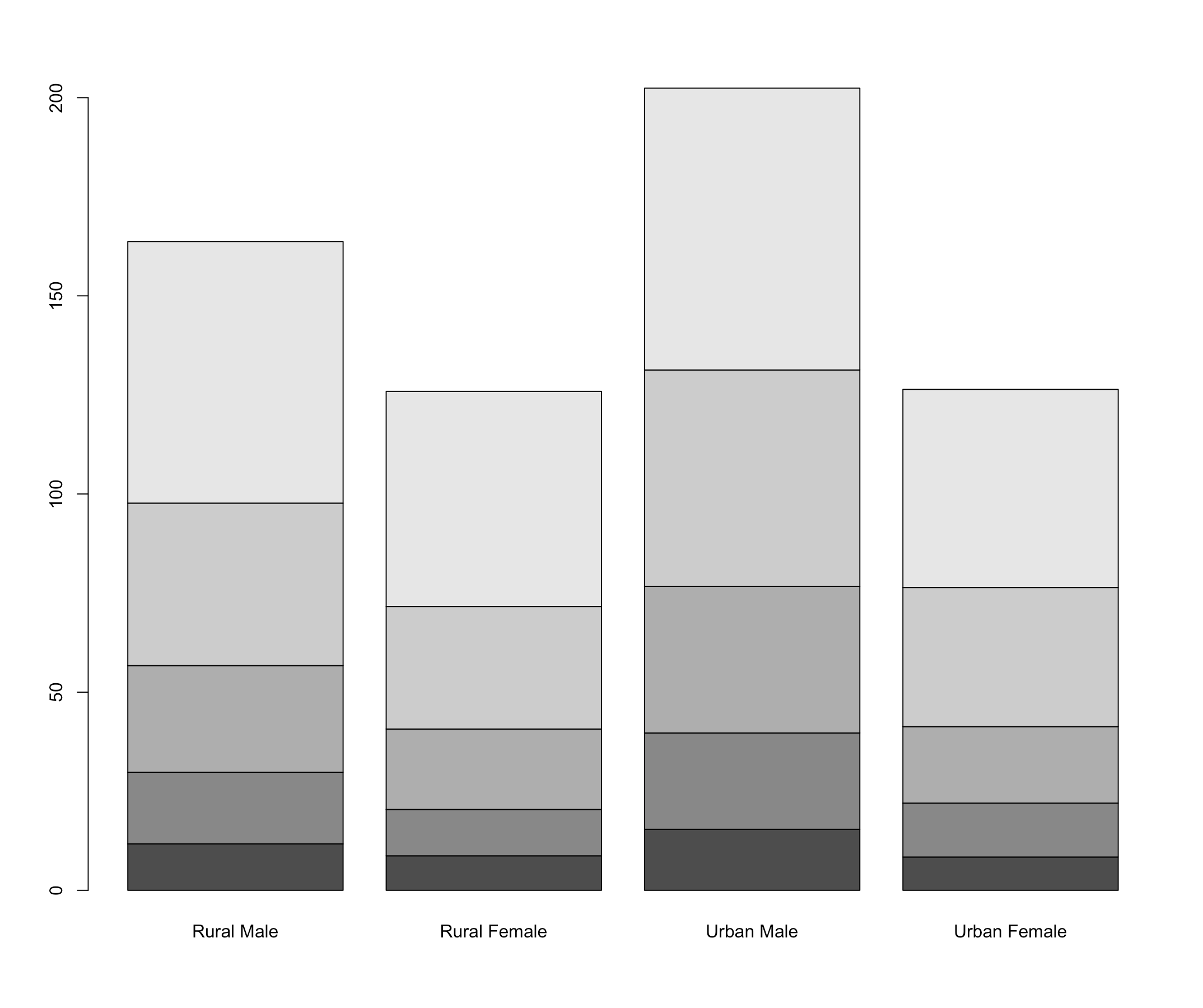
8 barplot() 堆栈式条形图;分年龄的人口信息被叠加在一起
barplot(VADeaths)
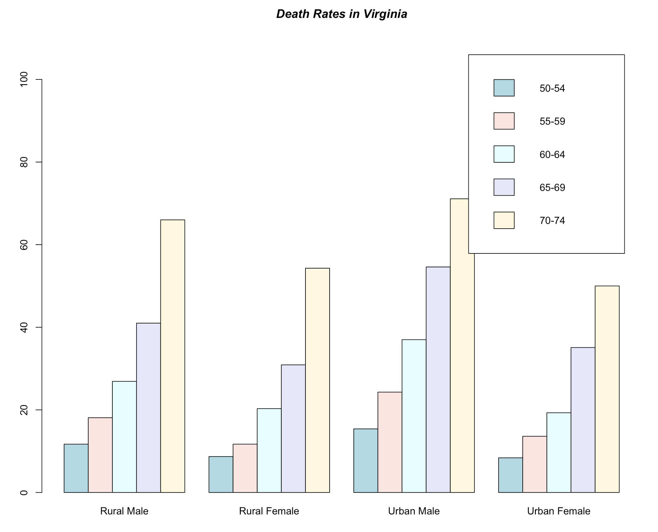
9 barplot() 按分类依次排列的条形图
barplot(VADeaths, beside = TRUE,
        col = c("lightblue", "mistyrose", "lightcyan",
                "lavender", "cornsilk"),
        legend = rownames(VADeaths), ylim = c(0, 110))
title(main = "Death Rates in Virginia", font.main = 4)
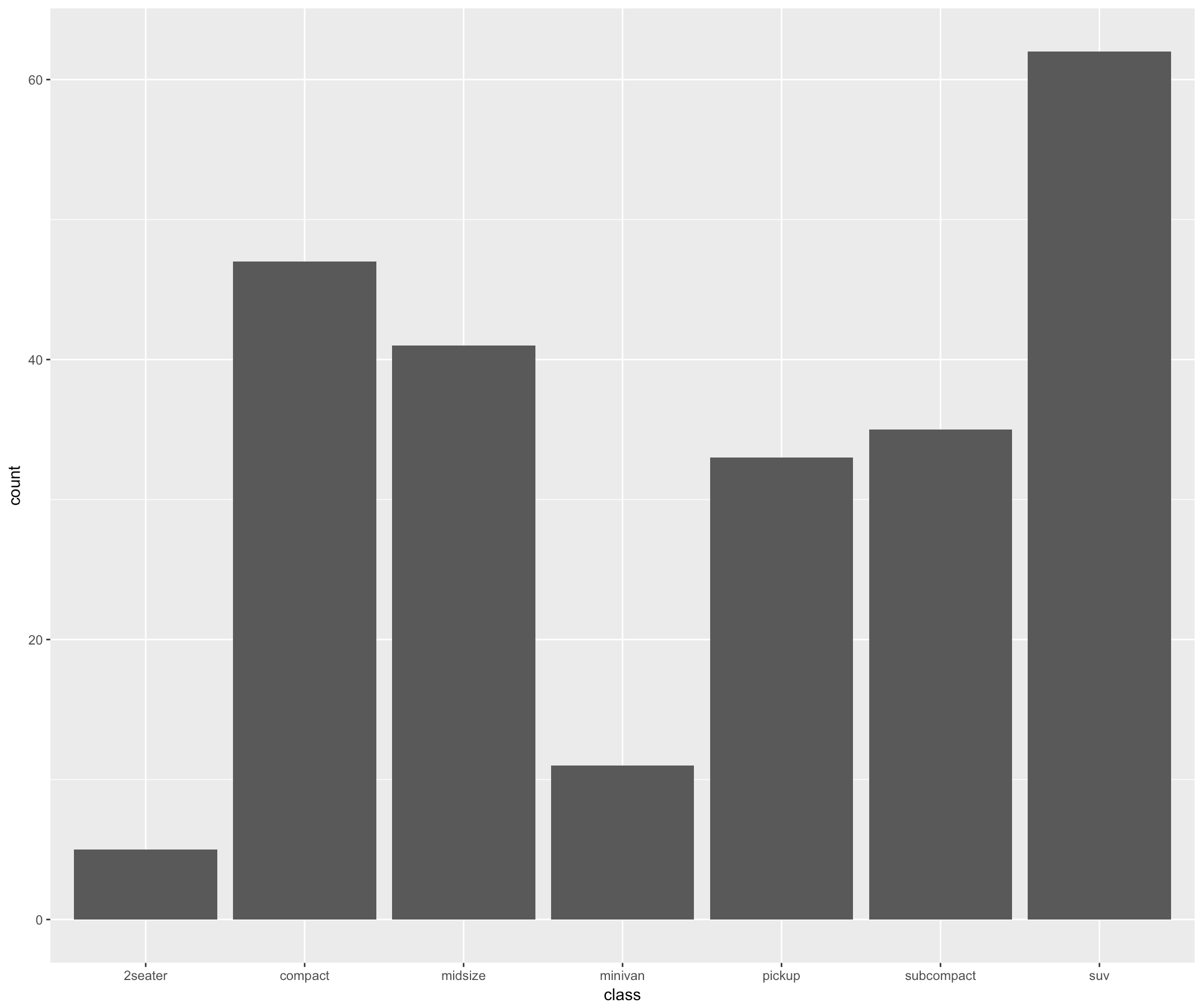
10 geom_bar() 基本条形图
library(ggplot2)
ggplot(mpg, aes(class))+geom_bar()
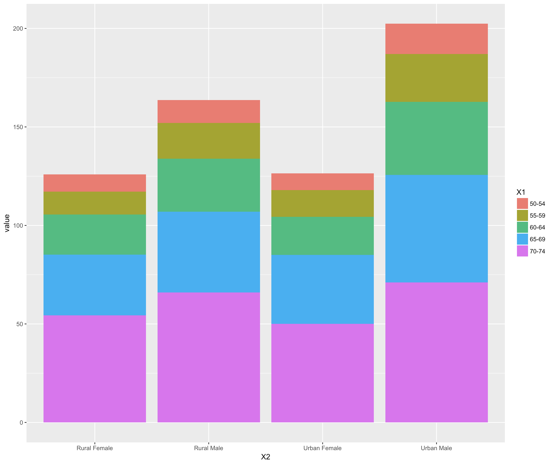
11 geom_bar() 堆栈式条形图
- melt函数对宽数据进行处理,得到长数据;
- identity 不调整位置
library(ggplot2)
library(reshape)
ggplot(data=melt(VADeaths), aes(x=X2, y=value, fill=X1)) + geom_bar(stat="identity")
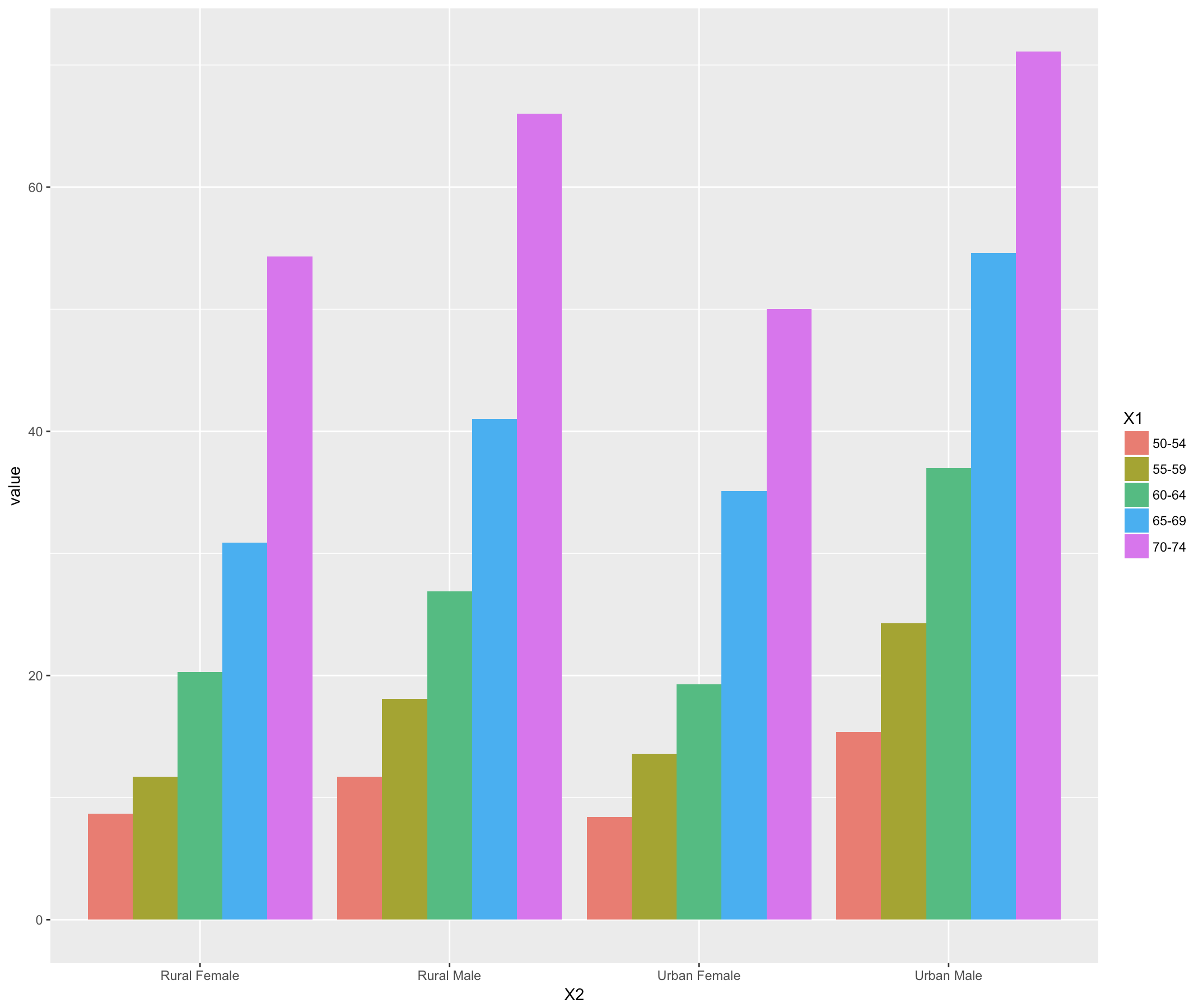
12 geom_bar() 依次排列式条形图
- dodge 躲闪
ggplot(data=melt(VADeaths), aes(x=X2, y=value, fill=X1)) + geom_bar(stat="identity", position="dodge")
13 geom_bar() 比列式条形图
ggplot(data=melt(VADeaths), aes(x=X2, y=value, fill=X1)) + geom_bar(stat="identity", position="fill")

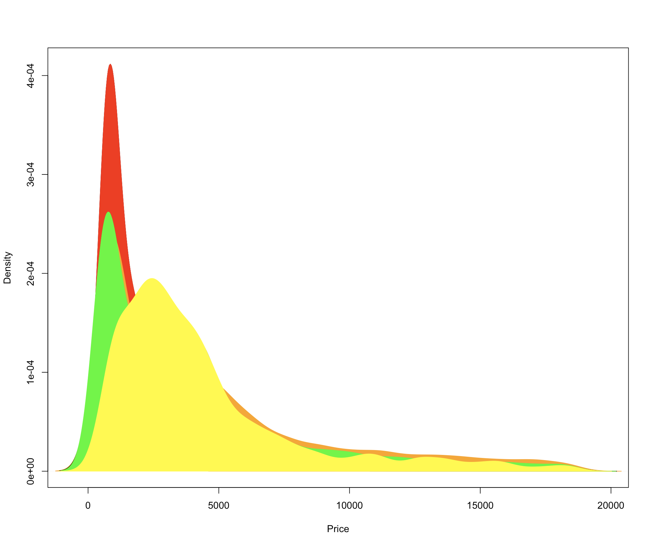
14 polygon() 密度图
- 面积图表示一个连续变量的变化程度,同时也展示了部分与整体之间的关系。
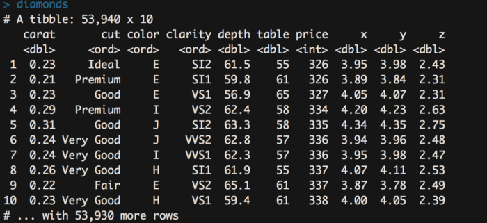
- 这次我们用个钻石相关的数据来做展示,这个数据集合包含了 54000 个钻石的 价格以及其他相关指标。
d <- density(diamonds[diamonds$cut=="Ideal",]$price)
plot(d,main="",xlab = "Price")
polygon(d, col="red",border = "red")
d <- density(diamonds[diamonds$cut=="Premium",]$price)
polygon(d, col="orange",border = "orange")
d <- density(diamonds[diamonds$cut=="Good",]$price)
polygon(d, col="black",border = "black")
d <- density(diamonds[diamonds$cut=="Very Good",]$price)
polygon(d, col="green",border = "green")
d <- density(diamonds[diamonds$cut=="Fair",]$price)
polygon(d, col="yellow",border ="yellow")
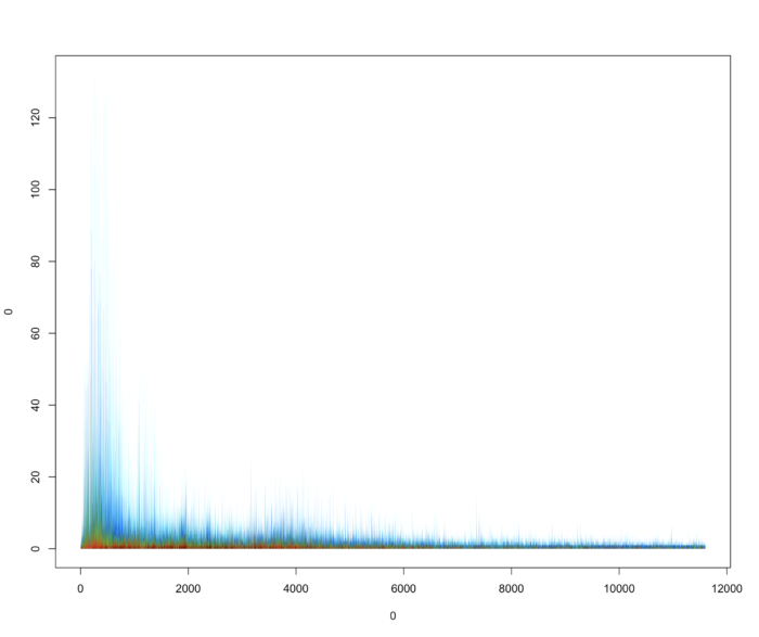
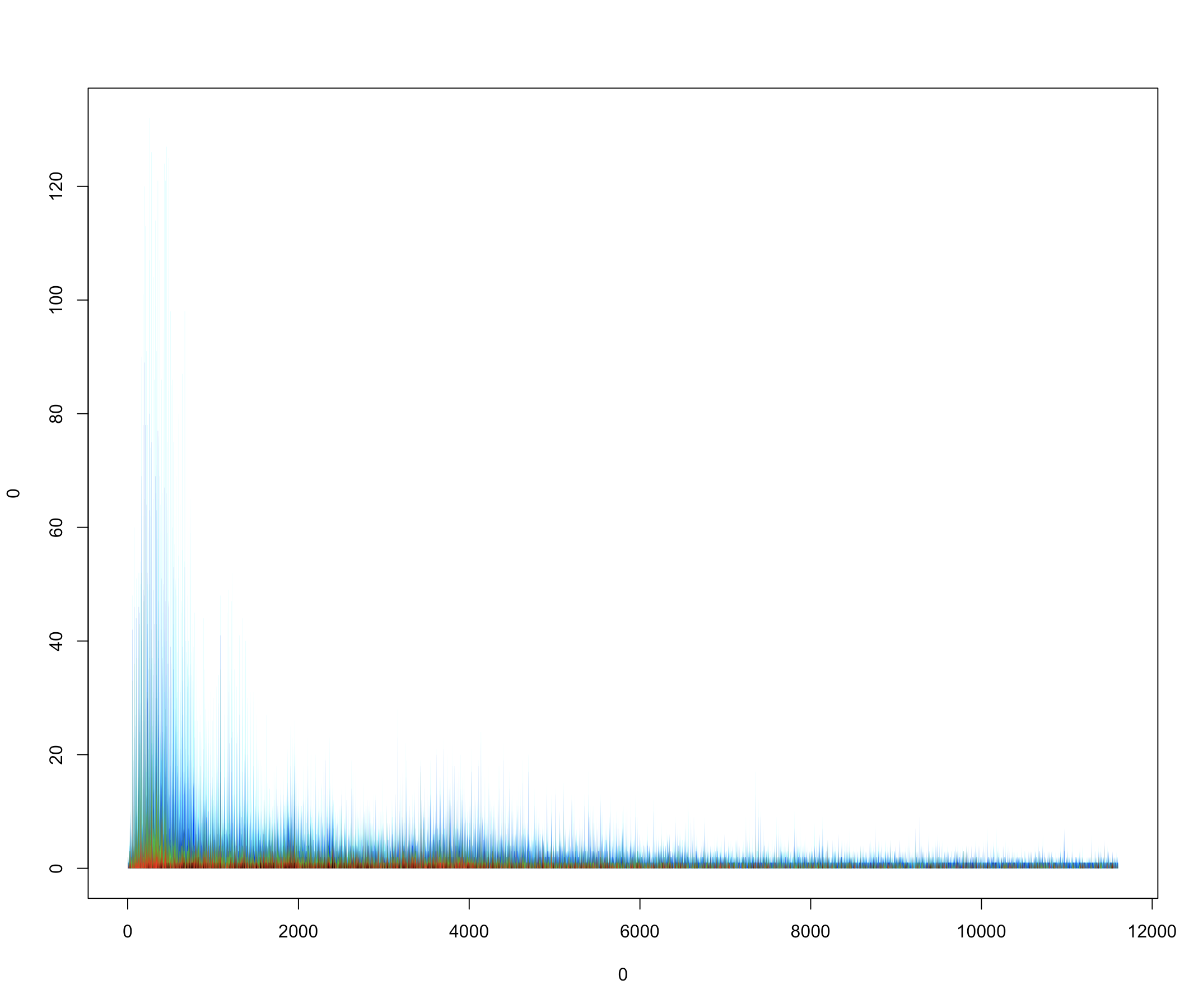
15 polygon() 面积堆积图
stackedPlot <- function(data, time=NULL, col=1:length(data), ...){
  if (is.null(time))
    time <- 1:length(data[[1]]);
  plot(0, 0, xlim = range(time), ylim = c(0,max(rowSums(data))), t="n", ...);
  for (i in length(data):1) {
  # Die Summe bis zu aktuellen Spalte
  prep.data <- rowSums(data[1:i]);
  # Das Polygon muss seinen ersten und letzten Punkt auf der Nulllinie haben
  prep.y <- c(0, prep.data, 0)
  prep.x <- c(time[1], time, time[length(time)])
  polygon(prep.x, prep.y, col=col[i], border = NA);
  }
}
diamonds.data <- as.data.frame.matrix(t(table(diamonds$cut,diamonds$price)))
stackedPlot(diamonds.data)
- 这张图好美
16 geom_area() 堆积面积图
ggplot(diamonds, aes(x = price, fill = cut))+ geom_area(stat = "bin")

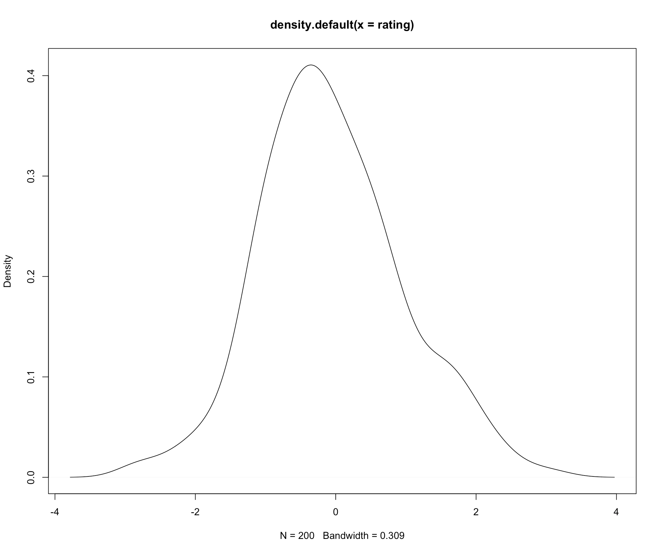
17 密度估计图
- 取 200 个正态分布的随机数,画其密度估计图像。
set.seed(1234)
rating <- rnorm(200)
plot(density(rating))
18 两个核密度估计图
- 在一张画布上画两个密度图,直接叠加就可以。
set.seed(1234)
rating <- rnorm(200)
rating2 <- rnorm(200, mean=.8)
plot(density(rating))
lines(density(rating2),col="red")

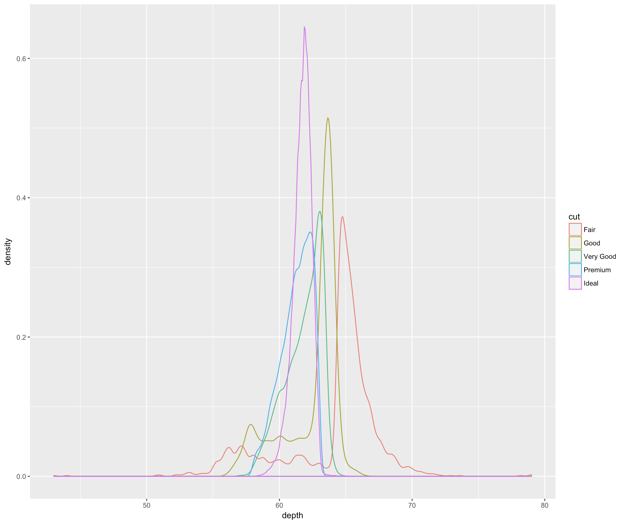
19 geom_density() 核密度估计图
ggplot(diamonds, aes(depth, colour = cut)) + geom_density()
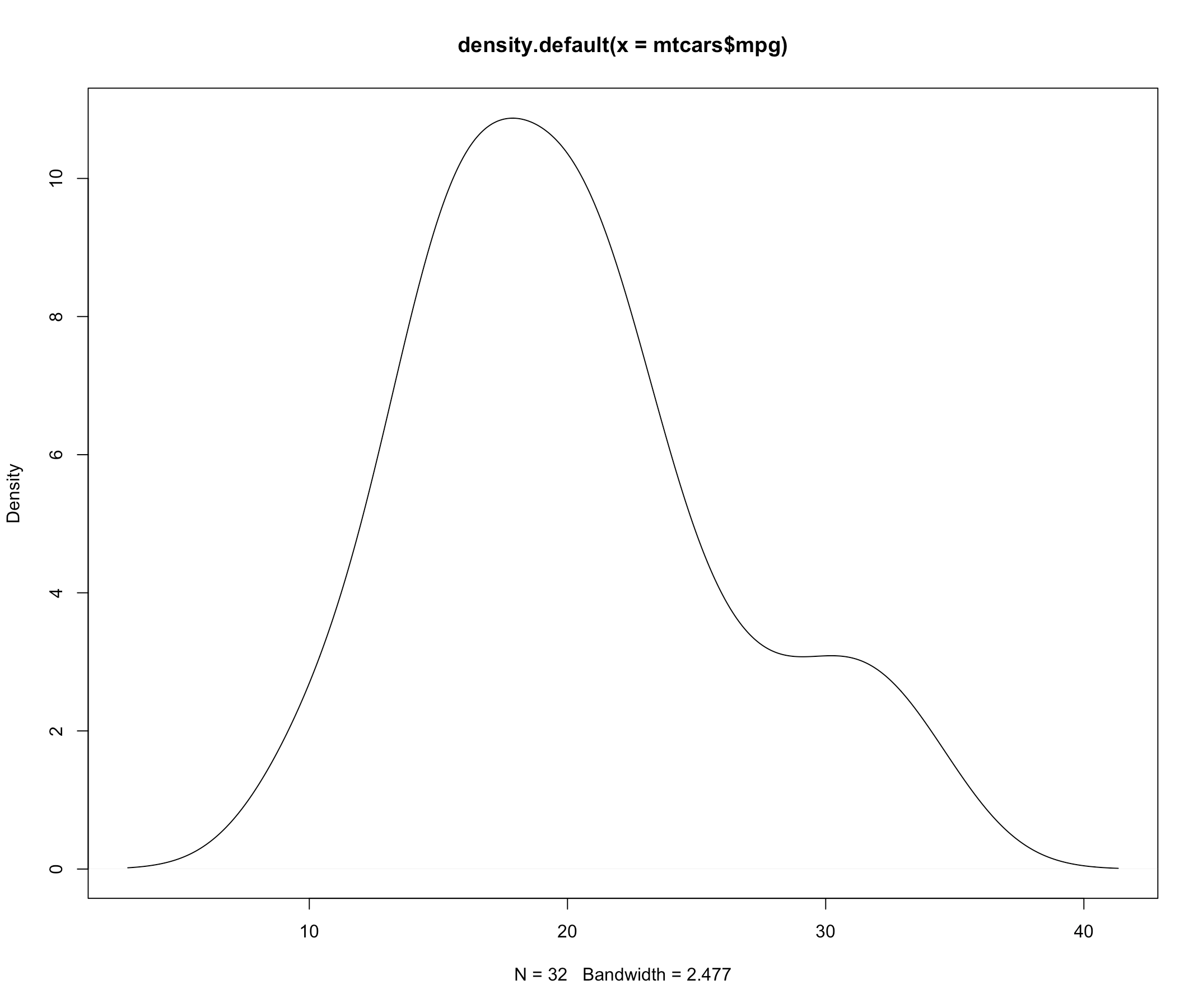
20 用 Graphics 函数画频率图
- 频率图像同密度函数图像的区别是:前者统计出现的频数,后者统计概率密度函数。从图中直观的反应就是纵坐标的单位不一样。
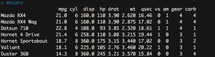
- mtcats 数据是 1974 年 Motor Trend 杂志 所刊登的一组 32 不同种类的汽车耗油量和其他特征信息
myhist <- hist(mtcars$mpg,plot = FALSE)
multiplier <- myhist$counts / myhist$density
mydensity <- density(mtcars$mpg)
mydensity$y <- mydensity$y * multiplier[1]
plot(mydensity)
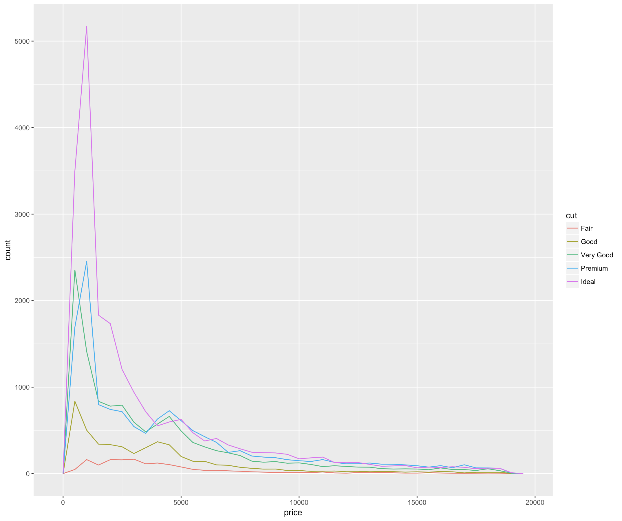
21 geom_freqpoly() 频率图
ggplot(diamonds, aes(price, colour = cut)) + geom_freqpoly(binwidth = 500)
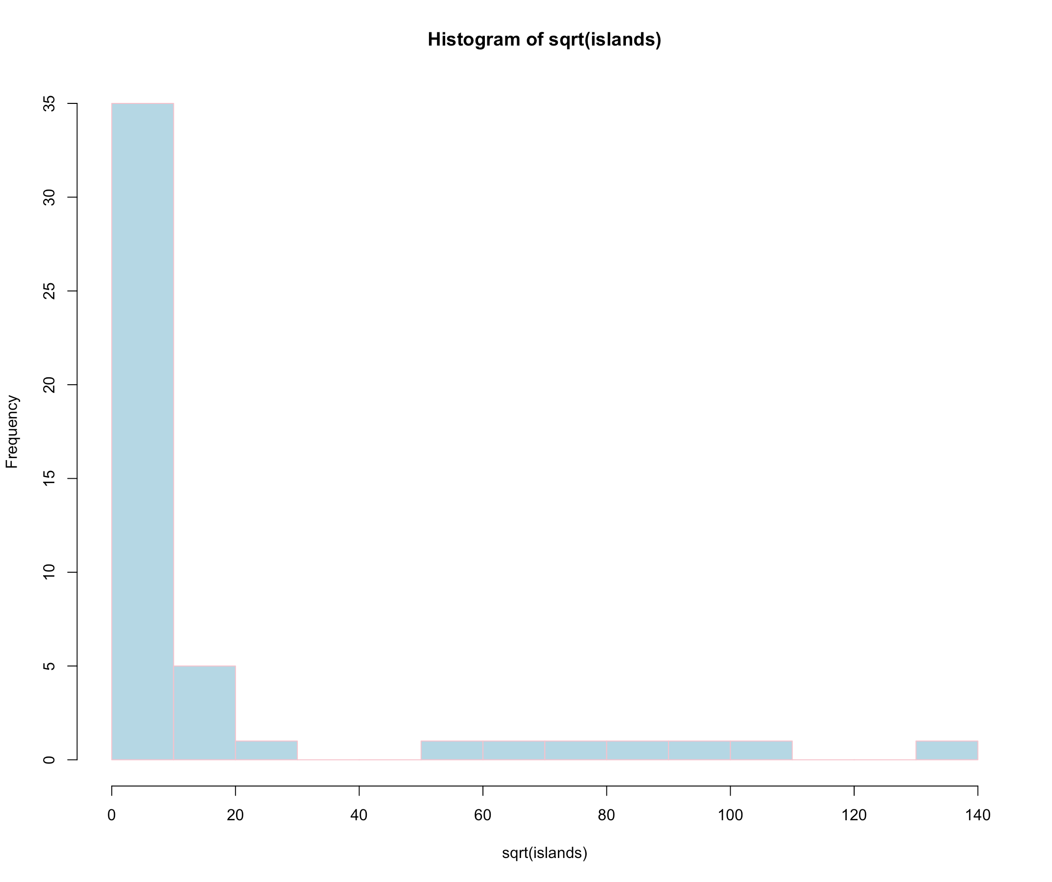
22 hist() 直方图
- 直方图是一种对数据分布情况的图形表示,它的样子同条形图相似,但直方图是 用面积而并非单一的高度来表示数量(同分布相关的图,都是用面积来表示数量)。
- 我们用世界主要大陆地区的数据来做演示,islands 数据统计了主要大陆和岛屿的面积信息
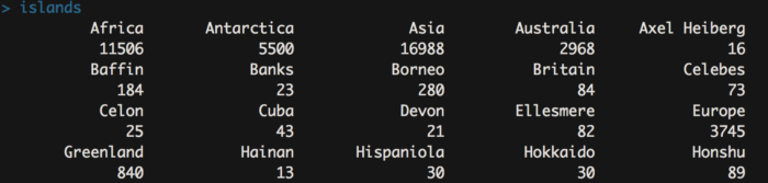
hist(sqrt(islands), breaks = 12, col = "lightblue", border = "pink")
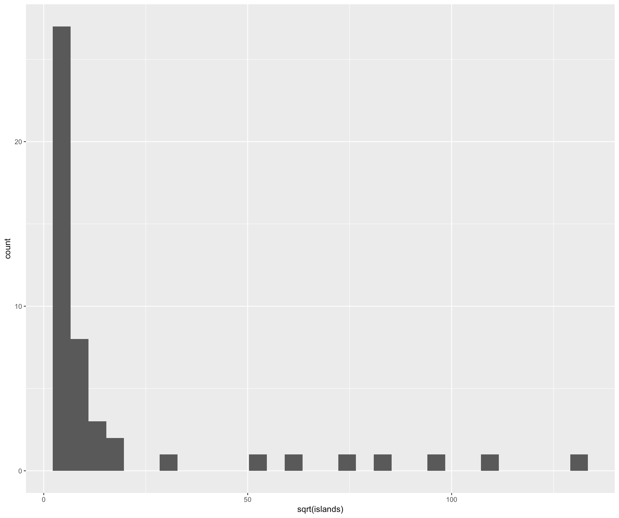
23 geom_hist() 直方图
ggplot(as.data.frame(islands), aes(sqrt(islands))) + geom_histogram()
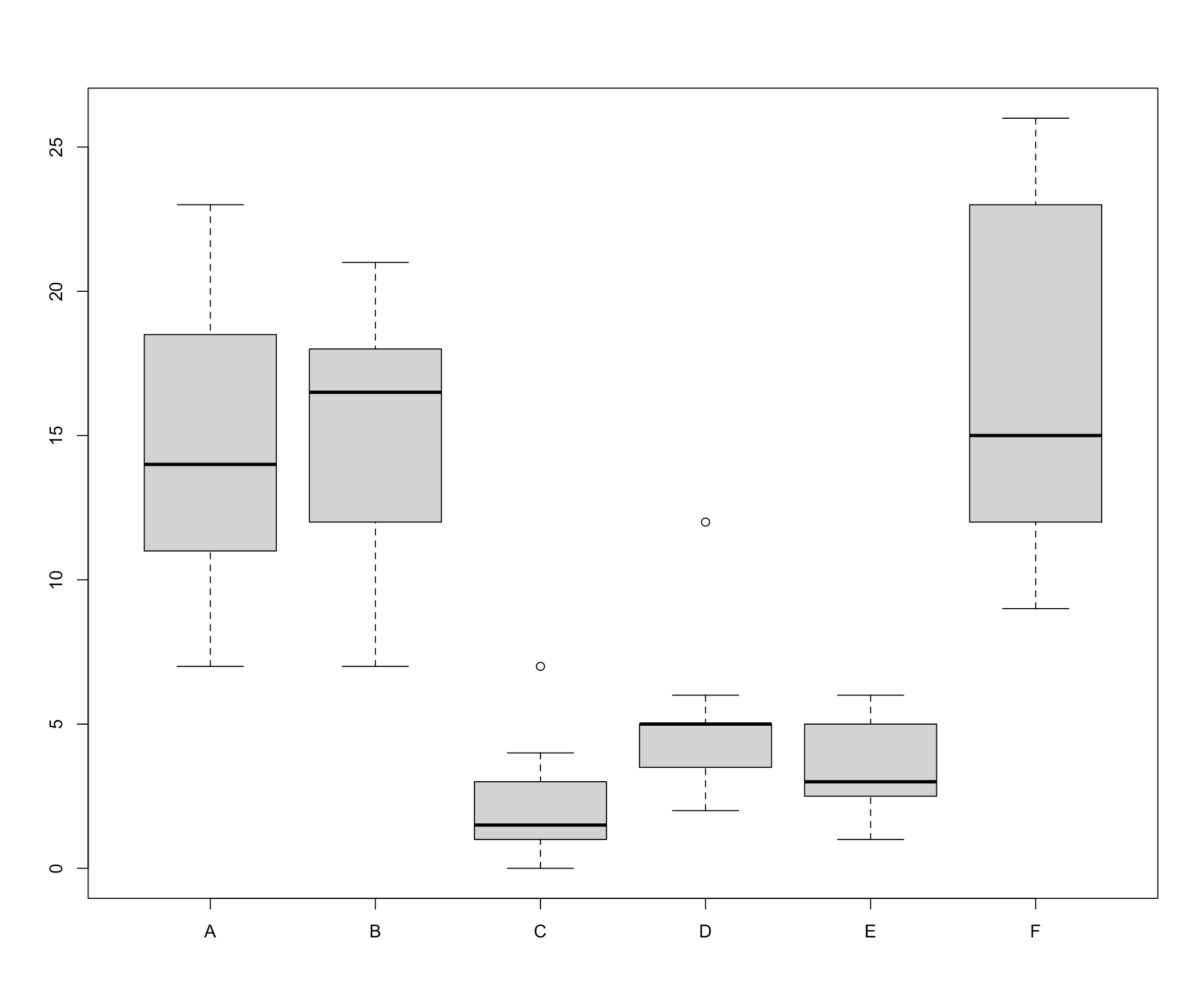
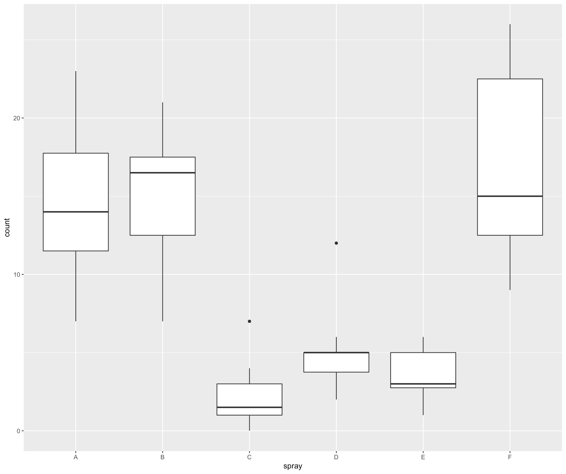
24 boxplot() 箱线图
- 箱线图是利用数据中的五个统计量(从下往上依次是):最小值、第一四分位数、 中位数、第三四分位数与最大值来描述数据的一种方法,它也可以粗略地看出数据是否具有有对称性,分布的分散程度等信息,特别可以用于对几个样本的比较。
- 第一列是昆虫数量,第二列是喷 雾器种类。
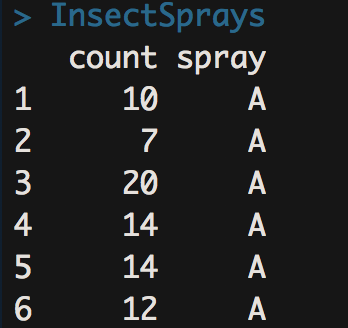
boxplot(count ~ spray, data = InsectSprays, col = "lightgray")
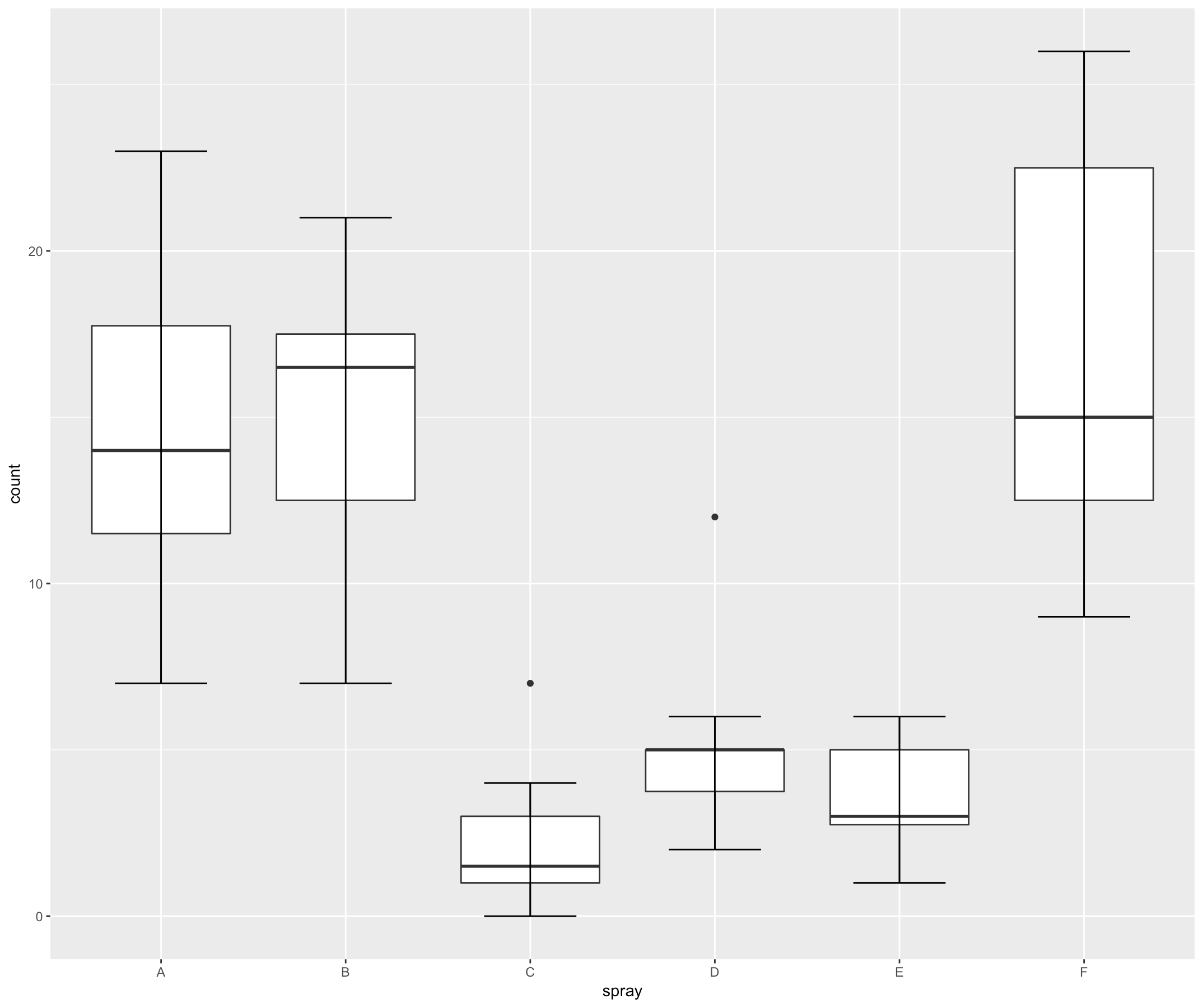
25 geom_boxplot() 箱线图
ggplot(InsectSprays, aes(spray, count))+geom_boxplot()
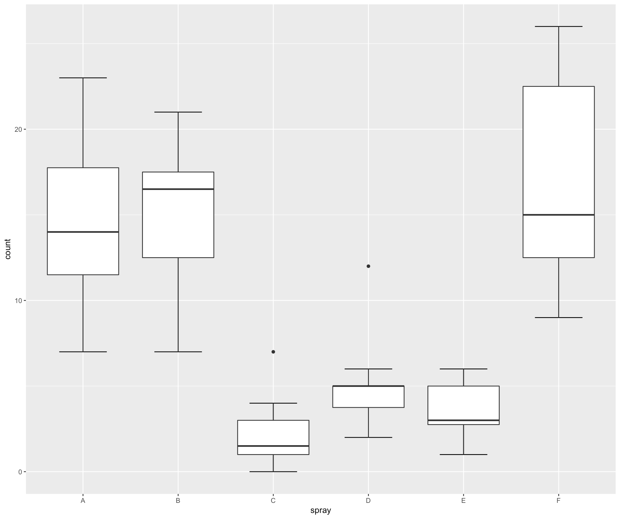
26 错误的 error bar 箱线图
ggplot(InsectSprays, aes(spray, count))+ geom_boxplot()+
  stat_boxplot(geom ='errorbar',width=0.5)
27 带 error bar 的箱线图
- 正确的绘图方法时先画 error bar,再画箱线图。(注意下面代码的顺序)
ggplot(InsectSprays, aes(spray, count))+ stat_boxplot(geom ='errorbar',width=0.5)+ geom_boxplot()
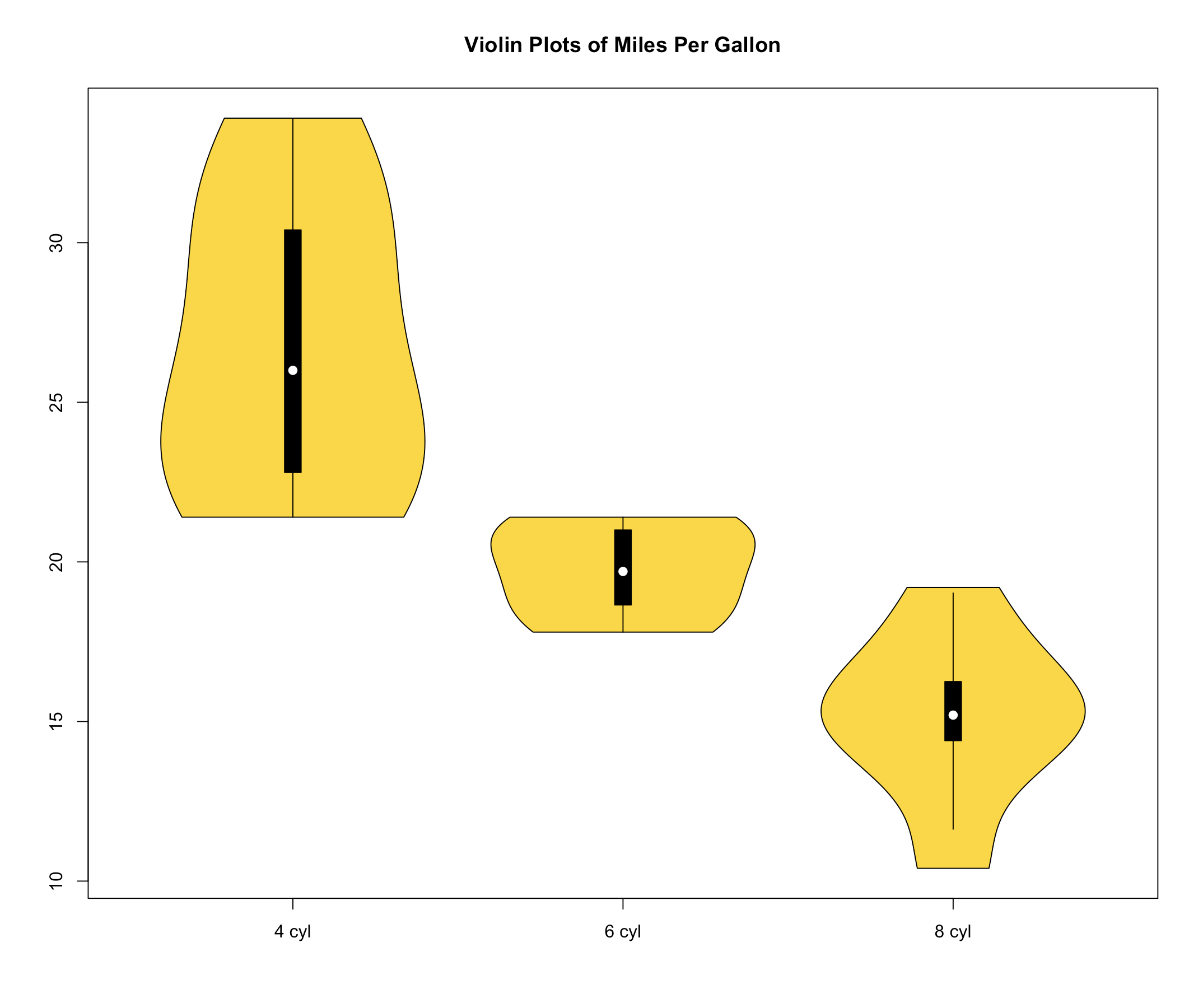
28 vioplot() 提琴图
- 提琴图展示了数据的密度估计情况,同箱线图类似。但是箱线图只是展示了分位 数的位置,而提琴图展示了任意位置的数据密度。
install.packages("vioplot")
library(sm)
library(vioplot)
x1 <- mtcars$mpg[mtcars$cyl==4]
x2 <- mtcars$mpg[mtcars$cyl==6]
x3 <- mtcars$mpg[mtcars$cyl==8]
vioplot(x1, x2, x3, names=c("4 cyl", "6 cyl", "8 cyl"),col="gold")
title("Violin Plots of Miles Per Gallon")
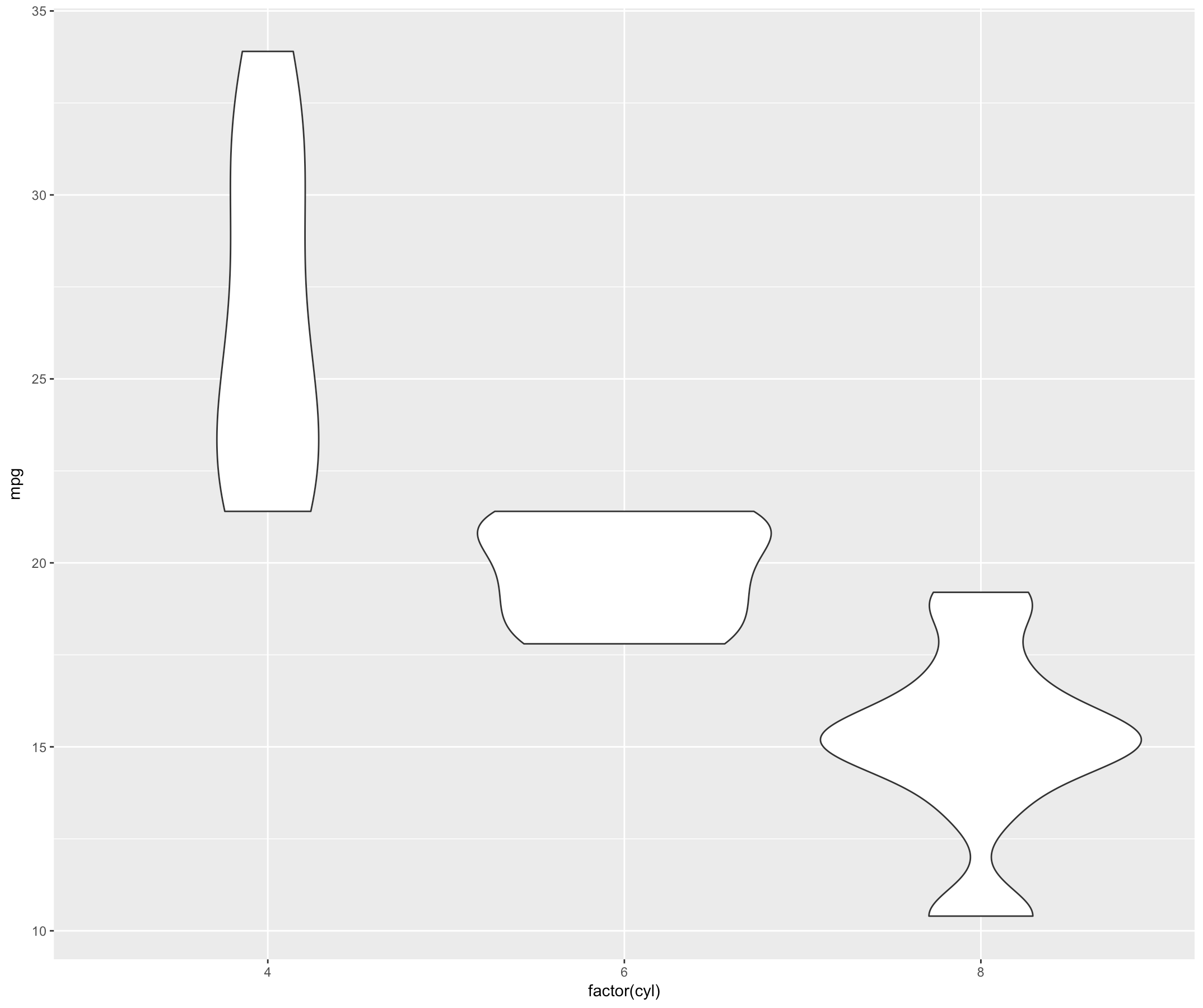
29 geom_violin() 提琴图
ggplot(mtcars, aes(factor(cyl), mpg))+ geom_violin()
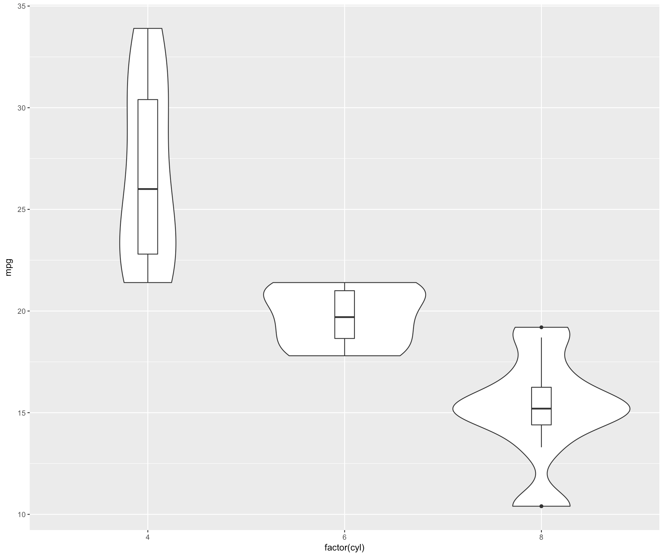
30 添加箱线图信息的提琴图
ggplot(mtcars, aes(factor(cyl), mpg))+ geom_violin()+ geom_boxplot(width=.1)
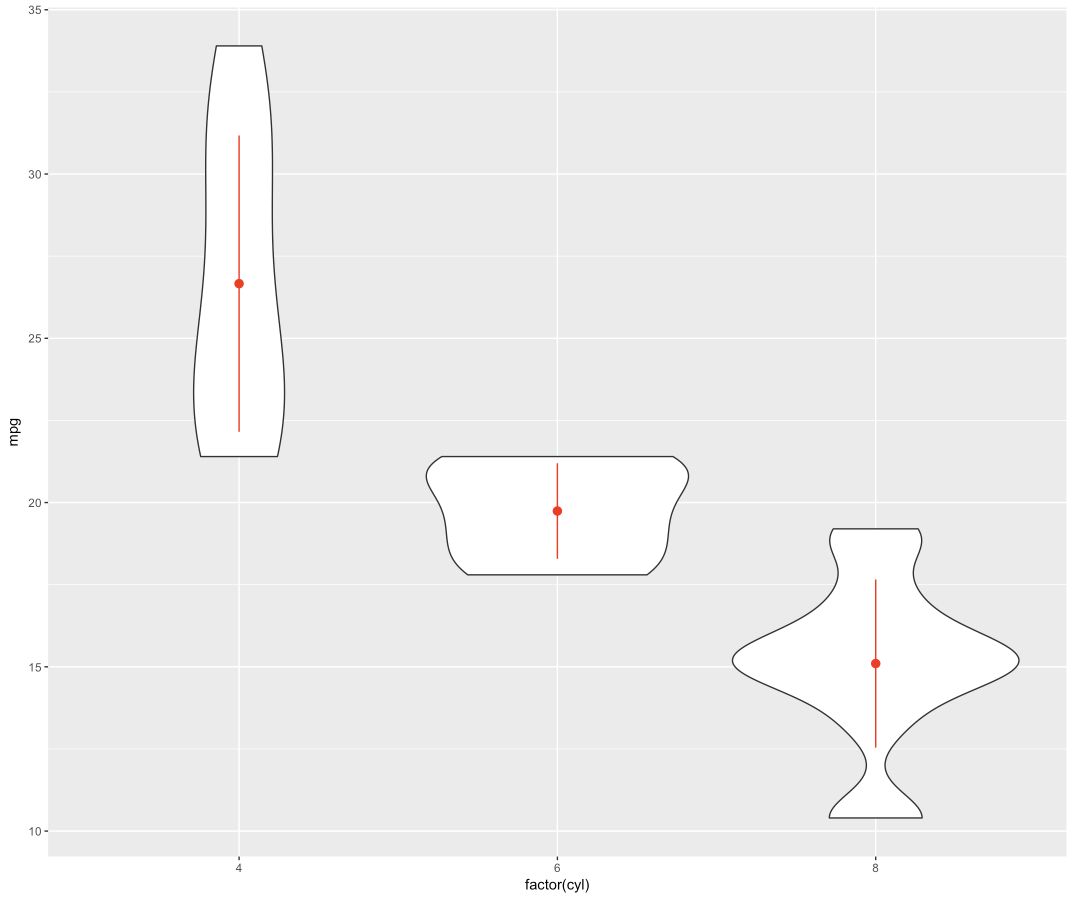
31 添加均值和标准差信息的提琴图
ggplot(mtcars, aes(factor(cyl), mpg))+ geom_violin()+ stat_summary(fun.data = mean_sdl,
                                                                   geom = "pointrange",
                                                                   color = "red",
                                                                   fun.args = list(mult = 1))
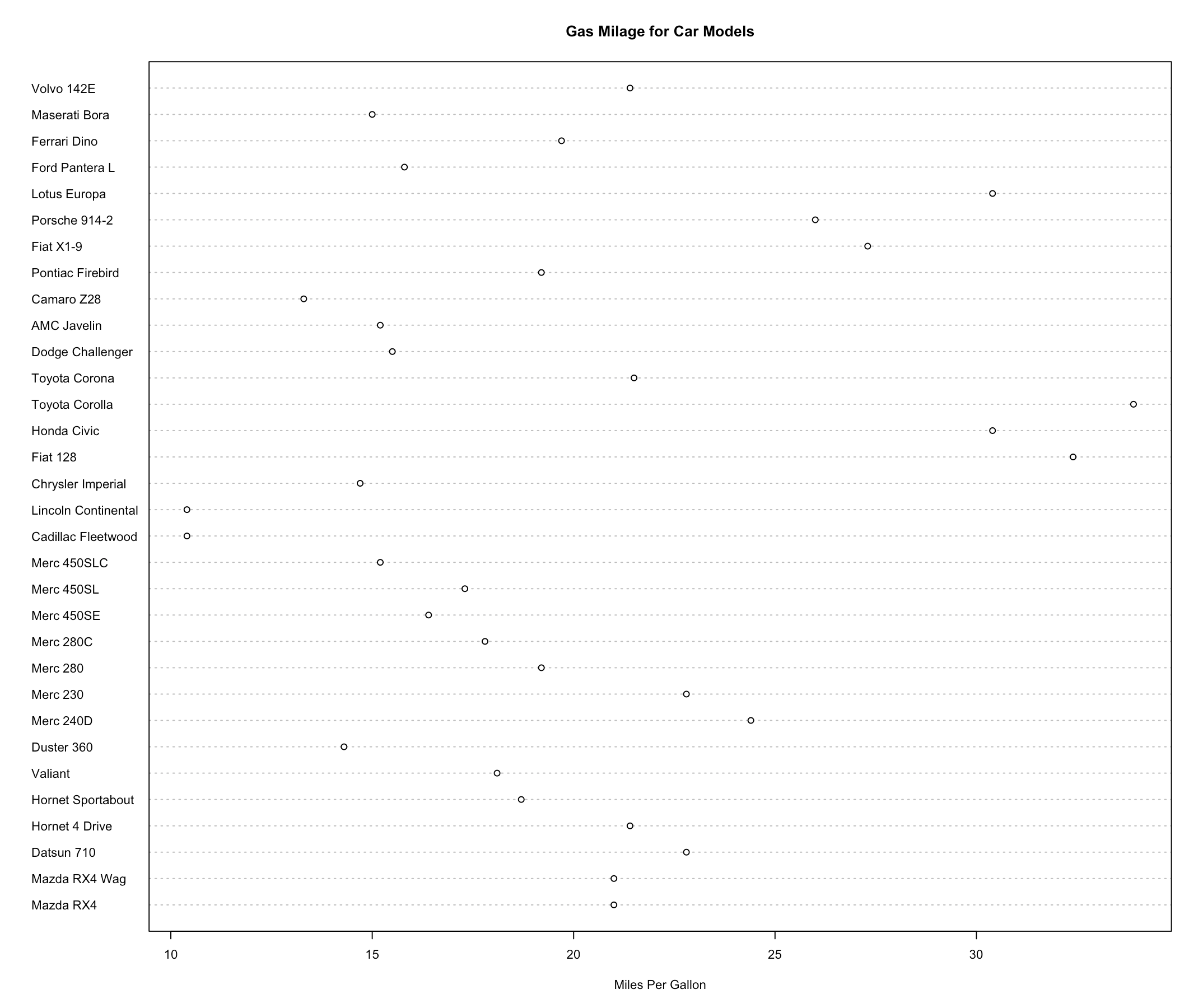
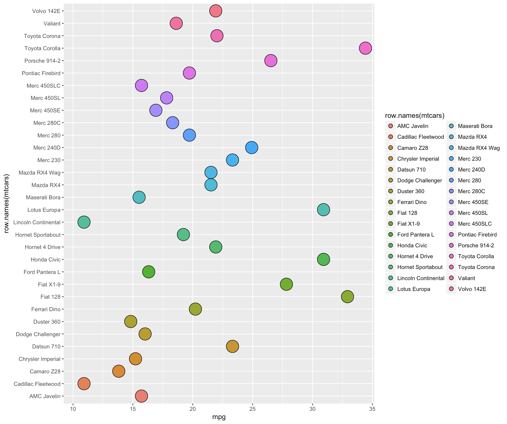
32 dotchart() 绘制 Cleveland 点图
- Cleveland 点图用于绘制有分类别的数据信息。
dotchart(mtcars$mpg,labels=row.names(mtcars),cex=.7, main="Gas Milage for Car Models",
         xlab="Miles Per Gallon")
33 geom_dotplot() 绘制 Cleveland 点图
ggplot(mtcars,aes(x = mpg,y = row.names(mtcars), fill =row.names(mtcars))) + geom_dotplot(binaxis = "y",
                                                                                          stackgroups = TRUE,
                                                                                          binwidth = 1,
                                                                                          method = "histodot")
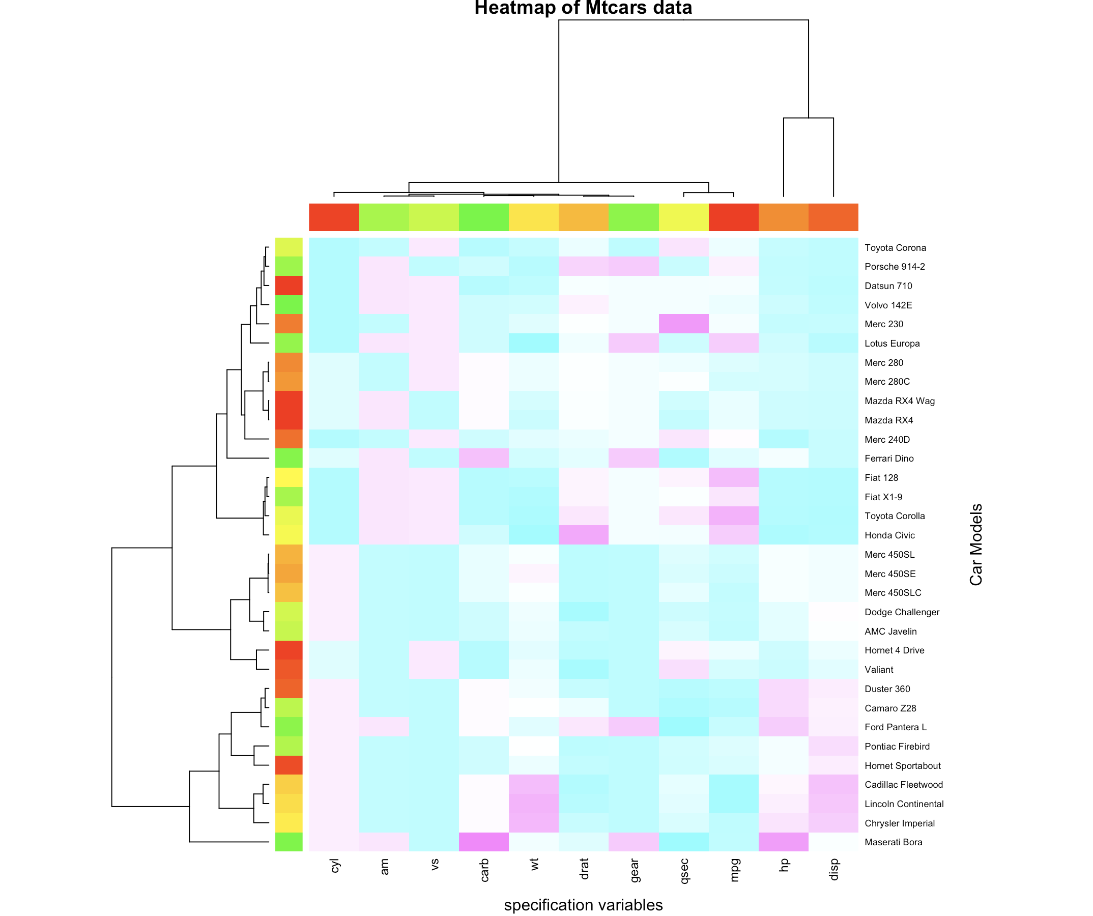
34 用 heatmap() 绘制热图
x <- as.matrix(mtcars)
rc <- rainbow(nrow(x), start = 0, end = .3)
cc <- rainbow(ncol(x), start = 0, end = .3)
hv <- heatmap(x,
                col = cm.colors(256),
                scale = "column",
                RowSideColors = rc, ColSideColors = cc,
                margins = c(5,10),
                xlab = "specification variables", ylab = "Car Models",
                main = "Heatmap of Mtcars data")
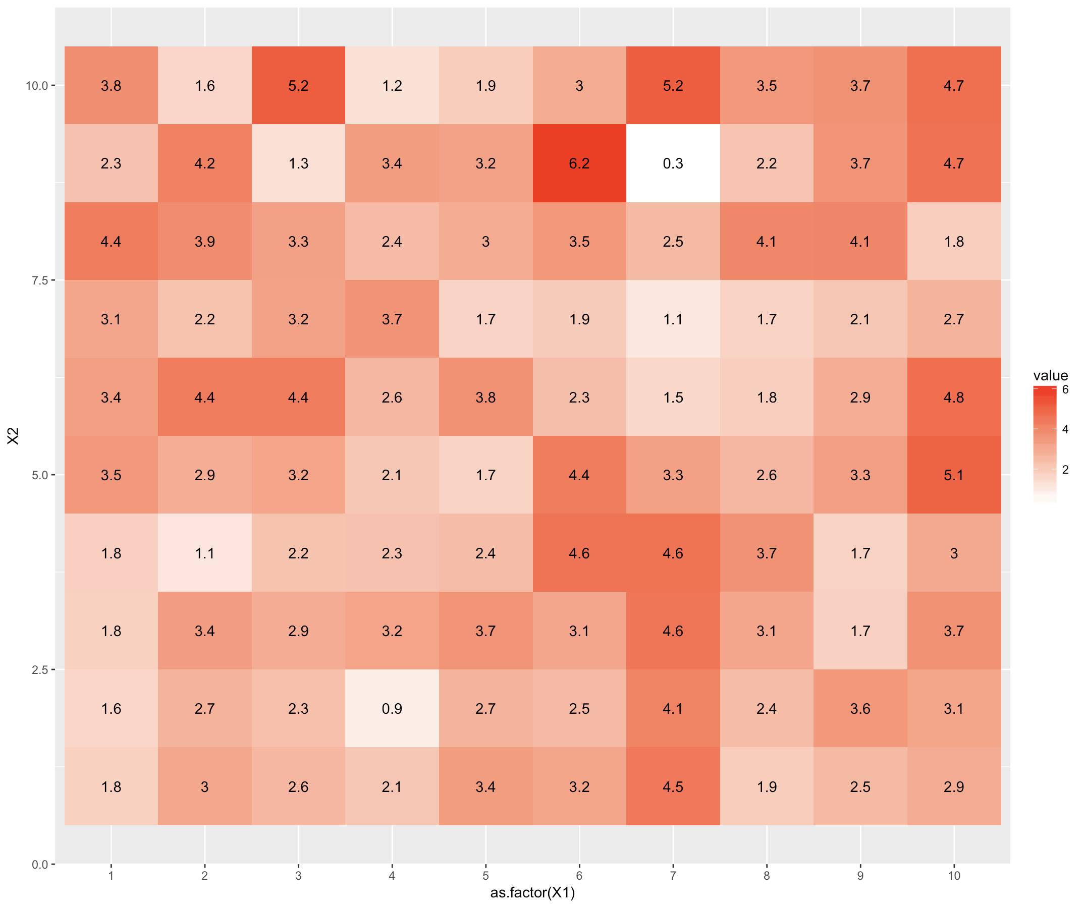
35 geom_tile() 绘制热图
library(reshape2)
library(ggplot2)
dat <- matrix(rnorm(100, 3, 1), ncol=10)
names(dat) <- paste("X", 1:10)
dat2 <- melt(dat, id.var = "X1")
ggplot(dat2, aes(as.factor(X1), X2, group=X2)) + geom_tile(aes(fill = value))+geom_text(aes(fill = dat2$value, label = round(dat2$value, 1))) + scale_fill_gradient(low = "white", high = "red")
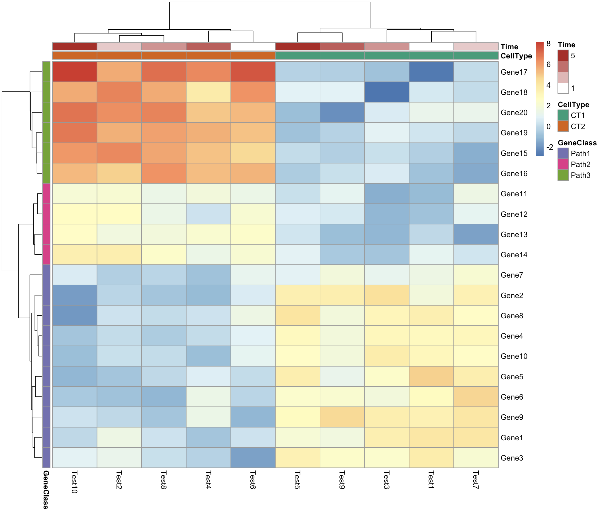
36 pheatmap() 绘制热图
library(pheatmap)
test = matrix(rnorm(200), 20, 10)
test[1:10, seq(1, 10, 2)] = test[1:10, seq(1, 10, 2)] + 3
test[11:20, seq(2, 10, 2)] = test[11:20, seq(2, 10, 2)] + 2
test[15:20, seq(2, 10, 2)] = test[15:20, seq(2, 10, 2)] + 4
colnames(test) = paste("Test", 1:10, sep = "")
rownames(test) = paste("Gene", 1:20, sep = "")
# 设置每一列的注释
annotation_col = data.frame(
  CellType = factor(rep(c("CT1", "CT2"), 5)), Time = 1:5
)
rownames(annotation_col) = paste("Test", 1:10, sep = "") # 设置每一行的注释
annotation_row = data.frame(
  GeneClass = factor(rep(c("Path1", "Path2", "Path3"), c(10, 4, 6)))
)
rownames(annotation_row) = paste("Gene", 1:20, sep = "") # 设置注释的颜色
ann_colors = list(
  Time = c("white", "firebrick"),
  CellType = c(CT1 = "#1B9E77", CT2 = "#D95F02"),
  GeneClass = c(Path1 = "#7570B3", Path2 = "#E7298A", Path3 = "#66A61E")
)
pheatmap(test,
           annotation_col = annotation_col,
           annotation_row = annotation_row,
           annotation_colors = ann_colors)
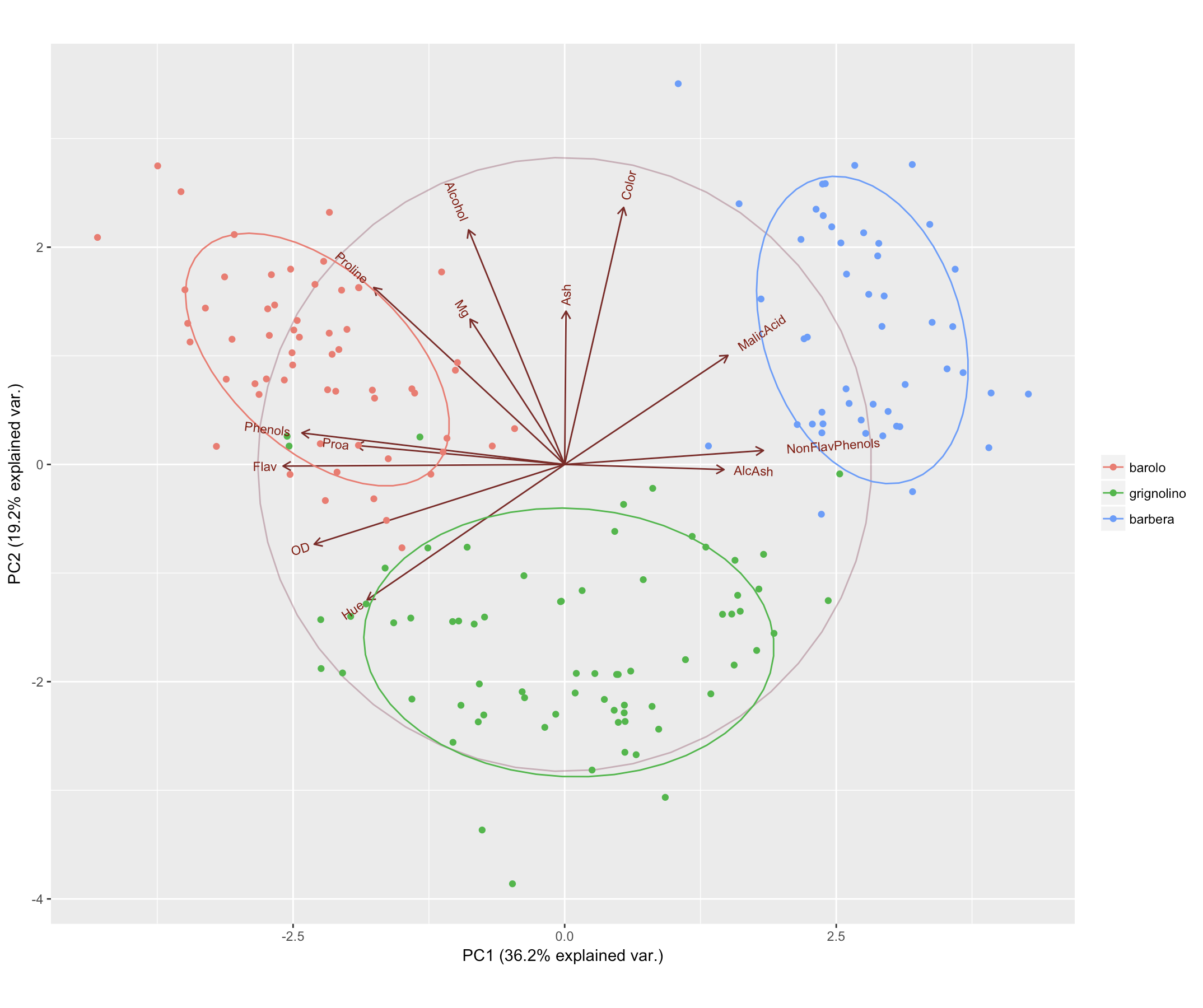
37 主成分分析图
- 做 PCA 时我们通常会将前两个主成分展示到坐标平面上,以此来区分样本的差异性。这种图是基本统计图形的综合展示。
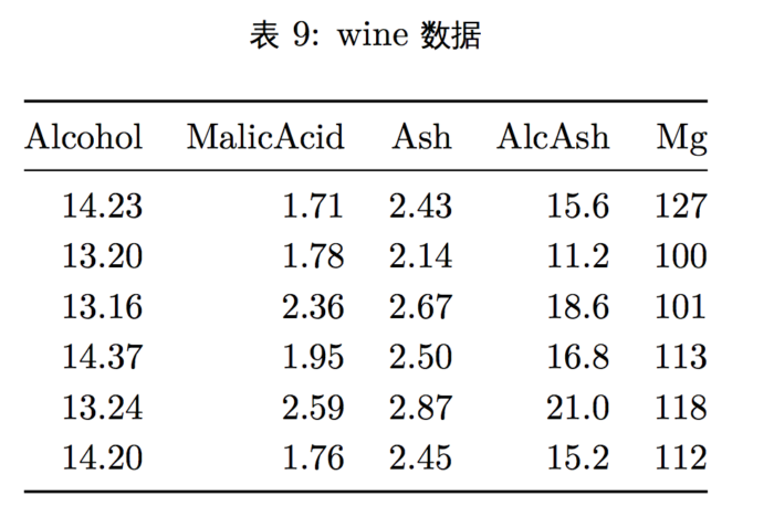
- 我们用 ggbiplot 包里的 wine 数据来做主成分分析,该数据记录了意大利同一 个地区的三种葡萄酒的化学成分和其他特征。

library(devtools)
install_github("vqv/ggbiplot")
library(plyr)
library(ggbiplot)
data("wine")
wine.pca <- prcomp(wine, scale. = TRUE)
ggbiplot(wine.pca, obs.scale = 1, var.scale = 1,
        groups = wine.class, ellipse = TRUE, circle = TRUE) + scale_color_discrete(name = '')
38 基本层次聚类图
- 层次聚类是聚类算法的一种,通过计算样本间的相似度来构造一棵聚类树。
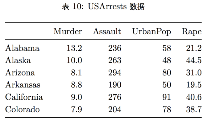
- 我们采用美国暴力犯罪率来展示层次聚类,USArrests 包含每个州的三种犯罪 人员被逮捕的数量以及该州城市地区人口数量。
hc <- hclust(dist(USArrests), "ave")
plot(hc)
39 dendrograms() 绘制层次聚类图
install.packages("ggdendro")
library(ggdendro)
hc <- hclust(dist(USArrests), "ave")
hcdata <- dendro_data(hc)
ggdendrogram(hcdata, rotate=TRUE, size=2) + labs(title="Dendrogram in ggplot2")

40 plot.phylo() 绘制层次聚类图
install.packages("ape")
hc <- hclust(dist(USArrests), "ave")
library(ape)
plot(as.phylo(hc), type = "fan")

41 graphics 包里如何添加图片标题
- 在 graphics 包中添加标题用 main 参数,添加子标题用 sub 参数,添加 x 轴标签用 xlab 参数,添加 y 轴标签用 ylab 参数。
plot(table(rpois(100, 5)), type = "h", col = "red", lwd = 10, main = "rpois(100, lambda = 5)",sub="this is a sub title", xlab="x axis title",ylab="y axis title"
)

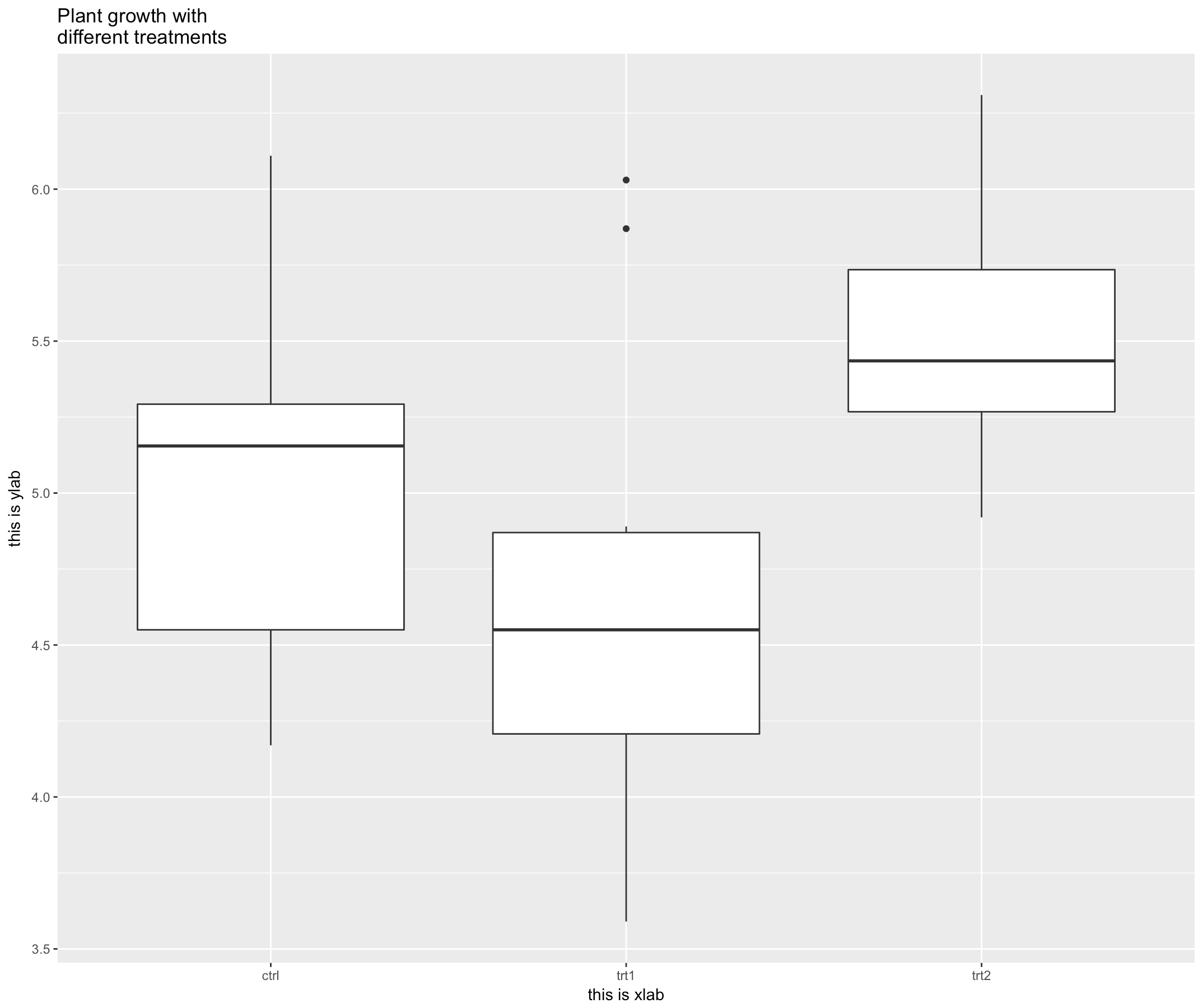
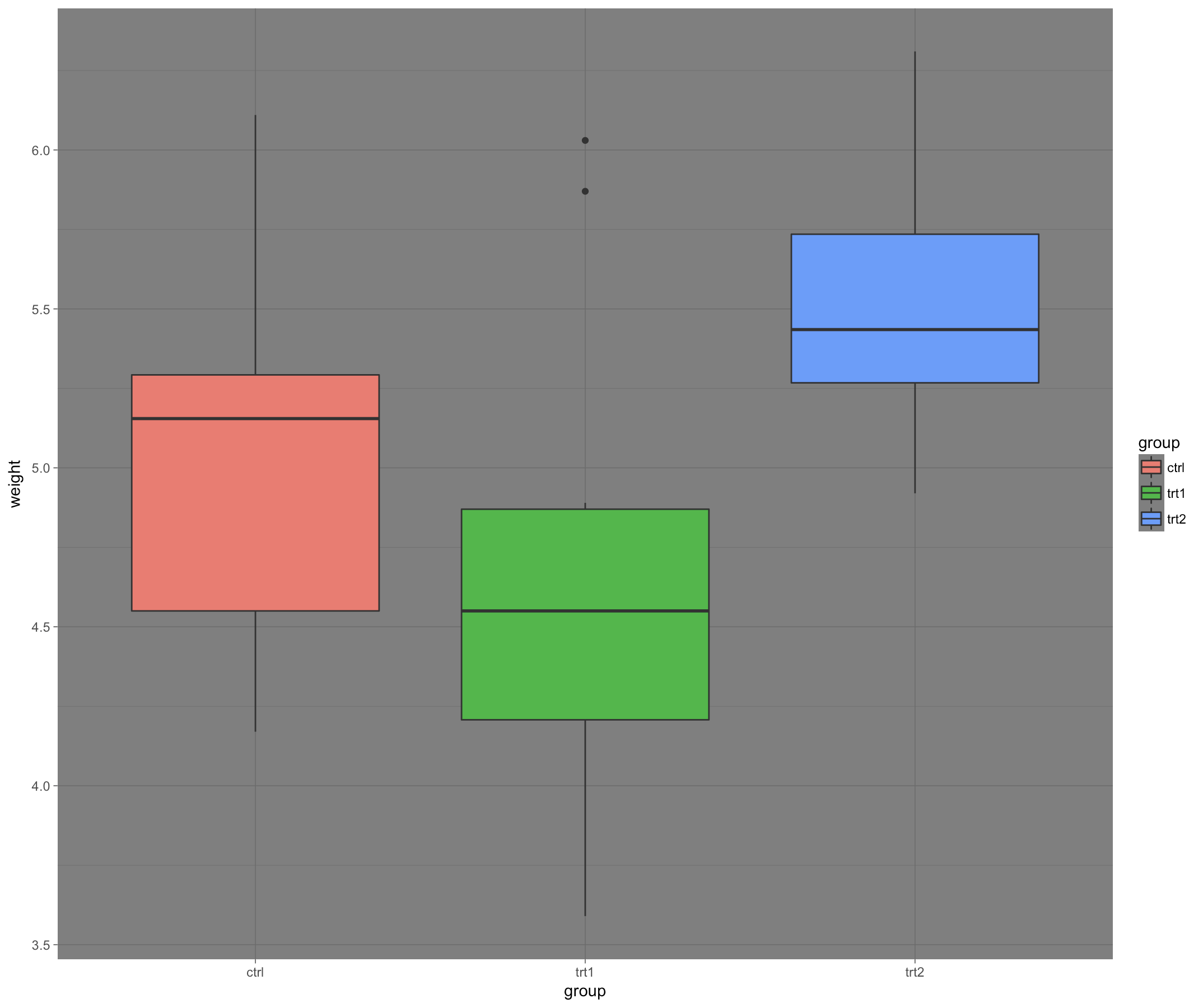
42 ggplot2 包里如何添加图片标题
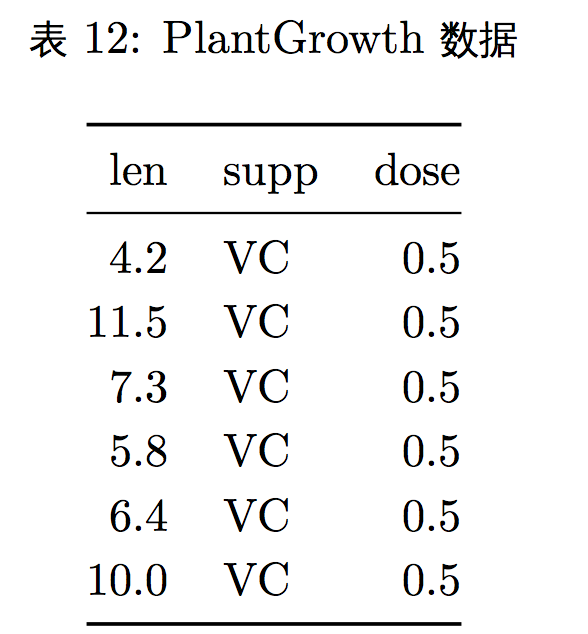
- 这里我们又用了一个新的示例数据 PlantGrowth,该数据展示了在一个试验中 控制不同的条件下植物的生长情况。

ggplot(PlantGrowth, aes(x=group, y=weight)) + geom_boxplot() +
  ggtitle("Plant growth with\ndifferent treatments")+ xlab("this is xlab")+
  ylab("this is ylab")
43 par() 函数 mfrow 设置多个图片同个画布
attach(mtcars)
par(mfrow=c(2,2))
plot(wt,mpg, main="Scatterplot of wt vs. mpg")
plot(wt,disp, main="Scatterplot of wt vs disp")
hist(wt, main="Histogram of wt")
boxplot(wt, main="Boxplot of wt")
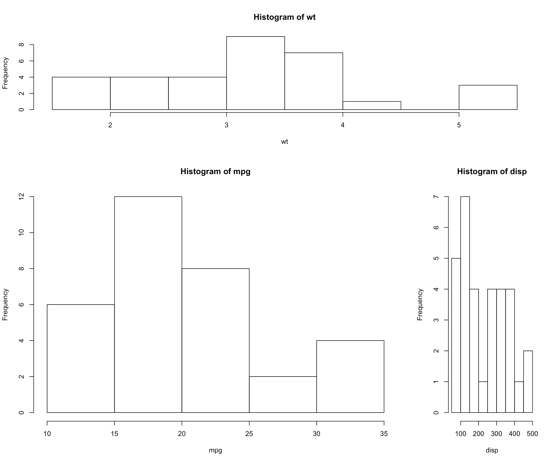
44 layout() 设置多个图片同个画布
attach(mtcars)
layout(matrix(c(1,1,2,3), 2, 2, byrow = TRUE),
       widths=c(3,1), heights=c(1,2))
hist(wt)
hist(mpg)
hist(disp)
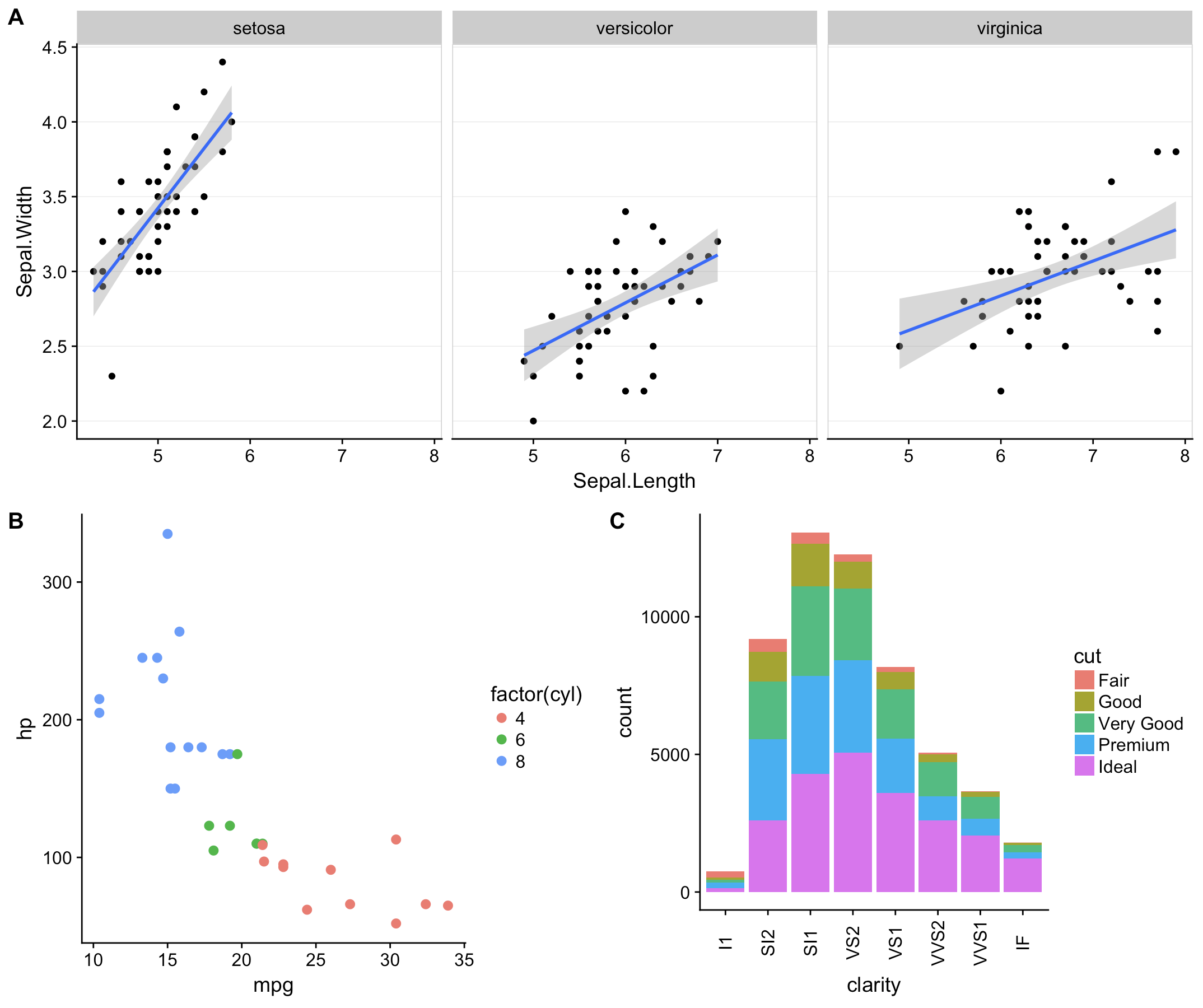
45 cowlplot::ggdraw() 设置多个图片同 个画布
library(cowplot)
sp <- ggplot(mtcars, aes(x = mpg, y = hp, colour = factor(cyl)))+
  geom_point(size=2.5)
bp <- ggplot(diamonds, aes(clarity, fill = cut)) +
  geom_bar() +
  theme(axis.text.x = element_text(angle=90, vjust=0.5))
plot.iris <- ggplot(iris, aes(Sepal.Length, Sepal.Width)) +
  geom_point() + facet_grid(. ~ Species) + stat_smooth(method = "lm") + background_grid(major = 'y', minor = "none") +
  panel_border()
  plot_grid(sp, bp, labels=c("A", "B"), ncol = 2, nrow = 1)
ggdraw() +
  draw_plot(plot.iris, 0, .5, 1, .5) +
  draw_plot(sp, 0, 0, .5, .5) +
  draw_plot(bp, .5, 0, .5, .5) +
  draw_plot_label(c("A", "B", "C"), c(0, 0, 0.5), c(1, 0.5, 0.5), size = 15)
46 gridExtra::grid.arrange() 设置多个图片同个画布
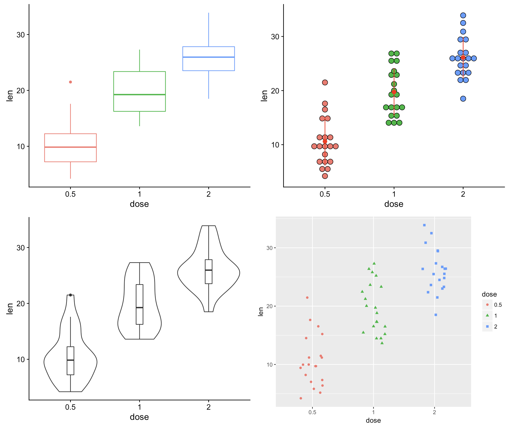
- 在这里我们使用一个维生素 D 对豚鼠牙齿生长的影响的数据(ToothGrowth), 该数据记录了维生素 D 含量同豚鼠牙齿长度的关系。
df <- ToothGrowth
df$dose <- as.factor(df$dose)
## 计量同牙齿长度的箱线图
bp <- ggplot(df, aes(x=dose, y=len, color=dose)) + geom_boxplot() +
  theme(legend.position = "none")
## 计量同牙齿长度的 Cleveland 点图
dp <- ggplot(df, aes(x=dose, y=len, fill=dose)) +
  geom_dotplot(binaxis='y', stackdir='center')+ stat_summary(fun.data=mean_sdl, fun.args = list(mult=1),
                                                             geom="pointrange", color="red")+ theme(legend.position = "none")
## 计量同牙齿长度的提琴图
vp <- ggplot(df, aes(x=dose, y=len)) +
  geom_violin()+
  geom_boxplot(width=0.1)
## 计量同牙齿长度的散点图(jitter 抖动模式)
sc <- ggplot(df, aes(x=dose, y=len, color=dose, shape=dose)) +
  geom_jitter(position=position_jitter(0.2))+ theme(legend.position = "none") + theme_gray()


library(gridExtra)
grid.arrange(bp, dp, vp, sc, ncol=2, nrow =2)
## Warning: Computation failed in `stat_summary()`:
## Hmisc package required for this function
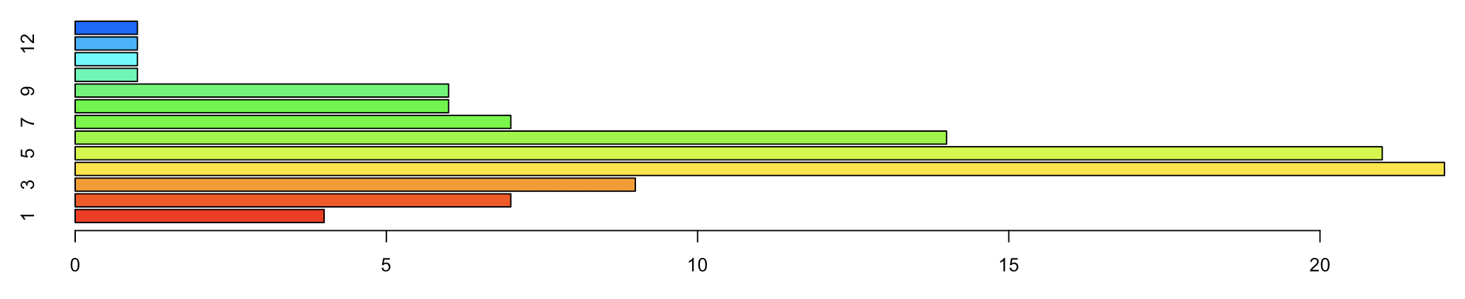
47 barplot() 水平显示条形图
tN <- table(Ni <- stats::rpois(100, lambda = 5))
barplot(tN, col = rainbow(20), horiz=TRUE)
48 coord_ ip() 水平显示直方图
ggplot(PlantGrowth, aes(x=group, y=weight))+ geom_boxplot() + coord_flip()
49 theme_grey() 背景
ggplot(PlantGrowth, aes(x=group, y=weight, fill=group)) + geom_boxplot() +
  theme_grey()
50 theme_gray() 背景
ggplot(PlantGrowth, aes(x=group, y=weight, fill=group)) + geom_boxplot() +
  theme_gray()

51 theme_bw() 背景
ggplot(PlantGrowth, aes(x=group, y=weight, fill=group)) + geom_boxplot() +
theme_bw()

52 theme_linedraw() 背景
ggplot(PlantGrowth, aes(x=group, y=weight, fill=group)) + geom_boxplot() +
  theme_linedraw()

53 theme_light() 背景
ggplot(PlantGrowth, aes(x=group, y=weight, fill=group)) + geom_boxplot() +
  theme_light()

54 ggplot2 包里如何更改背景
ggplot(PlantGrowth, aes(x=group, y=weight, fill=group)) + geom_boxplot() +
  theme_minimal()
55 theme_classic() 背景
ggplot(PlantGrowth, aes(x=group, y=weight, fill=group)) + geom_boxplot() +
  theme_classic()
56 theme_dark() 背景
ggplot(PlantGrowth, aes(x=group, y=weight, fill=group)) + geom_boxplot() +
  theme_dark()
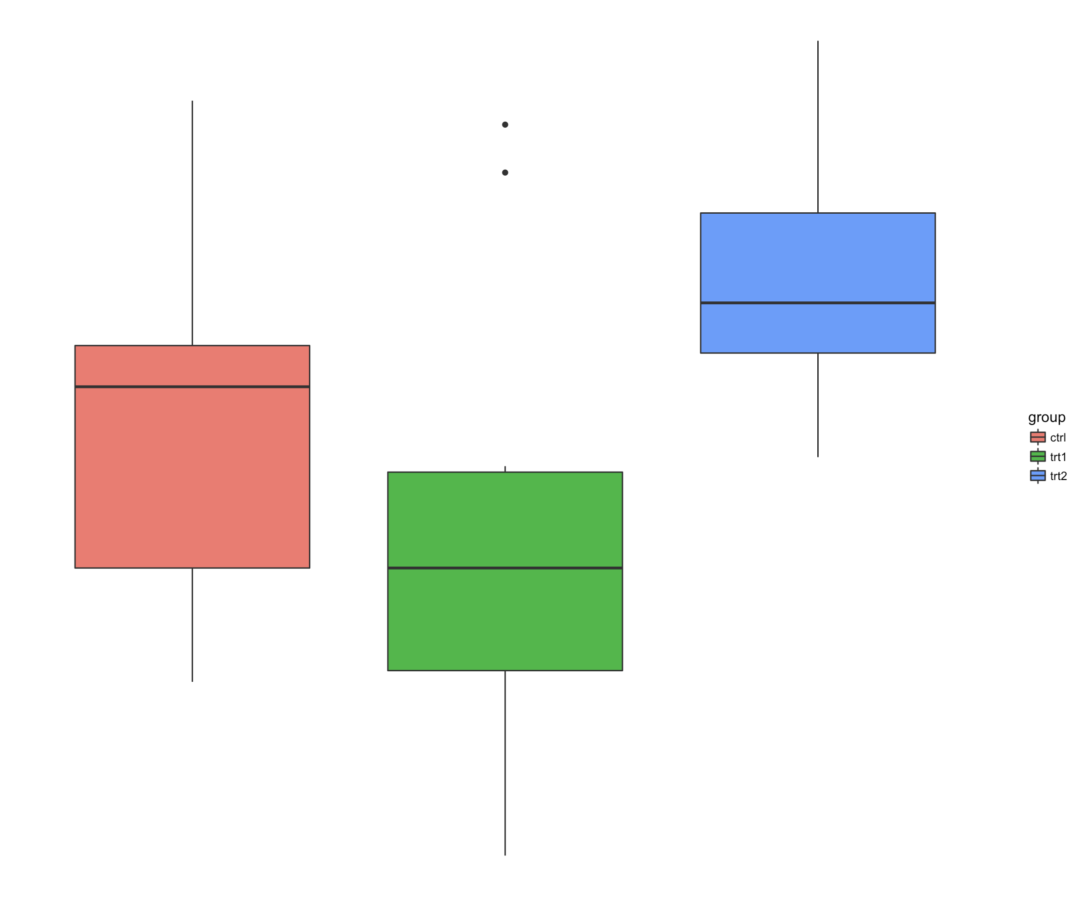
57 theme_void() 背景
ggplot(PlantGrowth, aes(x=group, y=weight, fill=group)) + geom_boxplot() +
  theme_void()
58 去掉背景仅显示坐标轴
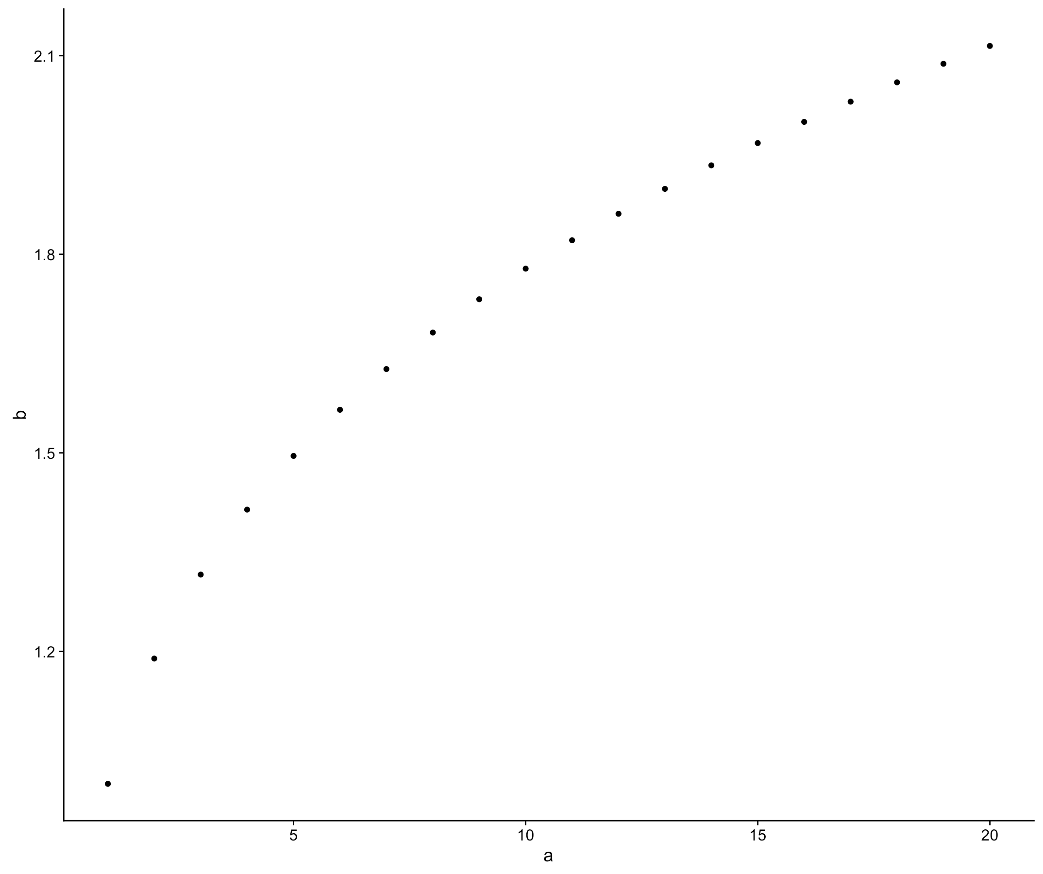
library(ggplot2)
a <- seq(1,20)
b <- a^0.25
df <- as.data.frame(cbind(a,b))
ggplot(df, aes(a, b)) +
  geom_point() +
  theme(axis.line.x = element_line(color = "black"),
        axis.line.y = element_line(color = "black"), panel.grid.major = element_blank(), panel.grid.minor = element_blank(), panel.border = element_blank(), panel.background = element_blank())