## A largish data set
n <- 10000
x1 <- matrix(rnorm(n), ncol = 2)
x2 <- matrix(rnorm(n, mean = 3, sd = 1.5), ncol = 2)
x <- rbind(x1, x2)

oldpar <- par(mfrow = c(2, 2), mar=.1+c(3,3,1,1), mgp = c(1.5, 0.5, 0))
smoothScatter(x, nrpoints = 0)
smoothScatter(x)

## but considerably *less* efficient for really large data:
plot(x, col = densCols(x), pch = 20)

## use with pairs:
par(mfrow = c(1, 1))
library(MASS)
library(ggplot2)
## Warning: package 'ggplot2' was built under R version 3.2.5
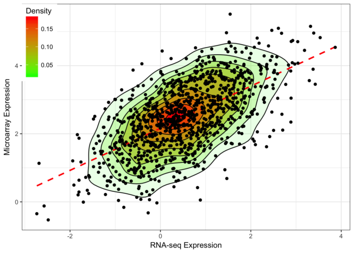
n <- 1000
x <- mvrnorm(n, mu=c(.5,2.5), Sigma=matrix(c(1,.6,.6,1), ncol=2))
df = data.frame(x); colnames(df) = c("x","y")
commonTheme = list(labs(color="Density",fill="Density",
x="RNA-seq Expression",
y="Microarray Expression"),
theme_bw(),
theme(legend.position=c(0,1),
legend.justification=c(0,1)))
ggplot(data=df,aes(x,y)) +
geom_density2d(aes(colour=..level..)) +
scale_colour_gradient(low="green",high="red") +
geom_point() + commonTheme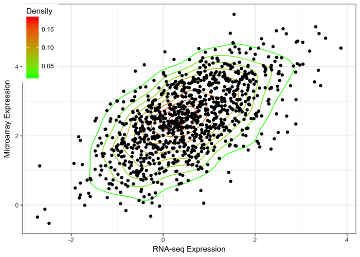
ggplot(data=df,aes(x,y)) +
  stat_density2d(aes(fill=..level..,alpha=..level..),geom='polygon',colour='black') +
  scale_fill_continuous(low="green",high="red") +
  geom_smooth(method=lm,linetype=2,colour="red",se=F) +
  guides(alpha="none") +
  geom_point() + commonTheme
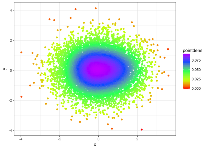
n <- 10000
x <- rnorm(n)
y <- rnorm(n)
DF <- data.frame(x,y)
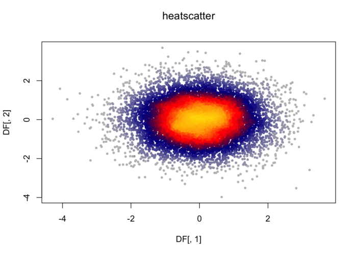
library(LSD)
heatscatter(DF[,1],DF[,2])
# generare random data, swap this for yours :-)!
n <- 10000
x <- rnorm(n)
y <- rnorm(n)
DF <- data.frame(x,y)

# Calculate 2d density over a grid
library(MASS)
dens <- kde2d(x,y)

# create a new data frame of that 2d density grid
# (needs checking that I haven't stuffed up the order here of z?)
gr <- data.frame(with(dens, expand.grid(x,y)), as.vector(dens$z))
names(gr) <- c("xgr", "ygr", "zgr")

# Fit a model
mod <- loess(zgr~xgr*ygr, data=gr)

# Apply the model to the original data to estimate density at that point
DF$pointdens <- predict(mod, newdata=data.frame(xgr=x, ygr=y))

# Draw plot
library(ggplot2)
ggplot(DF, aes(x=x,y=y, color=pointdens)) + geom_point() + scale_colour_gradientn(colours = rainbow(5)) + theme_bw()