
简述
Python 中,数据可视化一般是通过较底层的 Matplotlib 库和较高层的 Seaborn 库实现的,本文主要介绍一些常用的图的绘制方法。在正式开始之前需要导入以下包
import numpy as np # 线性代数库
import pandas as pd # 数据分析库
import matplotlib.pyplot as plt
import seaborn as sns
在 Jupyter Notebook 中,为了让图片内嵌在网页中,可以打开如下开关
%matplotlib inline
另外,设置了不同的图像效果和背景风格,图片的显示也不一样。
Matplotlib 基础
函数基本形式
Matplotlib 要求原始数据的输入类型为 Numpy 数组,画图函数一般为如下形式(与 Matlab 基本一致)
plt.图名(x, y, 'marker 类型')
例如
plt.plot(x, y)
plt.plot(x, y, 'o-')
plt.plot(x, y, 'o-')
plt.scatter(x, y)
plt.scatter(x, y, linewidths=x,marker='o')
等等,参数 x,y 要求为 np 数组。
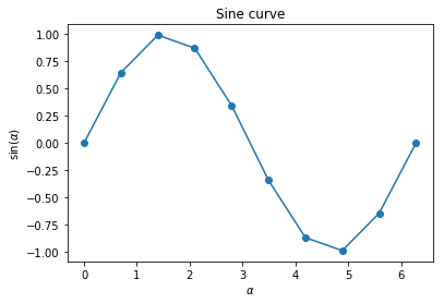
举个例子
X = np.linspace(0, 2 * np.pi, 10)
plt.plot(X, np.sin(X), '-o')
plt.title('Sine curve')
plt.xlabel(r'$\alpha$')
plt.ylabel(r'sin($\alpha$)')
设置标题及 X,Y 轴
- 方法一
plt.figure(figsize=(3, 2))
plt.title("Title")
plt.xlabel("X")
plt.ylabel("Y")
plt.plot(np.arange(10), np.sin(np.arange(10)))
- 方法二
f, ax = plt.subplots(figsize=(3, 2))
ax.set_xlabel("X")
ax.set_ylabel("Y")
ax.set_title("Title", fontsize=20)
ax.plot(np.arange(10), np.sin(np.arange(10)))
导出矢量图
在论文写作中,一般要求插入图片的格式为矢量图,Matplotlib 和 Seaborn 图片可以用如下代码导出
plt.plot(.......)
# pdf 格式
plt.savefig('./filename.pdf',format='pdf')
# svg 格式
plt.savefig('./filename.svg',format='svg')
Seaborn 基础
Seaborn 要求原始数据的输入类型为 pandas 的 Dataframe 或 Numpy 数组,画图函数一般为如下形式
sns.图名(x='X轴 列名', y='Y轴 列名', data=原始数据df对象)
或
sns.图名(x='X轴 列名', y='Y轴 列名', hue='分组绘图参数', data=原始数据df对象)
或
sns.图名(x=np.array, y=np.array[, ...])
hue 的意思是 variable in data to map plot aspects to different colors。
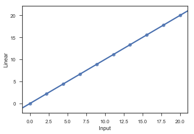
举个例子,建立如下数据集
X = np.linspace(0, 20, 10)
df = pd.DataFrame({"Input": X, "Linear": X, "Sin": np.sin(X)})
Input       Linear      Sin
0   0.000000    0.000000    0.000000
1   2.222222    2.222222    0.795220
2   4.444444    4.444444    -0.964317
3   6.666667    6.666667    0.374151
4   8.888889    8.888889    0.510606
……
我们来拟合第一列与第二列
sns.regplot(x='Input', y='Linear', data=df)
子图的绘制
绘制子图一般使用 subplots 和 subplot 函数,我们分别介绍。
subplots
一般形式为
f, ax = plt.subplots(ncols=列数, nrows=行数[, figsize=图片大小, ...])
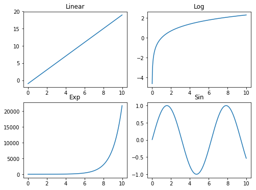
举两个例子
f, ax = plt.subplots(ncols=2, nrows=2, figsize=(8, 6))

X = np.arange(0.01, 10, 0.01)
ax[0, 0].plot(X, 2 * X - 1)
ax[0, 0].set_title("Linear")
ax[0, 1].plot(X, np.log(X))
ax[0, 1].set_title("Log")
ax[1, 0].plot(X, np.exp(X))
ax[1, 0].set_title("Exp")
ax[1, 1].plot(X, np.sin(X))
ax[1, 1].set_title("Sin")
# 设置风格
sns.set(style="white", context="talk")
# 随机数生成器
rs = np.random.RandomState(7)
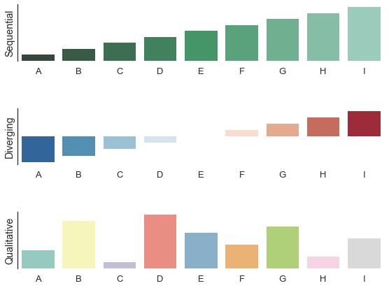
# Set up the matplotlib figure
f, (ax1, ax2, ax3) = plt.subplots(3, 1, figsize=(8, 6), sharex=True)
# Generate some sequential data
x = np.array(list("ABCDEFGHI"))
y1 = np.arange(1, 10)
sns.barplot(x, y1, palette="BuGn_d", ax=ax1)
ax1.set_ylabel("Sequential")
# Center the data to make it diverging
y2 = y1 - 5
sns.barplot(x, y2, palette="RdBu_r", ax=ax2)
ax2.set_ylabel("Diverging")
# Randomly reorder the data to make it qualitative
y3 = rs.choice(y1, 9, replace=False)
sns.barplot(x, y3, palette="Set3", ax=ax3)
ax3.set_ylabel("Qualitative")
# Finalize the plot
sns.despine(bottom=True)
plt.setp(f.axes, yticks=[])
plt.tight_layout(h_pad=3)
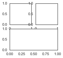
subplot
基本形式为
subplot(nrows, ncols, index, **kwargs)
In the current figure, create and return an
Axes, at position index of a (virtual) grid of nrows by ncols axes. Indexes go from 1 tonrows *ncols, incrementing in row-major order.
If nrows, ncols and index are all less than 10, they can also be given as a single, concatenated, three-digit number.
For example,subplot(2, 3, 3)andsubplot(233)both create anAxesat the top right corner of the current figure, occupying half of the figure height and a third of the figure width.
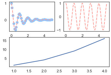
举几个例子
plt.figure(figsize=(3, 3))
plt.subplot(221)
# 分成2x2,占用第二个,即第一行第二列的子图
plt.subplot(222)
# 分成2x1,占用第二个,即第二行
plt.subplot(212)
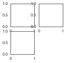
plt.figure(figsize=(3, 3))
plt.subplot(221)
plt.subplot(222)
plt.subplot(223)
plt.show()
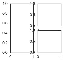
plt.figure(figsize=(3, 3))
plt.subplot(121)
plt.subplot(222)
plt.subplot(224)
plt.show()
def f(t):
    return np.exp(-t) * np.cos(2 * np.pi * t)
t1 = np.arange(0, 5, 0.1)
t2 = np.arange(0, 5, 0.02)

plt.subplot(221)
plt.plot(t1, f(t1), 'bo', t2, f(t2), 'r--')

plt.subplot(222)
plt.plot(t2, np.cos(2 * np.pi * t2), 'r--')

plt.subplot(212)
plt.plot([1, 2, 3, 4], [1, 4, 9, 16])

plt.show()
直方图
准备数据
X = np.arange(8)
y = np.array([1, 4, 2, 3, 3, 5, 6, 3])
df = pd.DataFrame({"X":X, "y":y})
sns.barplot("X", "y", palette="RdBu_r", data=df)
# 或者下面这种形式,但需要自行设置Xy轴的 label
# sns.barplot(X, y, palette="RdBu_r")
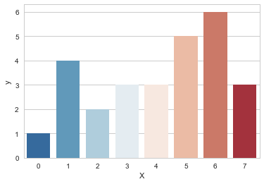
调整 palette 参数可以美化显示风格。
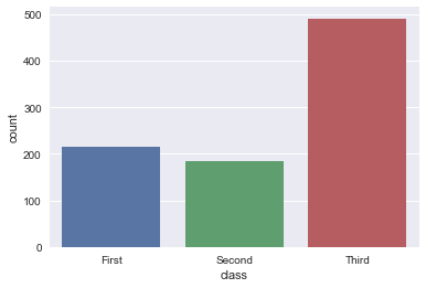
统计图
先调一下背景和载入一下数据
sns.set(style="darkgrid")
titanic = sns.load_dataset("titanic")
统计图
sns.countplot(x="class", data=titanic)
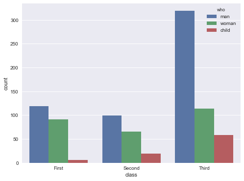
带 hue 的统计图(为了显示美观,可以调一下大小)
f, ax = plt.subplots(figsize=(8, 6))
sns.countplot(x="class", hue="who", data=titanic, ax=ax)
描述变量分布
描述变量的分布规律,方差、均值、极值等,通常使用 boxplots 图(箱图)和 violins 图(小提琴图)。
sns.set(style="whitegrid", palette="pastel", color_codes=True)
# Load the example tips dataset
tips = sns.load_dataset("tips")
violins 图
sns.violinplot(x="day", y="total_bill", data=tips)
sns.despine(left=True) # 不显示网格边框线
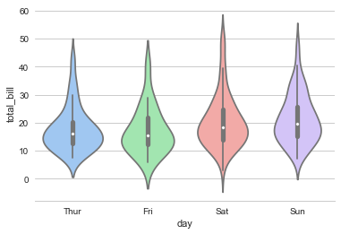
如图,图的高矮代表 y 值的范围,图的胖瘦代表分布规律。
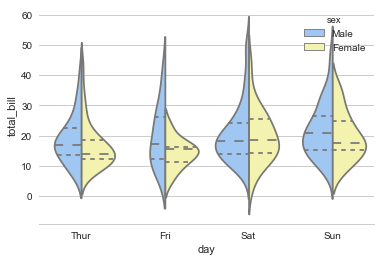
当然,也可以描述不同 label 的分布,下图就表示了男女在不同时间的消费差异
sns.violinplot(x="day", y="total_bill", hue="sex", data=tips, split=True,
               inner="quart", palette={"Male": "b", "Female": "y"})
sns.despine(left=True)
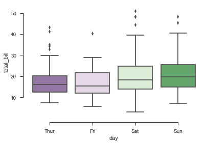
box 图
箱图和小提琴图的描述手段基本类似
sns.boxplot(x="day", y="total_bill", data=tips, palette="PRGn")
sns.despine(offset=10, trim=True) # 设置边框的风格
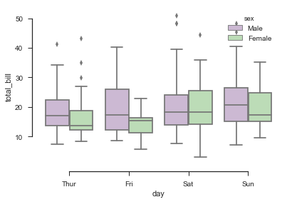
sns.boxplot(x="day", y="total_bill", hue="sex", data=tips, palette="PRGn")
sns.despine(offset=10, trim=True)
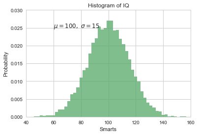
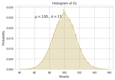
数据分布直方图
描述单变量的分布可以也使用数据分布直方图
准备一些数据
mu,sigma=100,15
x=mu+sigma*np.random.randn(10000)
- Matplotlib 形式
sns.set_color_codes()
n,bins,patches=plt.hist(x,50,normed=1,facecolor='g',alpha=0.75)
plt.xlabel('Smarts')
plt.ylabel('Probability')
plt.title('Histogram of IQ')
plt.text(60,.025, r'$\mu=100,\ \sigma=15$')
plt.axis([40,160,0,0.03])
plt.grid(True)
- Seaborn 形式
sns.set_color_codes()
plt.xlabel('Smarts')
plt.ylabel('Probability')
plt.title('Histogram of IQ')
plt.text(60,.025, r'$\mu=100,\ \sigma=15$')
sns.distplot(x, color="y")
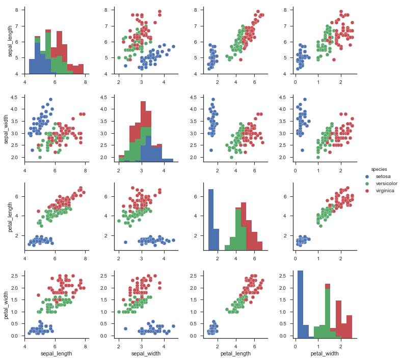
描述相关性
一般的,描述相关性一般使用 pairplot 图和 heatmap 图。
先 load 一下数据集和设置背景风格
sns.set(style="ticks")
df = sns.load_dataset("iris")
pairplot 图
pairplot 图一般用来描述不同 label 在同一 feature 上的分布。
sns.pairplot(df, hue="species")
heatmap 图
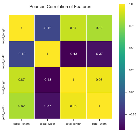
heatmap 图一般用来描述 feature 的相关性矩阵
sns.heatmap(df.corr(), square=True)
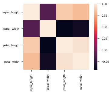
经过一些实践,下述代码的配色方案比较美观。
colormap = plt.cm.viridis
plt.figure(figsize=(12,12)) // 根据需要自行设置大小(也可省略)
plt.title('Pearson Correlation of Features', y=1.05, size=15) // 加标题
sns.heatmap(df.corr(),linewidths=0.1,vmax=1.0, square=True, cmap=colormap, linecolor='white', annot=True)